TABLE OF CONTENTS
- Overview
- Problem Statement and Research
- Competition Analysis
- Ideation and Sketches
- Proposal
- Iterations / Prototype
Overview
Had the opportunity to attend a 2-day crash course on UX Research & Design conducted by CuriousCore. Participants were told to prepare a topic and/or question we would like to research and design on. There were several examples such as grocery shopping, meal planning, attending a festival etc.
The Topic
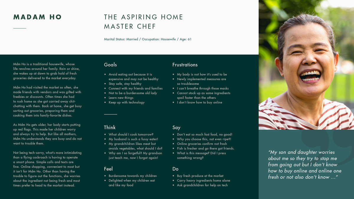
The topic of which I settled on was on online grocery shopping. With relevance to the pandemic situation and despite government's urge not to head out, many still shop for groceries at markets especially seniors (like my mum 😕). You can read about it here. I thought this is something close to heart and a field worth exploring into.
Roles
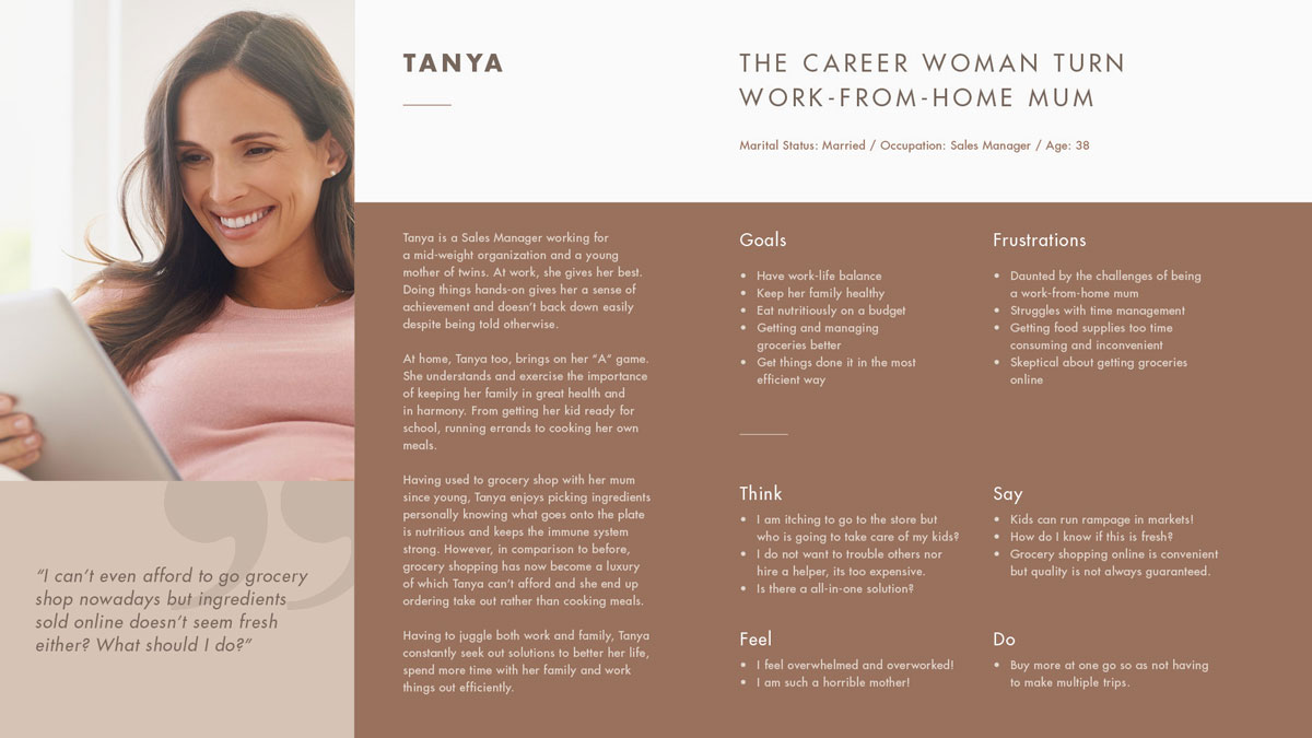
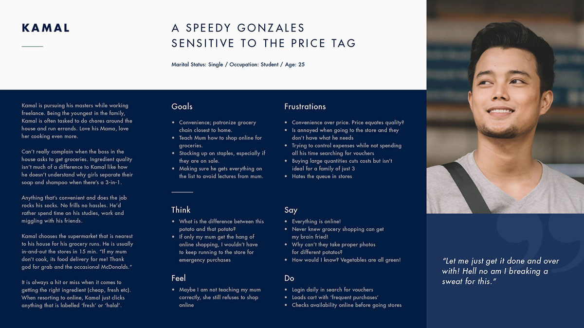
In relevance to the course, I imagined myself looking to encourage and improve the online shopping experience for senior citizens from a grocery retailer/business perspective. As this is a self-initiative, I am the UI/UX Designer, doing research, visual design, conducting user testing to prototyping. 🤘
Problem Statement
How might we improve/encourage online produce shopping so that more people, especially seniors, adopt the idea?
Assumptions
- Online grocery shopping is convenient for everyone.
- One of the biggest reason why people do not online grocery shop is that it is expensive.
- Groceries bought online are not guaranteed fresh.
- Online shops often carries false advertising.
Questions
- What makes you want to buy your groceries online / what makes you NOT what to buy your groceries online?
- How often do you buy groceries? And how often do you online shop?
- In general, how do you ensure the produce you buy are fresh?
- What makes you trust a product?
User Interviews
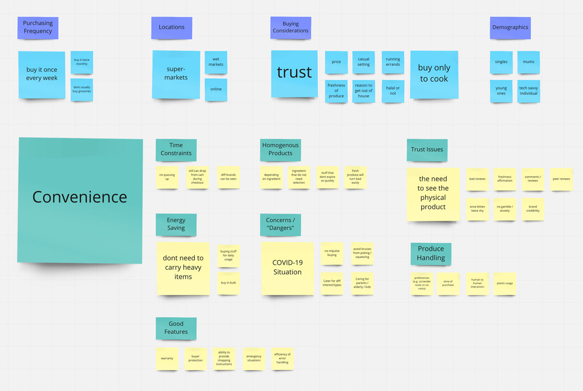
I interviewed 8 people ranging from 25 to 65 y.o, including a 30 y.o Singaporean who is residing in New Zealand. Here are some insights I gathered:
- Most of them are skeptical towards buying groceries online, they prefer to see, feel/touch the produce before they buy the product.
- They are open to online grocery shop if the trust is being built, from word of mouth, reviews or even personal experience.
- Different people have different idea of convenience and online grocery shopping is not infinitely convenient to everyone.
- Youngsters are more prone to shop online but not entirely, it largely depends on what they are buying (e.g. homogenous products) and more often non-perishables of which they would buy in bulk.
- Heading to the markets have intangible rewards such as meeting friends, product reservations, friendship discounts, it also acts as an outlet to get out of the house, all of which the online shopping experience cannot deliver.
Competition Analysis
I also did a "competitor" analysis of which I made a few discoveries:
- Most or all online grocery platforms are in English only?
- Big brands instill trust through the "homegrown label" advantage.
- Given Singapore's context of being multi-racial, it is suprising that most platforms do not have clear halal indicators.
- Most platforms require registration/login to proceed, first is this absolutely necessary? Second, if registration is a must, should this be brought a step further to better understand consumers?
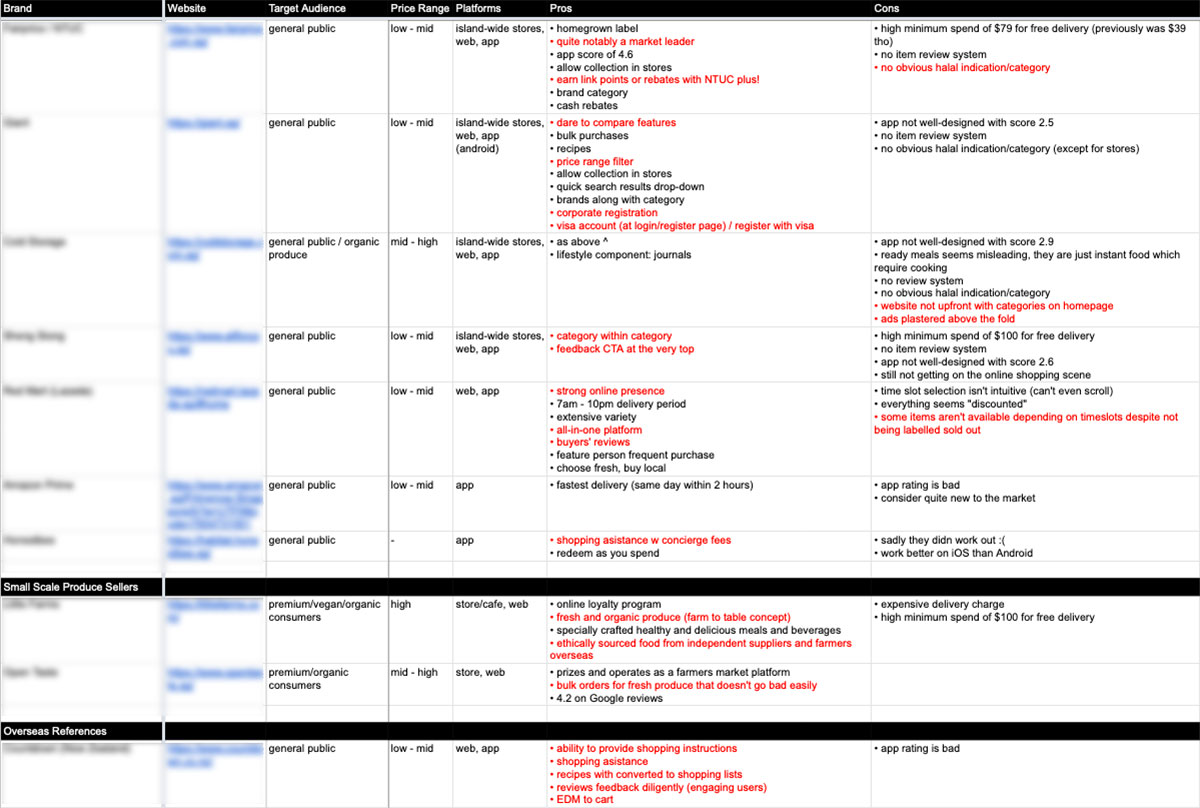 Apologies for not disclosing the brands. If you'd like, you can view these already available comparisons online here and here. (Disclaimer: These articles belong to their rightful owner, I do not own/wrote these)
Cross Platform Analysis
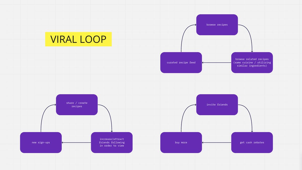
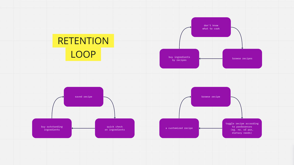
Apart from researching on similar industries, I took the liberty to study the viral/retention loops of other platforms which I thought was relevant to improve the overall experience.
- Flipboard: Quick registration process with quick tabs to determine what kind of articles should be on the consumers' feed.
- Instagram: From a casual mode of sharing content, it has become a platform for inspiration or a tool to kill boredom.
- Spotify / YouTube: List of recommendations base on your tuning habits along with the usage of data into interesting/funny ads.
- Shopee: Cashback system to entice return buyers.
Ideation
We were then told to fold an A4 paper into 8 sections and come up with ideas in relevance to our problem statement onto these respective rectangles within a short timeframe. Here is what I have got :
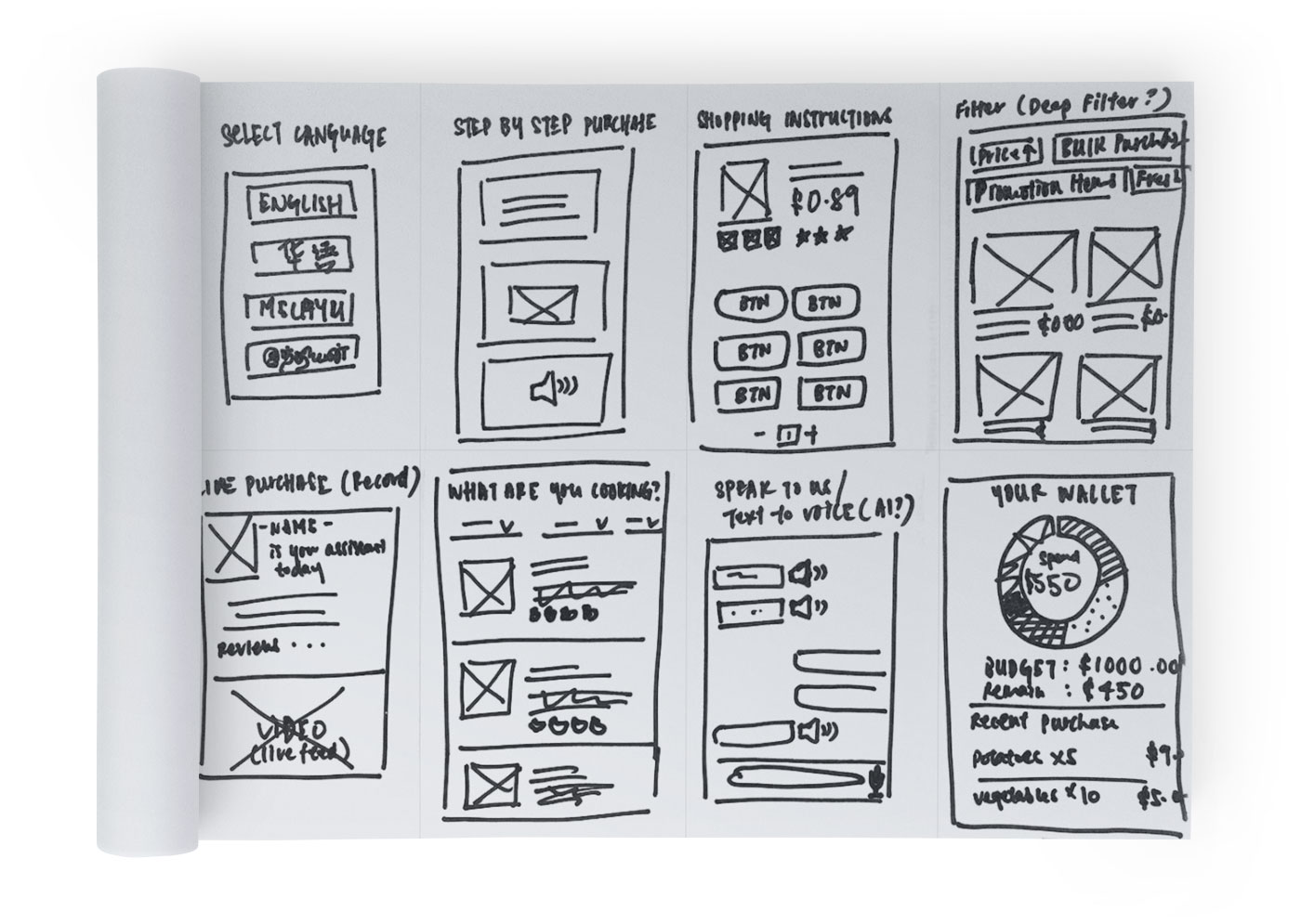
Given the readily available online grocery platforms such as Fairprice, RedMart and all the big names in the industry, the sprout of my ideas does not necessarily result in a whole new application. I foresee the possibilities of each and every one of them to be an additional feature or a improvised version of what is already available.
This is also one of the reason why its called Gosharey with a '+'. As an add-on feature and building this up for sharing purposes. And of course utilising seniors' creative ability in pronouncing 'grocery'. With that said, let me walk you through the ideas. 💡✨
From top to bottom, left to right:
- Language Selection / Custom Settings
This was something simple yet overlooked by many (or all) big brands in the industry. Despite Singaporeans' primary language is English, the older generation might not be well verse in English. This could also open up a wider range of consumers like foreign workers who are better verse in another language. Additional settings could also include determining font sizes, light/dark mode etc. - Step-by-Step Purchase
Often seniors have this tech phobia or tend to forget steps, a small tutorial at the onboarding screen can give a rough guideline as to how the app works. This takes reference from game tutorials whereby they give guidelines through messages or visual isolations for first time players. Here, consumers can use a step-by-step instruction tutorial whether in text, visual or audio whenever they need to. - Shopping Instructions
This idea came about when one of my interviewees mentioned about being able to choose her ingredients at the store. Understanding different people have different preferences, this is catered for those who have specific needs for their ingredients. Eg. parsley with roots, small potatoes or meat that carries more fat. - Deep Filter
Most apps can only filter by price or categories. I was thinking if we could have a master filter like how we search images on stock library, would that be helpful? Criterias such as freshness duration or even highly reviewed products. This could also be an eco-friendly approach whereby soon to be expired items are put on sale. - Live Purchase
This idea came about when Honestbee had the purchasing assistant and that many people buy groceries in stores because they could see and touch the produce. So why not have somebody do it for their behalf while the whole process is also being captured live to avoid any discrepencies. These assistants are also being reviewed by users to prove their credibility. - Browse by Recipes
Most of people buy groceries because they plan to cook, hence what a better way to browse by recipes? Each recipe also carry the necessary ingredients of which they can all be added to the cart and speed up the purchasing process. This could evolve into a recipe list base on the ingredients you have. - Voice Enquiry System
Often enquiries are a hassle and we often get served an auto reply which is rather frustrating. Having an AI (artificial intelligence) to manage these enquiries via voice messages could be one way to make the experience feel less distant. To increase accessibility, for text messages, they can also be converted to audio and vice versa. - Grocery Budgeting
This idea came from observing how my mum keep track of her grocery spending of which she does it mentally and it is often an estimation. If we can incorporate a budget system and track grocery purchases where it auto reflects monthly expenditures, would it also allow consumers to better understand their buying habits and reduce the chance of overspending?
Proposal
Out of the above mention ideas, we were told to choose and focus on one idea of which I chose 6. Browse by Recipes. With all credits due, it was my mum whom often went blank when questioned by the kids in the household (including me) during this isolation period that spark the decision. We often bombard her with "what are we having tomorrow" when dinner is not even settled. 😂
It was also in one of the interviews where one guy mentioned he had to do a market run because some ingredients was missed out or insufficient when his mum was cooking. This idea revolves around the situation whereby chefs in the house run out of ideas or even the time to get all the ingredients. This also gives immature cooks a headstart with step by step recipes not having to worry about any missing ingredients.
User Goal
- Inspire to cook something
- Have all ingredients conveniently ready without heading out
User Flow
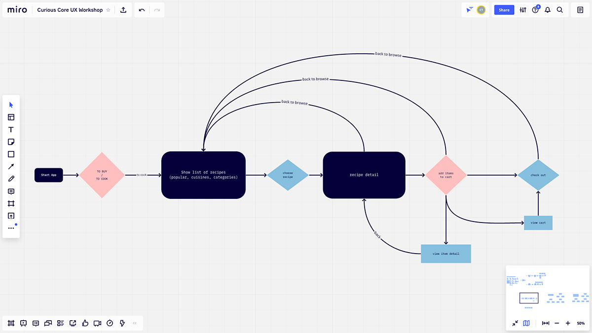
Before proceeding with wireframes it is also crucial to draft out the user flows so as to make sure every step that user takes is taken care of. And does each of these steps solves the problem and how can we improve or add on to this "base template" to make the experience even better.
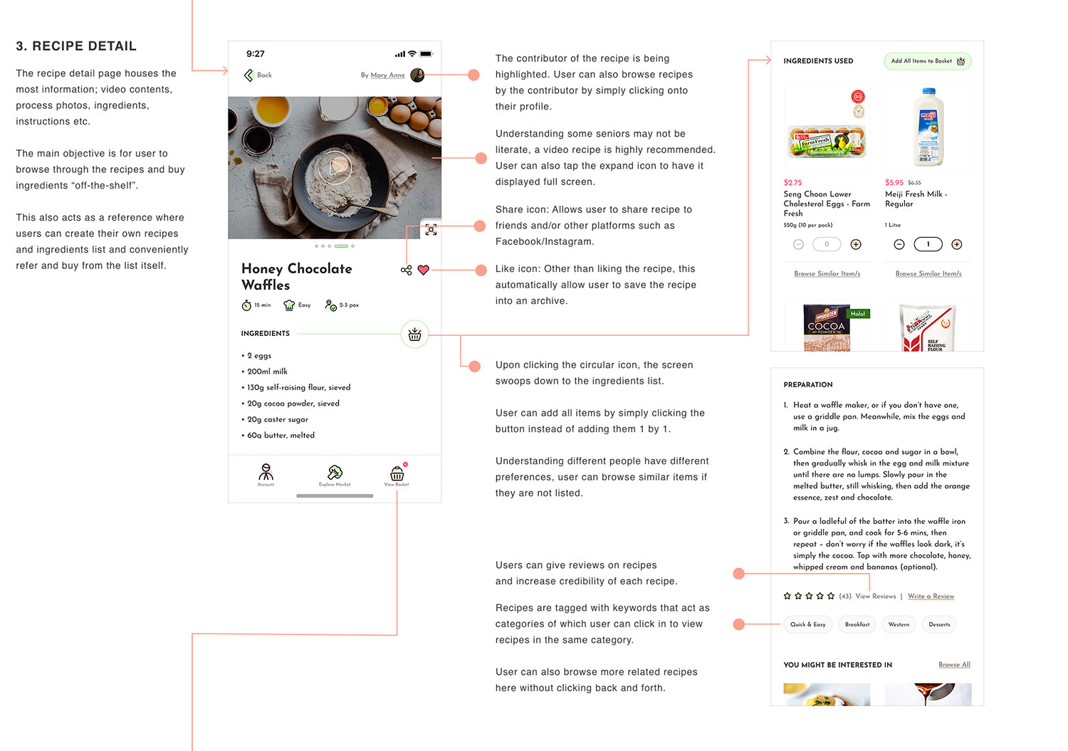
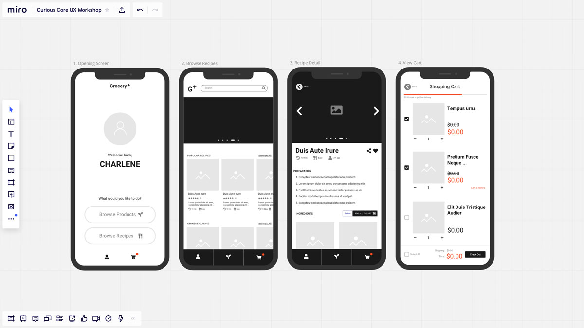
- Allow bookmarking/saving and sharing recipes
- Allow users to add all or selected ingredients into cart
- Allow recipes to be adjustable according to user's needs, eg. number of pax or dietary requirements like vegan/gluten-free
- Have related recipes that are of the same cuisine or uses the similar ingredients
Wireframe
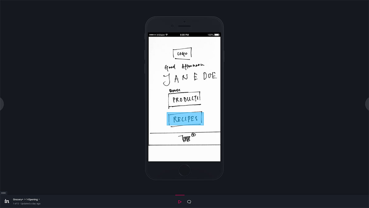
After drafting out the user flowchart, we created paper prototypes for the key screens and eventually translate it online via InVision. You can explore the InVision Prototype HERE. We had a user-testing session among our classmates which allowed me to picked up some areas that I have missed. Outside the class, I carried on to draft out the wireframe using MIRO's wireframing tools.
Prototype
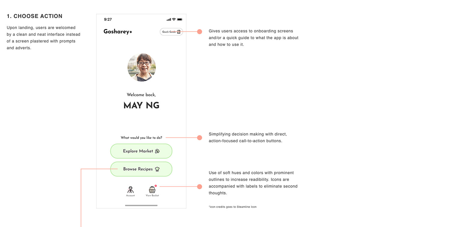
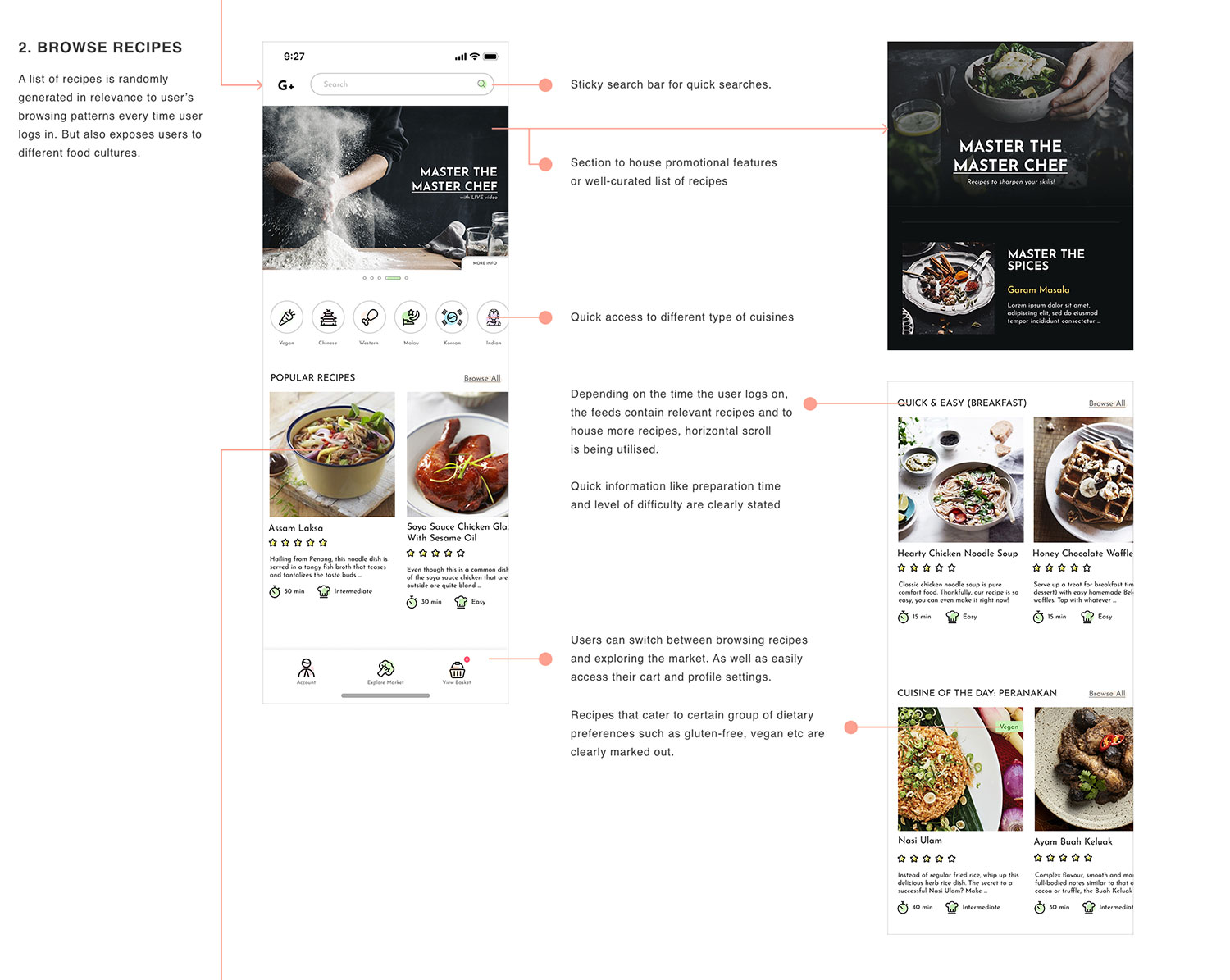
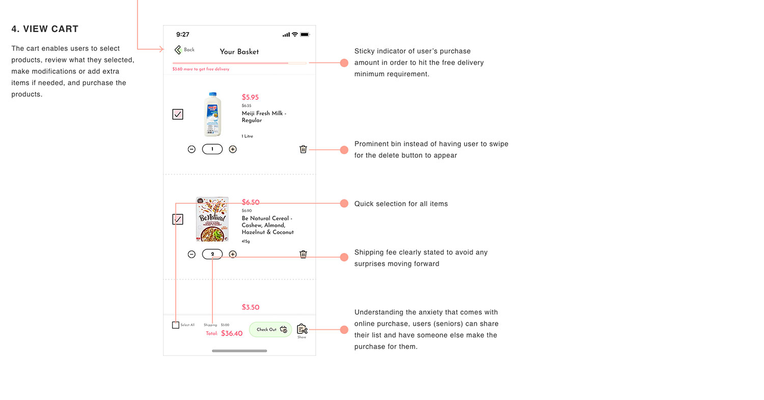
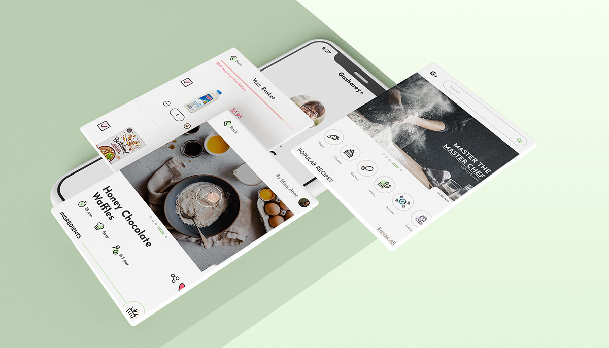
Looking back at the feedback from the user-testing session and the wireframe, I made several tweaks and add-on features. (click image to expand)
Iterations
Observing from user testing sessions and feedback, I saw the need to iterate my designs as well:
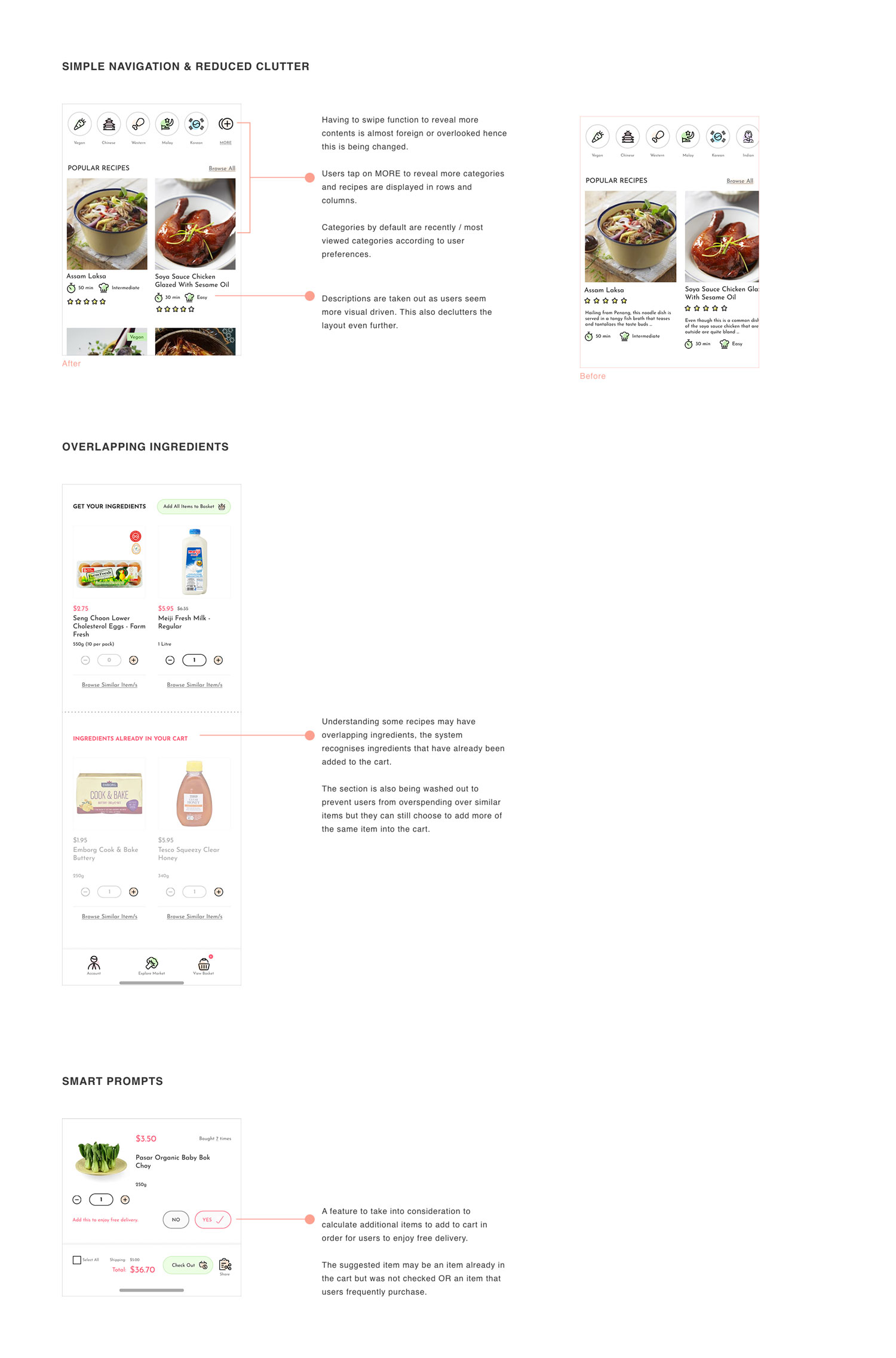
The prototype is built using FIGMA of which I am so glad that its FREE! Feel free to try it out below and mail me your feedback if you have any, they will be greatly appreciated. 💋
Reflections
Apart from absolutely enjoying the crash course, I was glad the thoughts and ideas were well-received by my instructor and classmates. Through observing my mum, who was the ultimate representation of my persona, it allowed me to take a step back and rethink my designs. One example was how she dare not buy anything online, afraid of her money disappearing unknowingly, hence the thought of sharing the purchase list. On another sentiment, having this recipe-purchase feature could eventually be an outlet for seniors or any inspiring chefs like how Instagram/Tik-Tok are for the youngsters. This too, could lead to collaborations between brands, inviting these unsung heroes cooped in our households to be "influencers".
Additionally, from a personal point of view, online shopping itself may not be the best solution to help senior citizens get groceries. Base on this point, the entire focus is drastically shifted. For example, instead of asking why users shop online or not, it could be asking how often do they use devices even. Instead of deep diving and leading users into a fix solution of online shopping, the problem statement is re-written to focus how to help senior citizens get their produce. The solution might not even be digitally related.
While doing this project, ideas kept churning and improvements were made as I proceed. It was challenging at times (anxiety issues) but overcoming them was definitely worth it because I explored and learnt along the way. All in all, it was a fulfiling process from start to end. Oh! If you would like to hook me up to discuss this further (over free teh peng 😋), you definitely are most welcomed!
