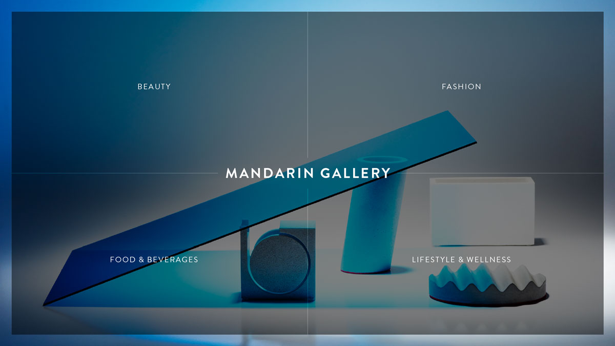
MANDARIN GALLERY - IN THE MOOD LOOKBOOK
Concept, Art Direction, Print Design, UI / UX Design, Content Population, Project Management, Product Photography
Visit Website
The Brief
Situated at the highly competitive retail stretch of Orchard Road, Mandarin Gallery hopes not to be misunderstood as just another luxuriant mall. Being a fourstorey congregation of boutique fashion designers with a wide range of unique and individual places to eat and drink, Mandarin Gallery would like to very much portray a way of living to its audience instead of overly indulging ones' shopping impulse. In the coming new year, in order to re-connect with their audience, Mandarin Gallery is looking at distributing direct mailers to a selected crowd in order to attract crowds and at the same time promote the line of brands and tenants within the mall.
Ideation
During the brainstorm session with the client and photography team, we were all aligned to not go with the usual flyer or brochures. The biggest challenge was to feature all of the tenants in the mall itself. The mood and direction with reference to Cereal Mag and Kinfolk was in the talks as well. Clean, minimal and easy to the eyes albeit being a promotional material.
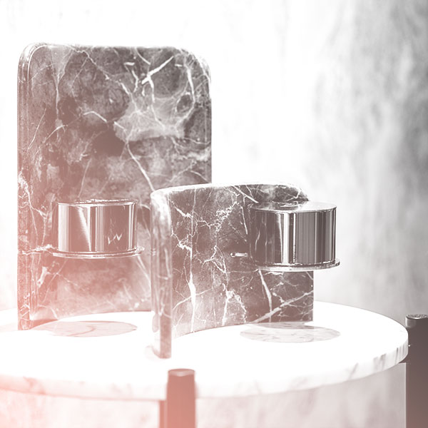
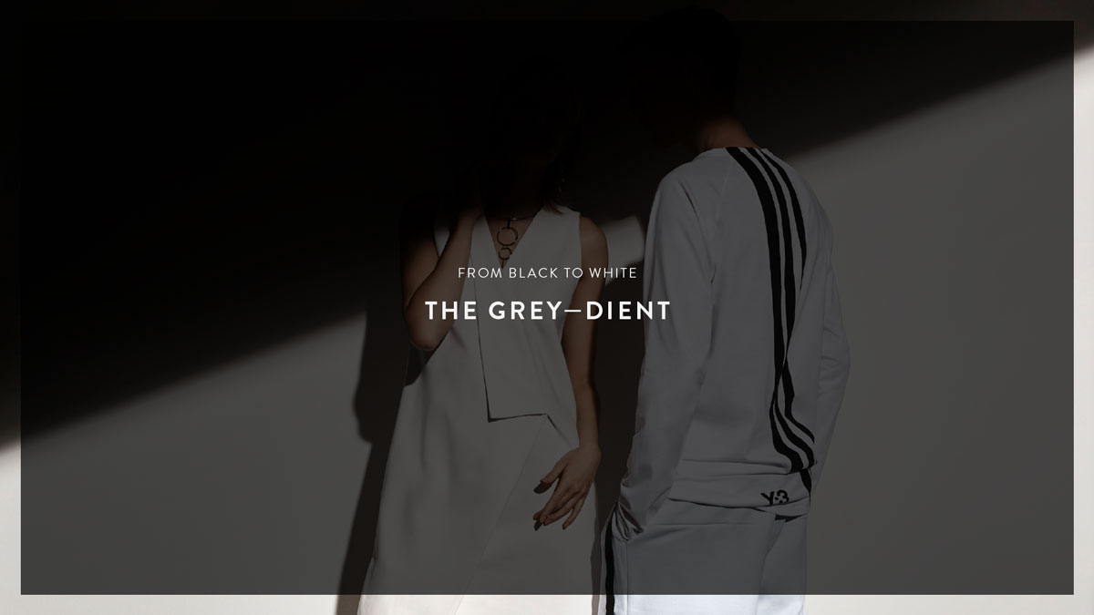
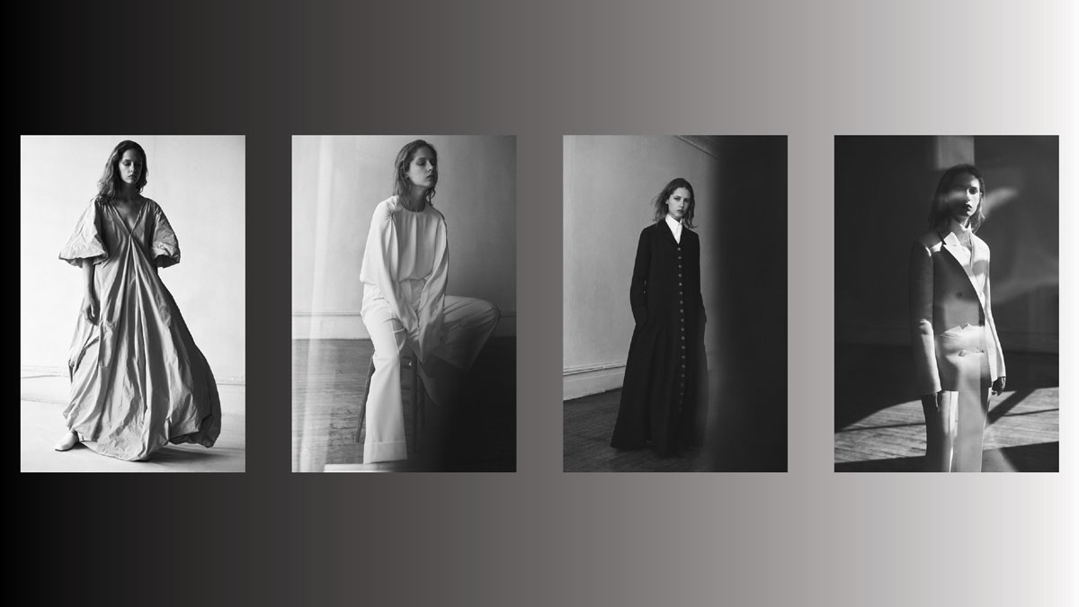
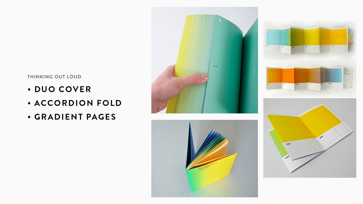
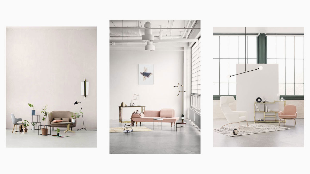
Concept #1: GREY-DIENT
From the brand guide, Mandarin Gallery's primary colors are simply black and white. In conceptual terms, black and white aren't colors, it is the absence/presence of light and white light comprises all hues on the spectrum. Using this analogy, I am proposing the use of lights, shadows and greys as a backdrop with subjects at the foreground, as if each image is color corrected and subjects are isolated, blooming in full color. Subjects should also be carefully curated and in a series of sequential color palatte.
For the end product, I was thinking other than a catalogue, it could function as a calendar as well. Another possibility was to have them in a perforated accordion, good together but beautiful as its own as well.
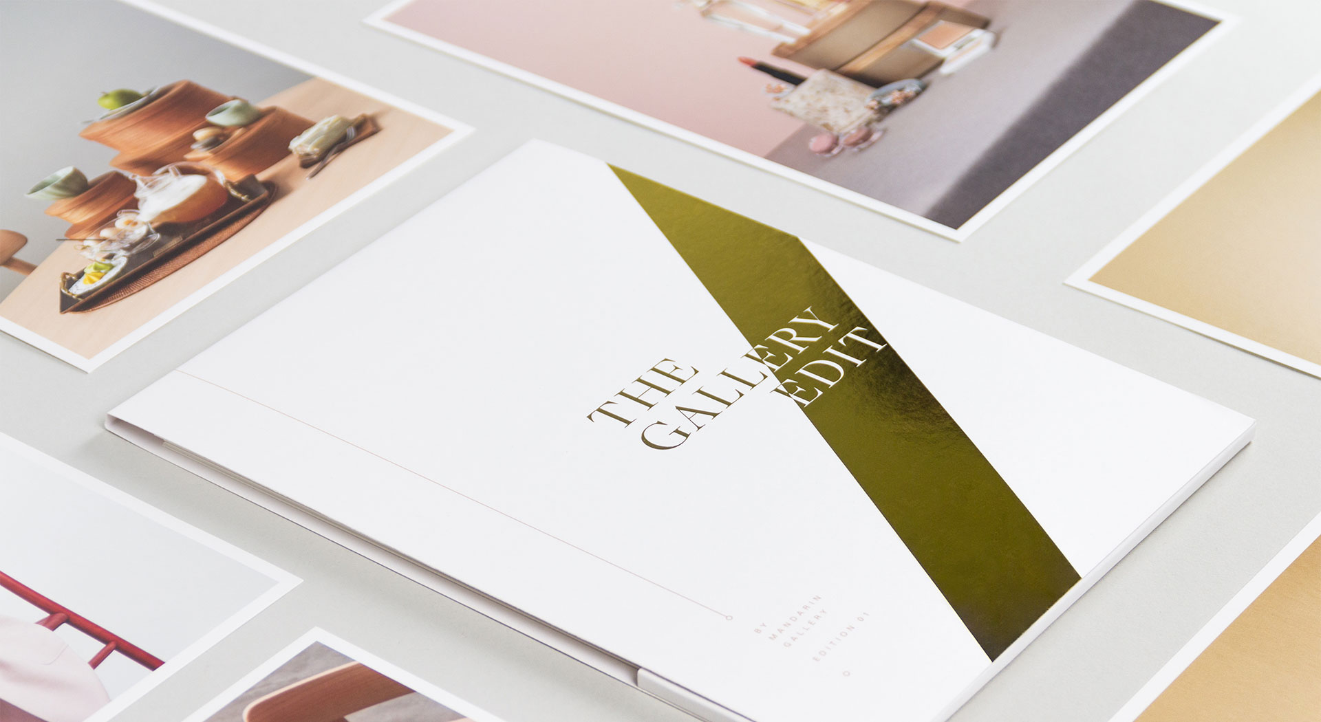
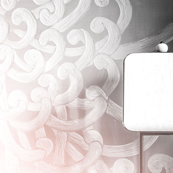
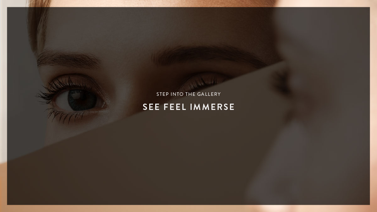
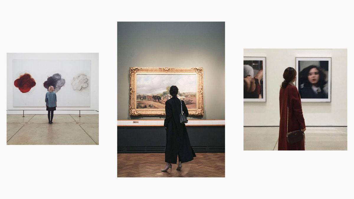
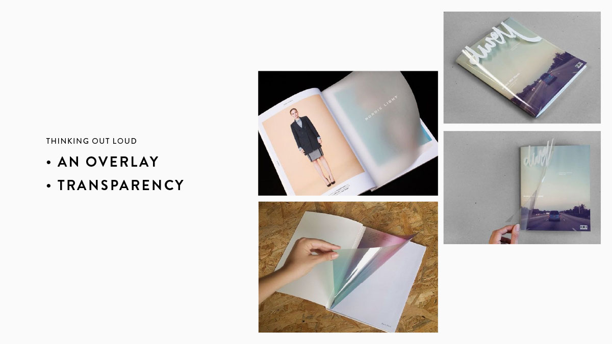
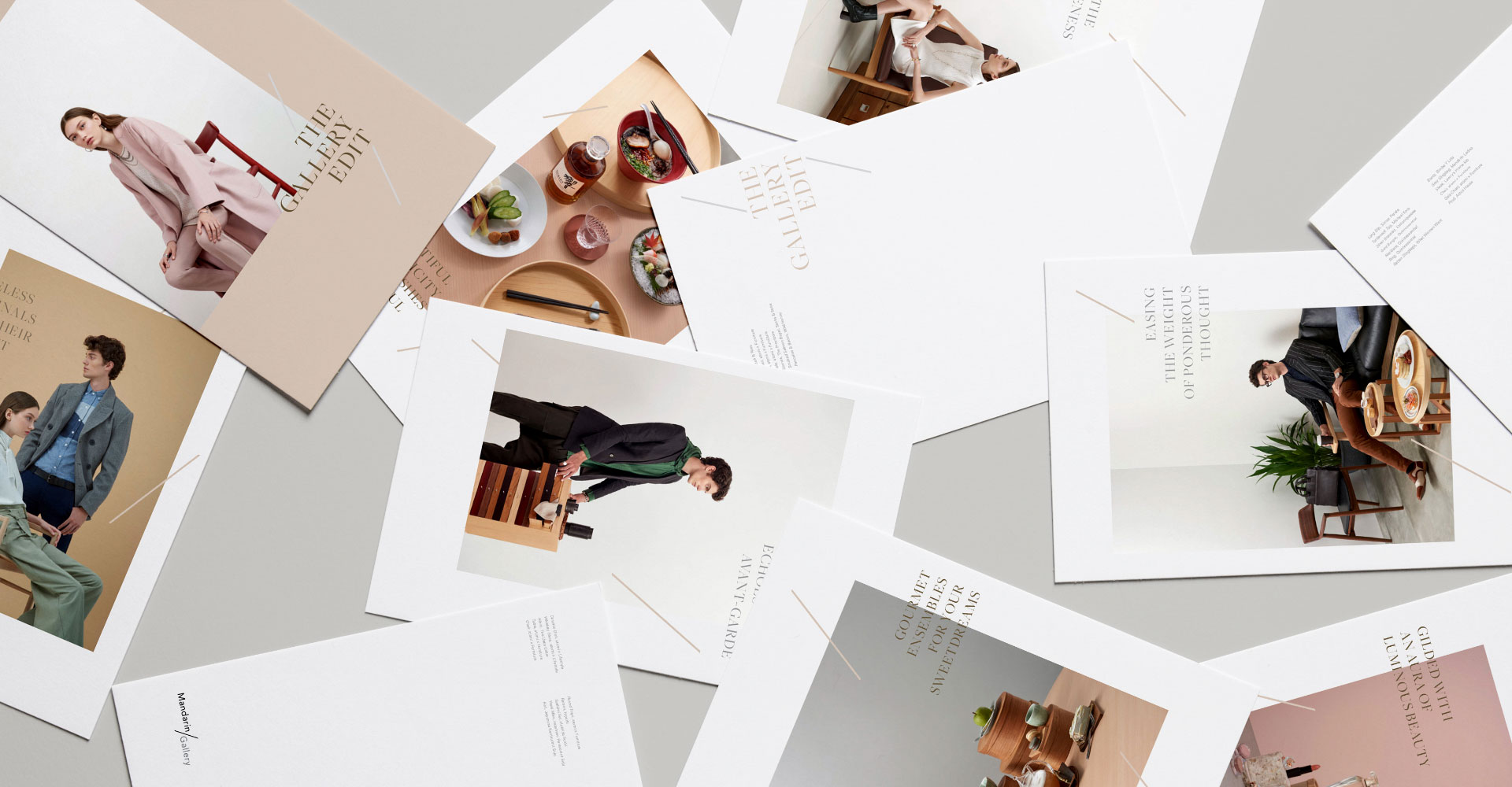
Concept #2: STEP INTO THE GALLERY (Client's Choice)
In this concept, I took the literal meaning of Mandarin Gallery's 'gallery', to house products of all tenants in the mall in a way it is like a showroom or an exhibition. These set ups will then be photographed, printed and possibly have them framed up and viewed as individual piece instead of simply producing a catalogue.
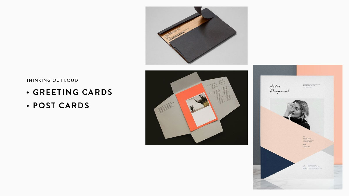
To add on a sense of mystery, I proposed the use of rice paper or transparencies tucked in between or on the cover itself. To standby Mandarin Gallery's ethos on building itimacy with customers, well-crafted messages in handwritten fonts in between postcards can be a go to as well.
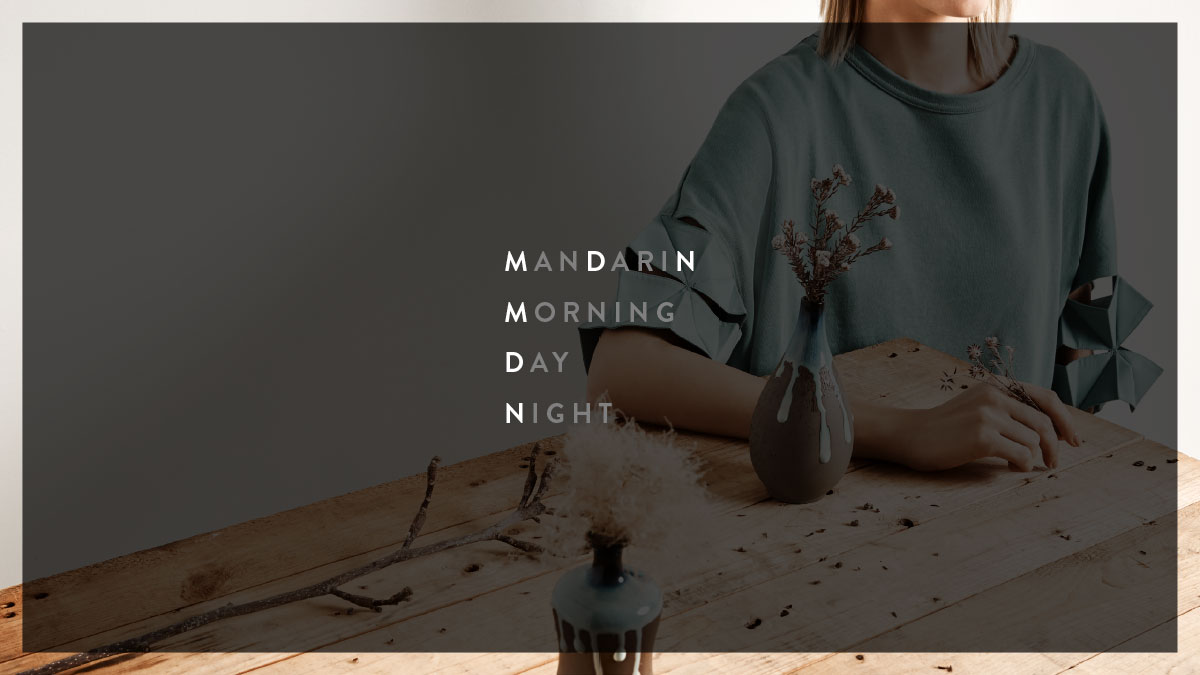
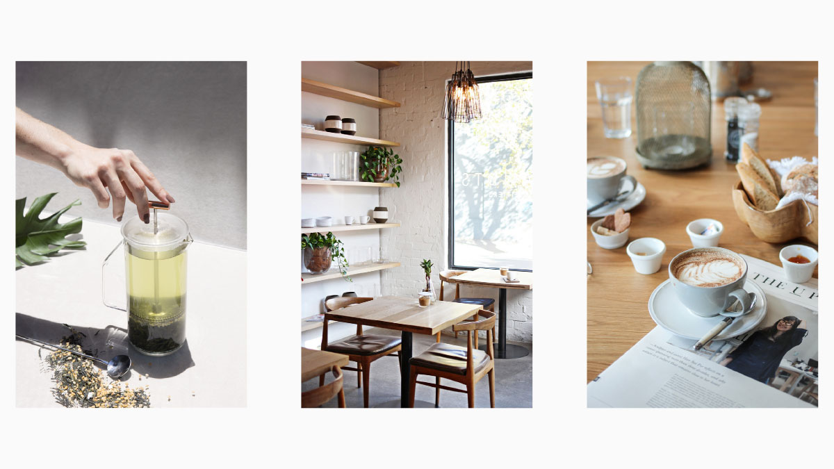
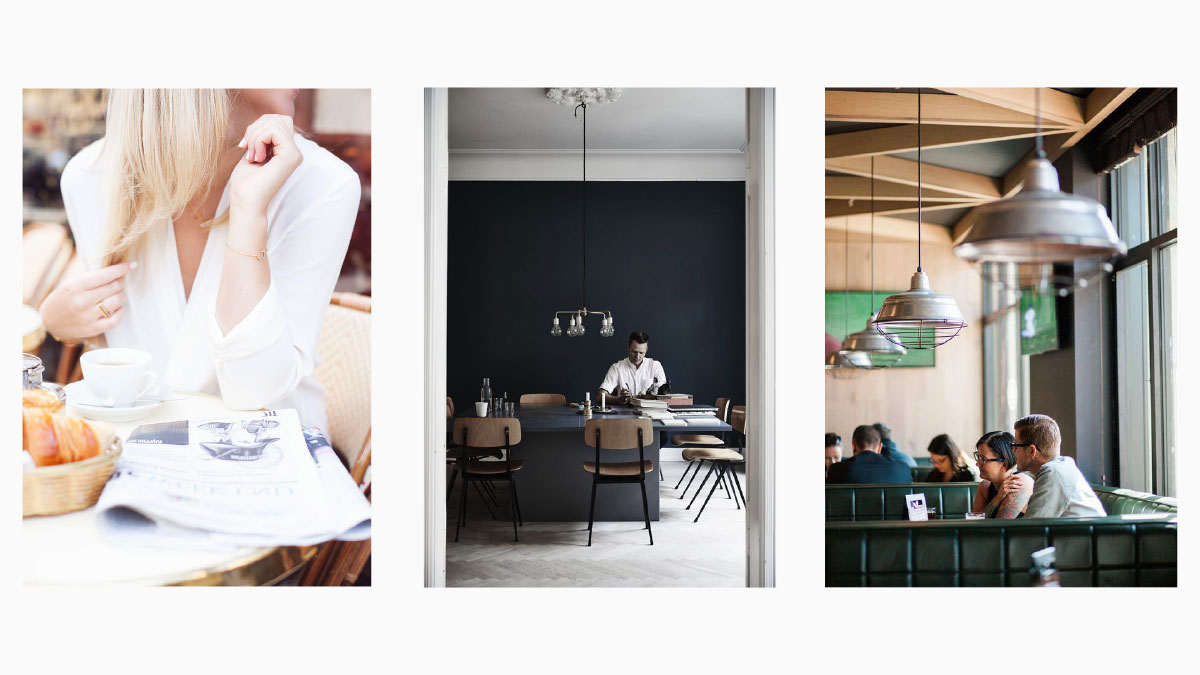
Concept #3: MOOD BOARD
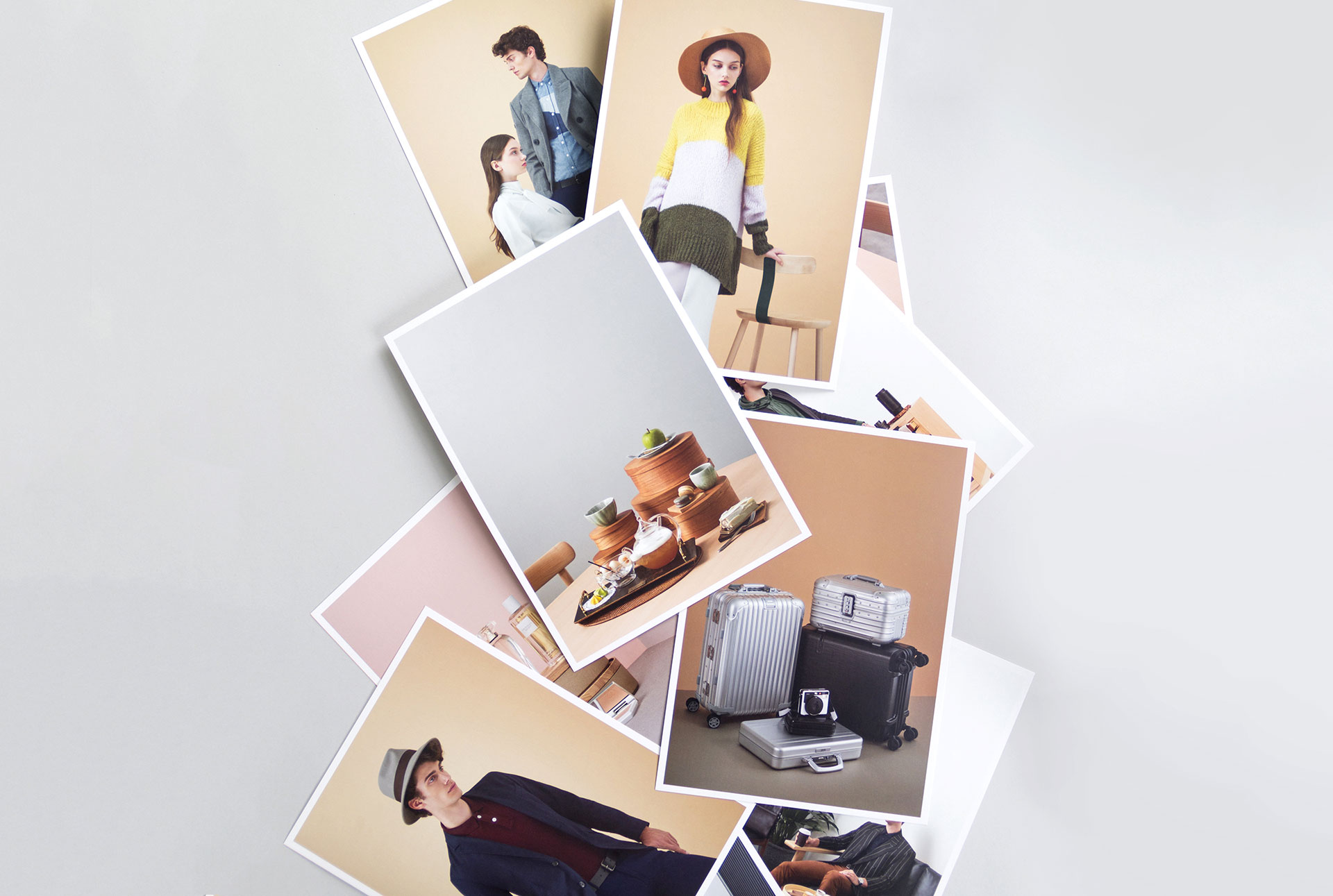
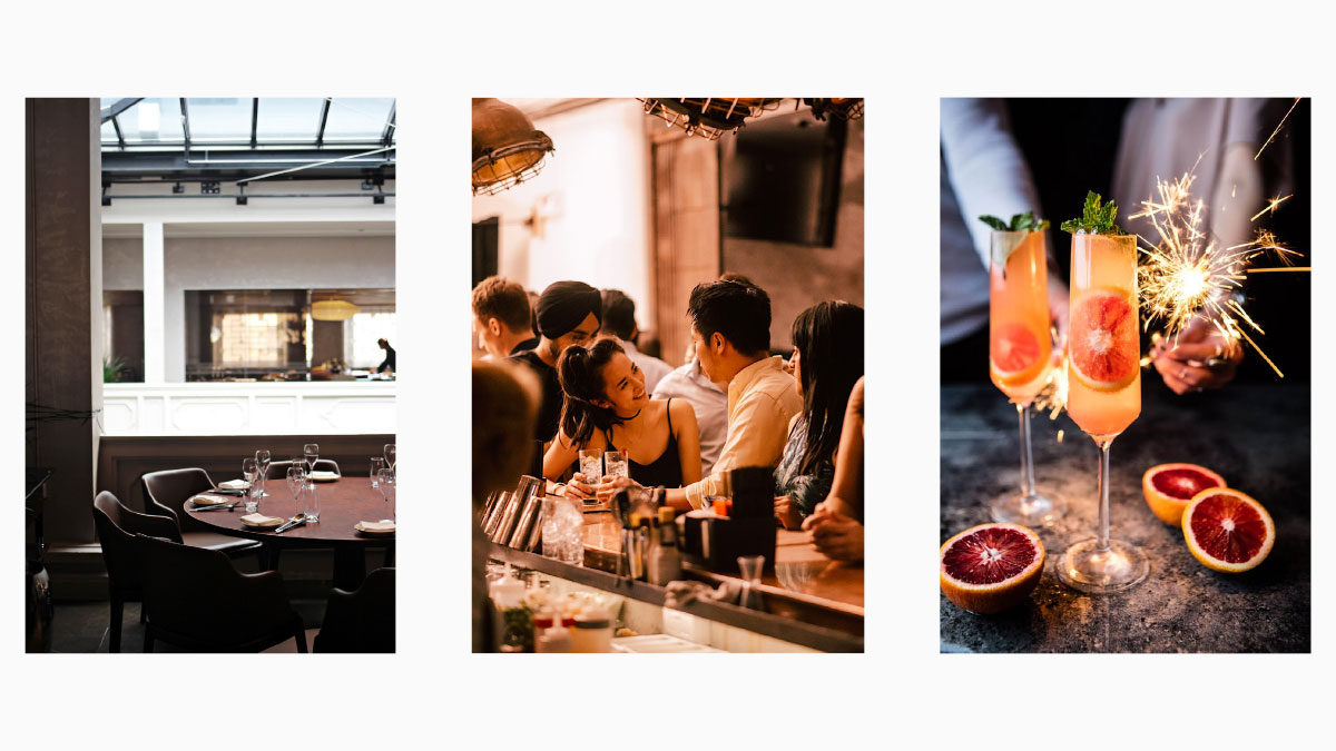
This concept is a potrayal of coming and goings in Mandarin Gallery, scenes from day to night. Instead of staging a scene, moments are captured, evoking a sense of familarity. It aims to welcome and engage the audience into the scene. People can also take inspiration of these photographed moments and relive them when they come to Mandarin Gallery.
As Mandarin Gallery is a retail outlet, the thought of how buyers receive packages from online e-commerce sites came to mind. To have the direct mailers packaged in well designed envelop, aiming to surprise receivers or even encourage them to capture their moments of unboxing the item.
Execution Direction #1
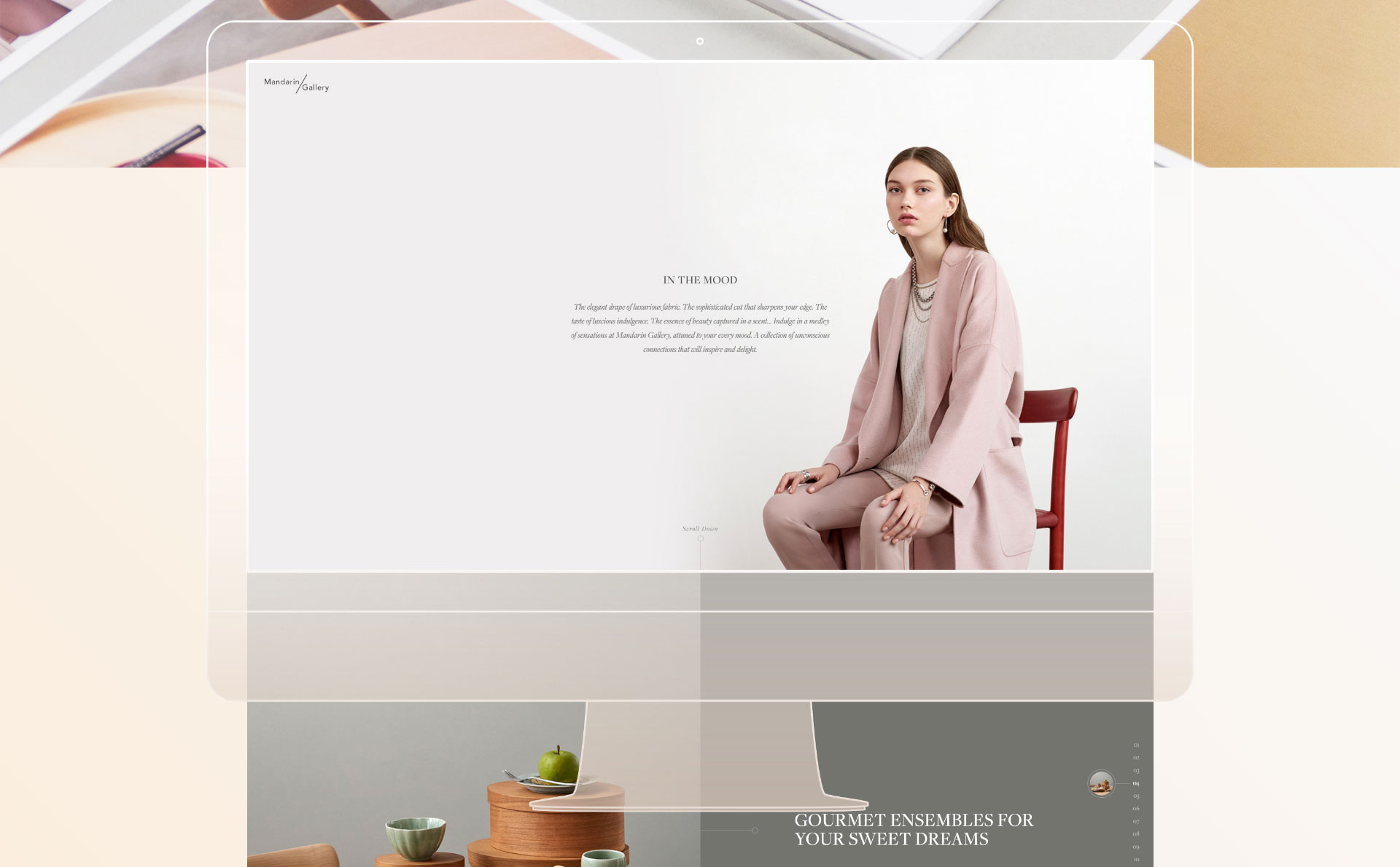
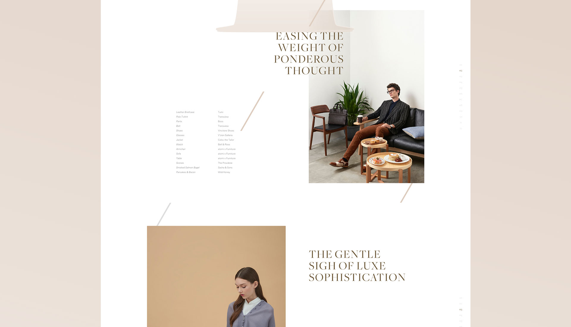
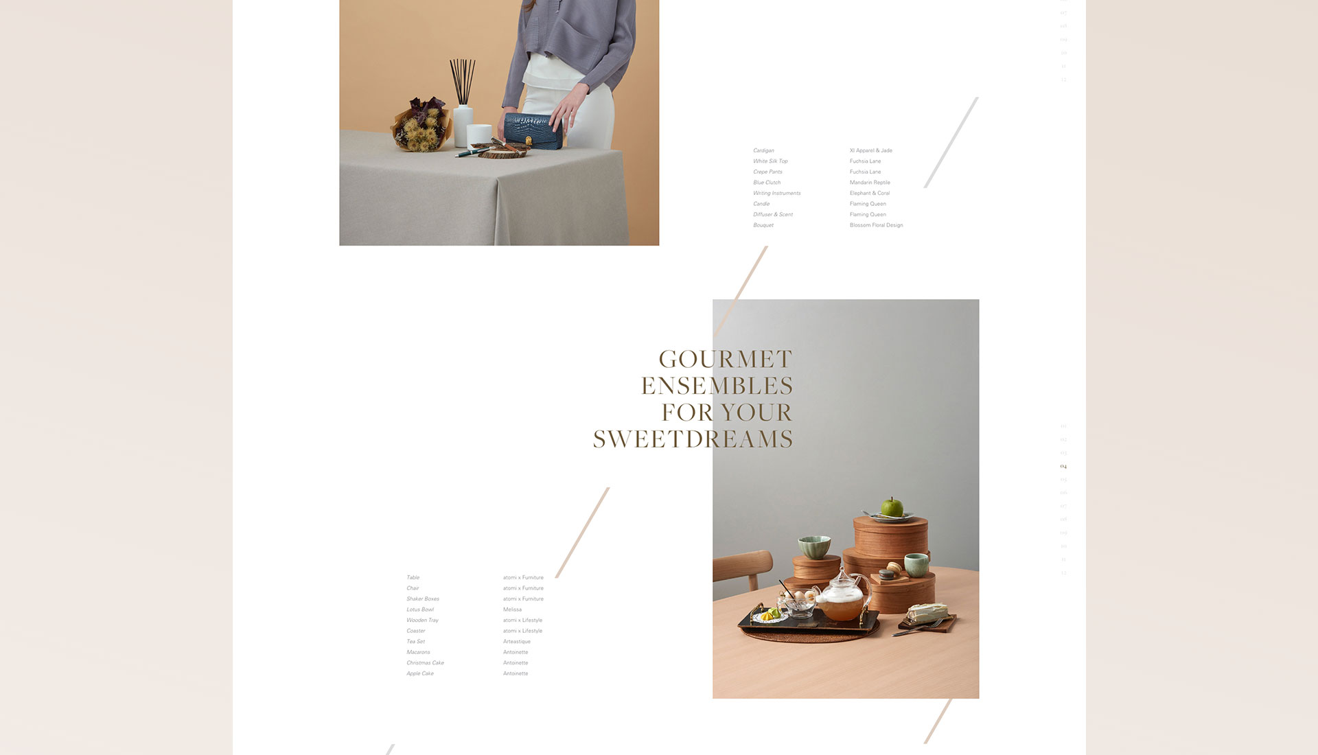
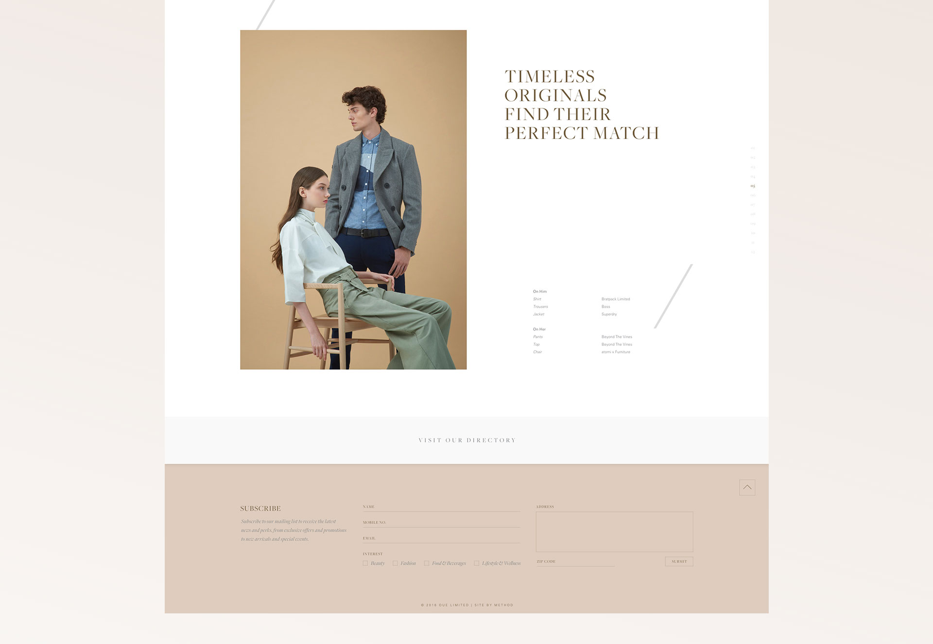
Drawing inspiration from Mandarin Gallery's logo, the slash is being utilized throughout; leading the eye towards the content, additionally serving as a design element. The direction maintains the clean minimal look with generous breathing space allowing the visuals itself to standout as individual portraits without compromising the height and width. Parallex effect is also the star of this direction, so as to give depth for the website as you scroll.
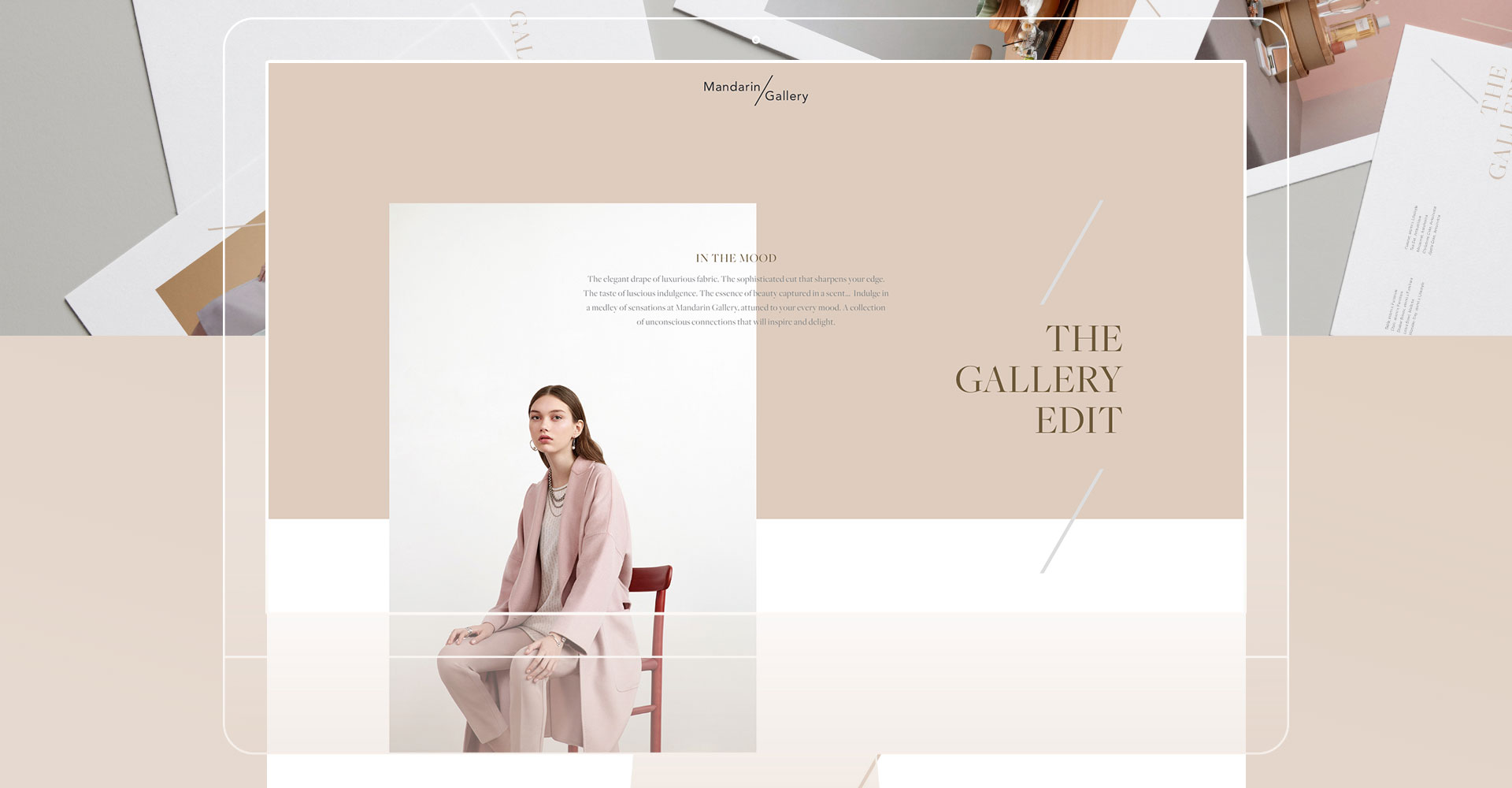
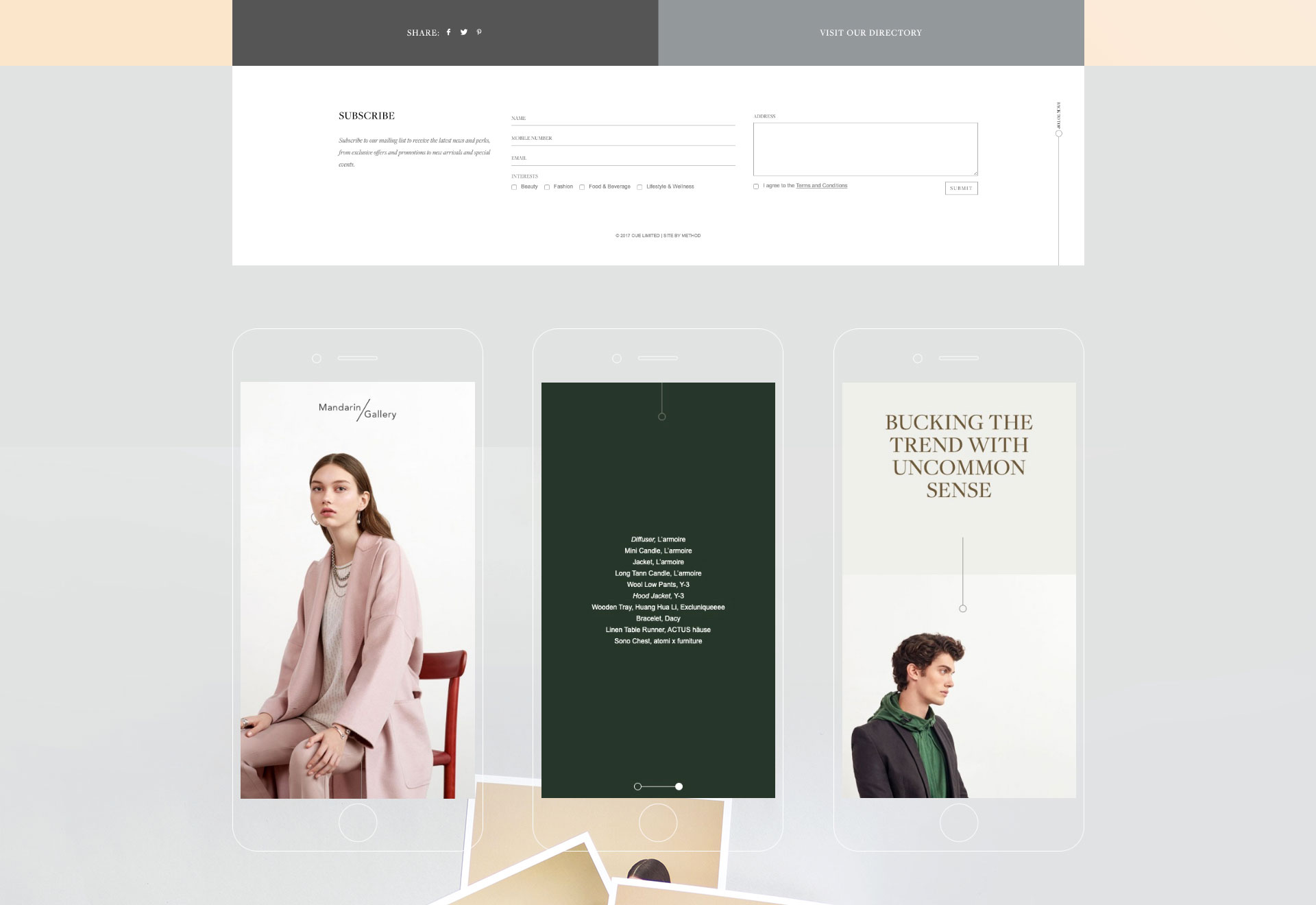
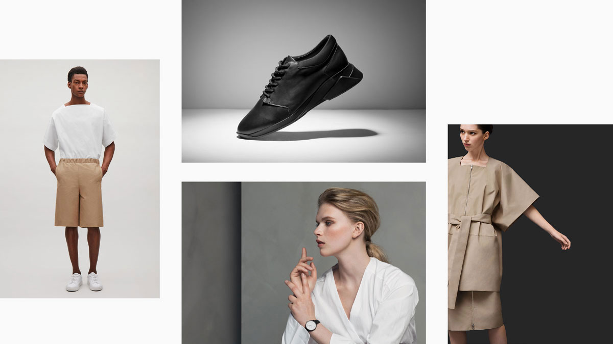
Execution Direction #2 (Client's Choice)
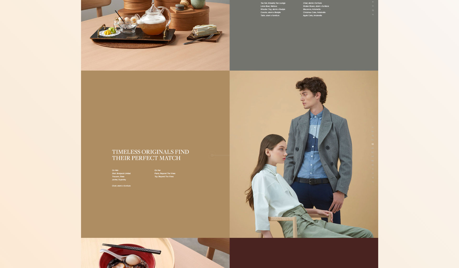
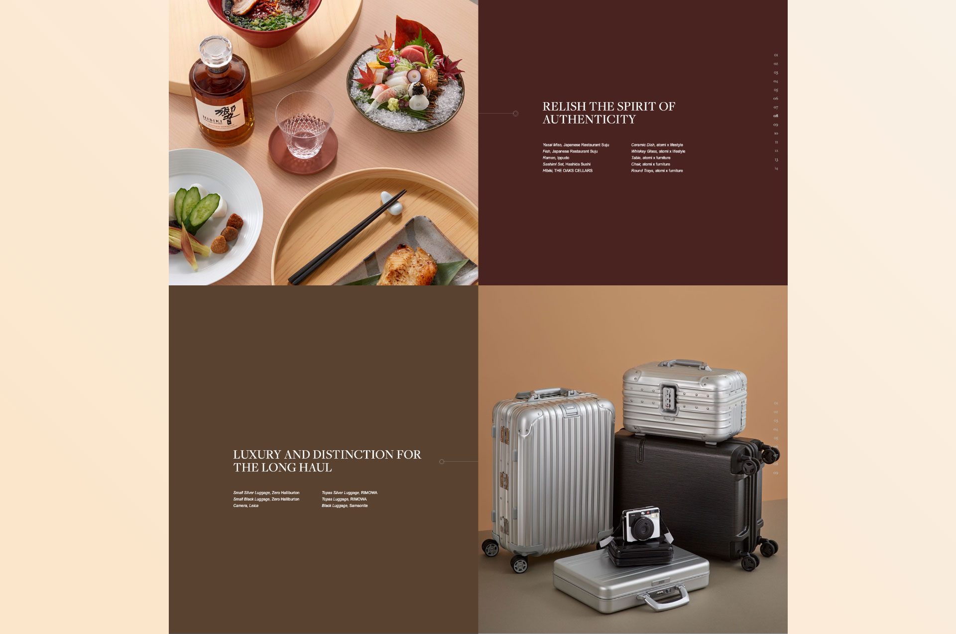
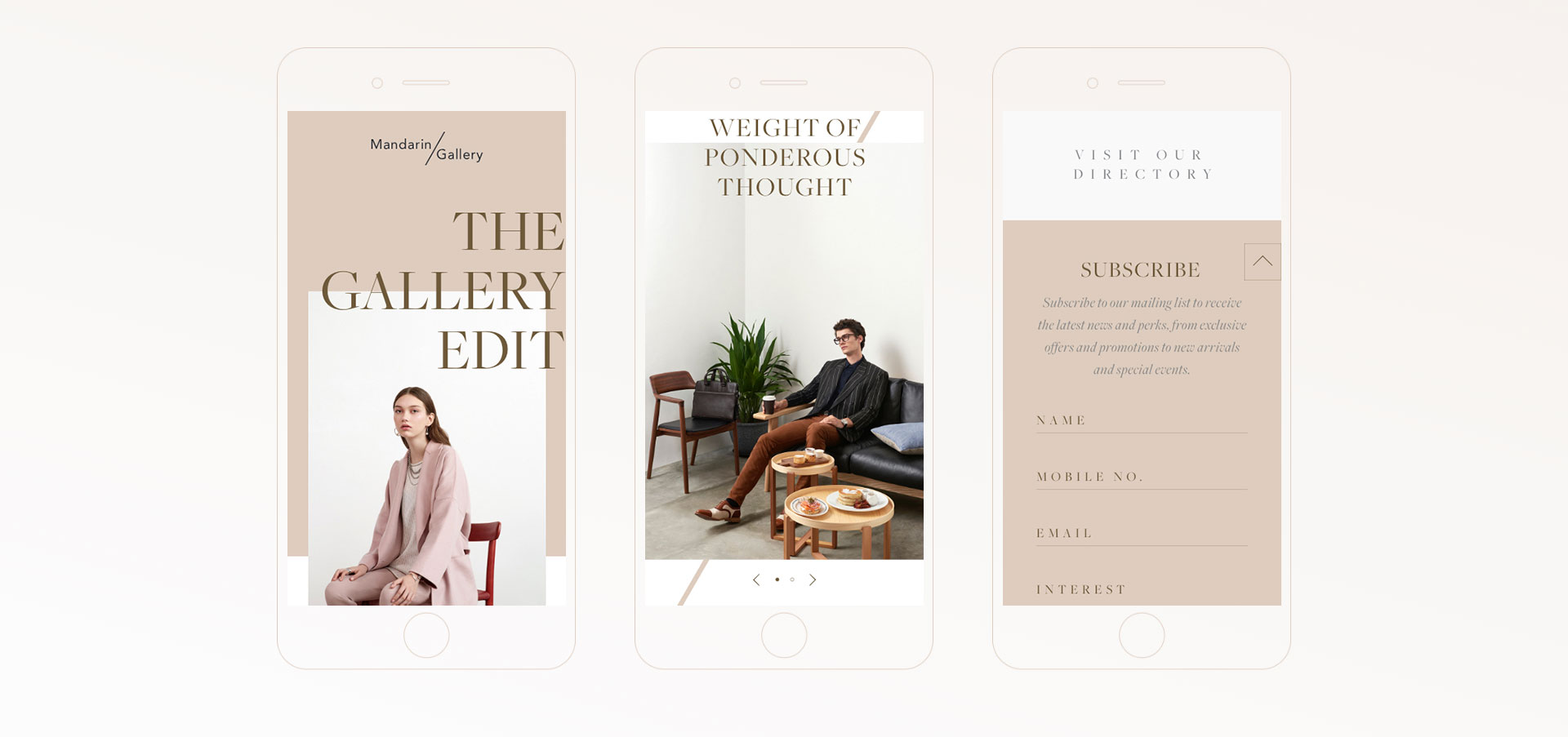
Given the rise of social media, the train of thought follows the idea of Instagram / Instastory. The catalogue follows a curiously curated earthy palette, like a flipped page on desktop as you scroll. The fully bleeded panels gives focus to the visuals with quick cues at the side, with teasers when you hover to allow quick accessibility between panels. Similarly, contents are laid out with swipable panels to add elegance on mobile.