V ON SHENTON - IN THE CENTRE OF IT ALL
Concept, Art Direction, UI / UX Design, Content Population, Project Management
Visit Website
The Brief
Set in the rejuvenated heart of the financial district, V on Shenton boasts a stunning architecture designed by world-famous UNStudio. However, the existing site did not do that justice with a limited "flash" site and a color palette of greys and pinkish maroons. As the development is due to re-launch with designer interiors and penthouse set to be on sale, it is important to captivate existing investors and attract new buyers. Additionally, one of the most asked or confused matter was the usage of the alphabet 'V' as the overall brand name.
Challenge
- Contents on the existing site is limited and highlights more of its history than the property itself.
- As the surrounding neighborhood has seen drastic changes, contents in the brochure are deemed outdated or not refined.
- V on Shenton's branding has always been diluted and does not fit what the property represents.
Gaps & Opportunities
- Give V on Shenton's website a brand new look that compliments its towering structure.
- Making use of its location; a bustling CBD, as a unique selling point.
- Highlight designer interiors and penthouse for sale.
- Identifying the 'V' as a roman character for '5' so as to be better translated.
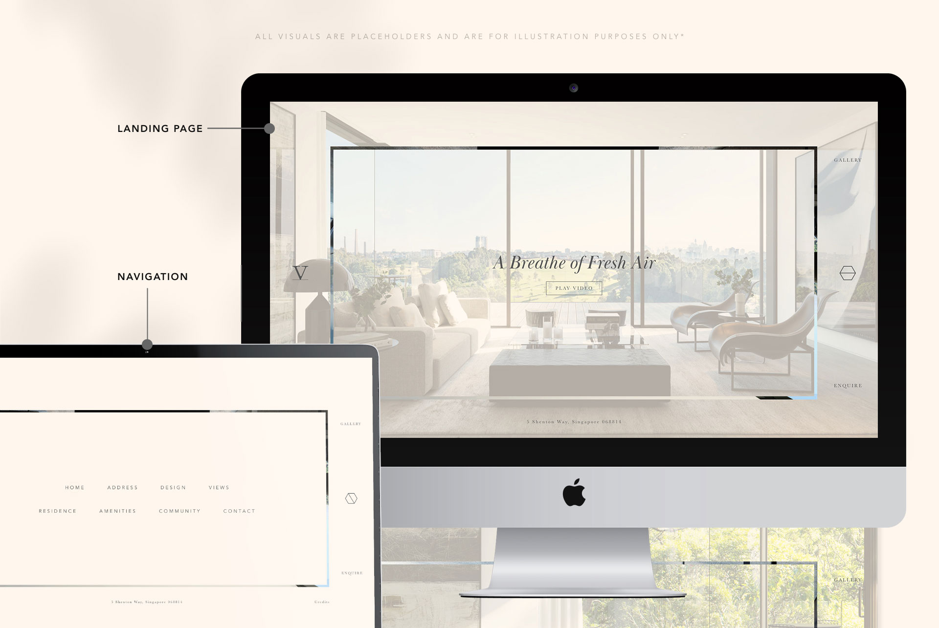
The Solution #1: Masculine (Client's choice)
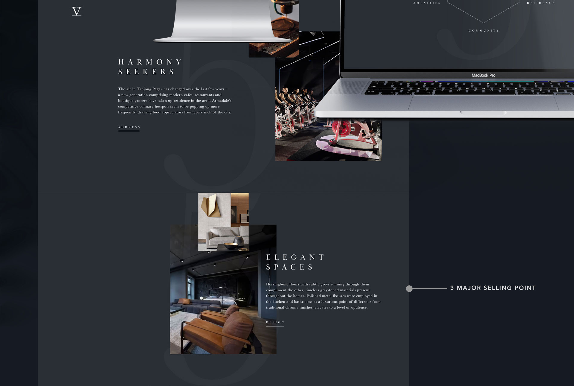
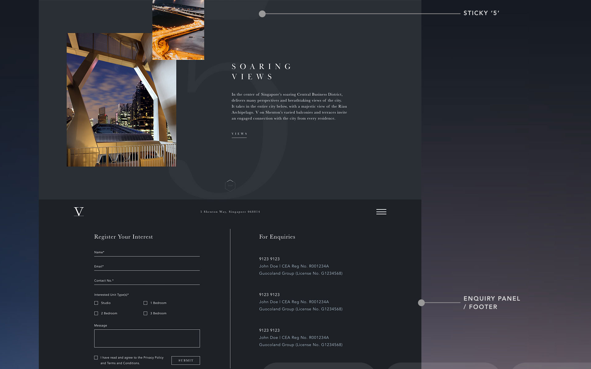
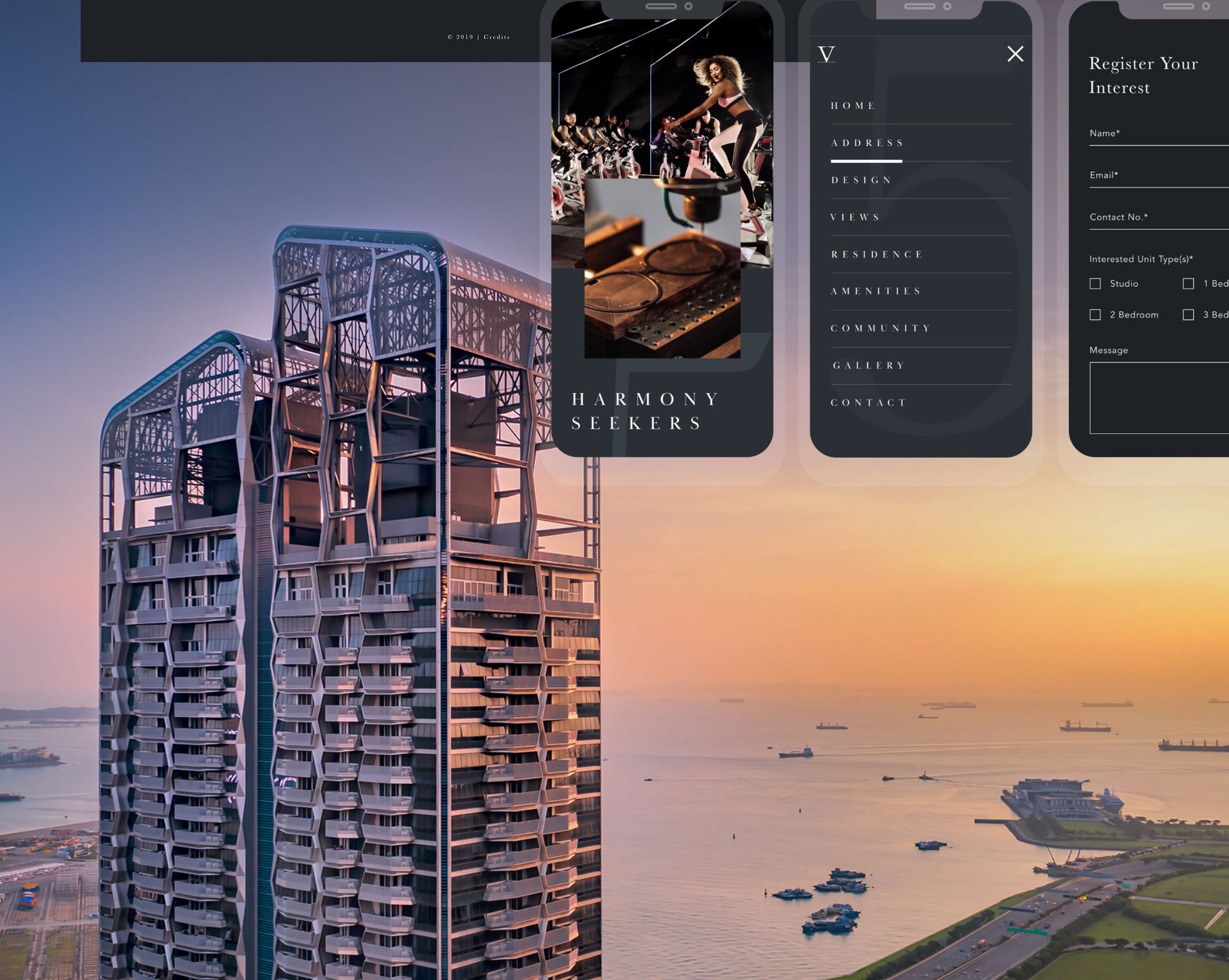
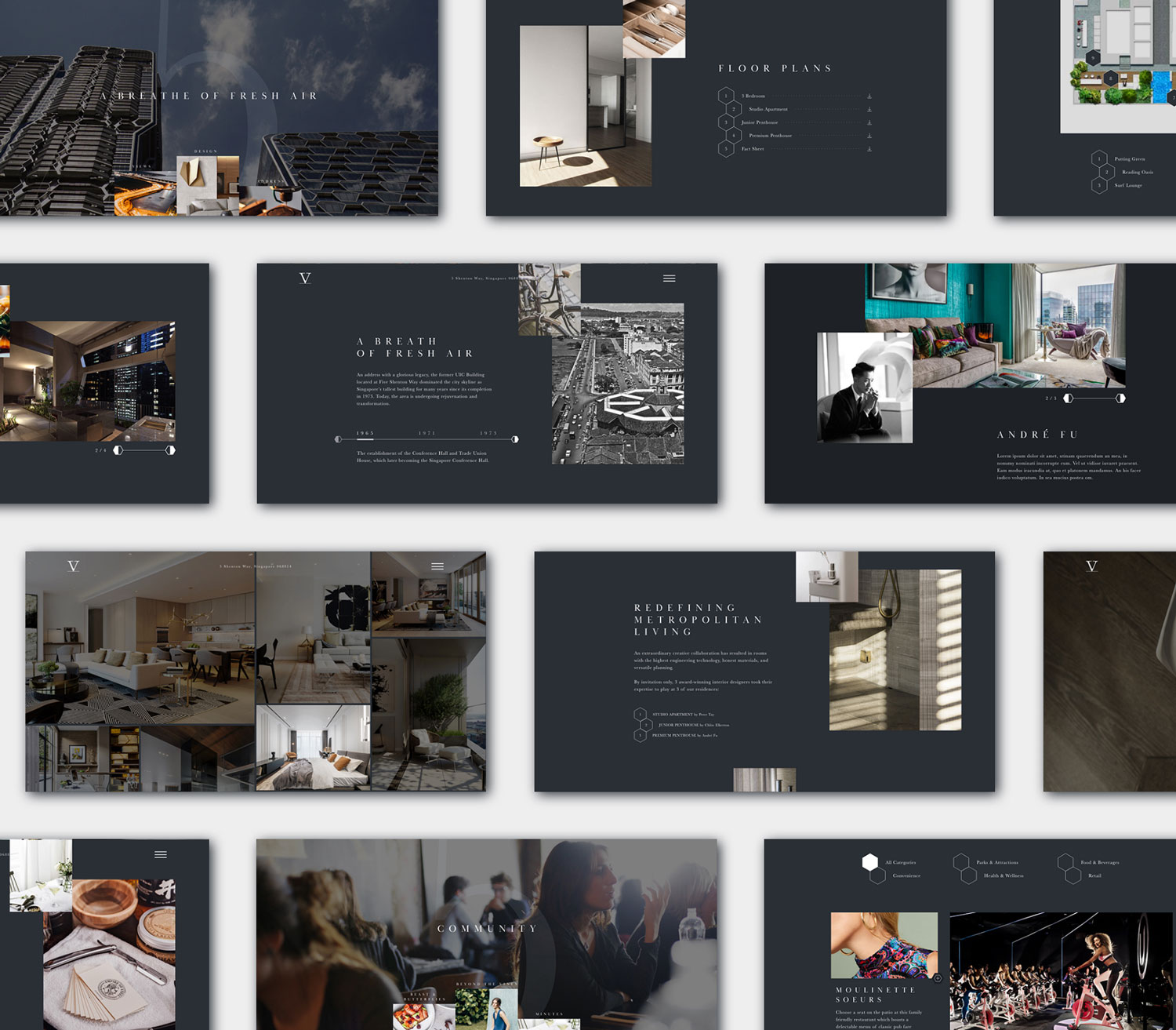
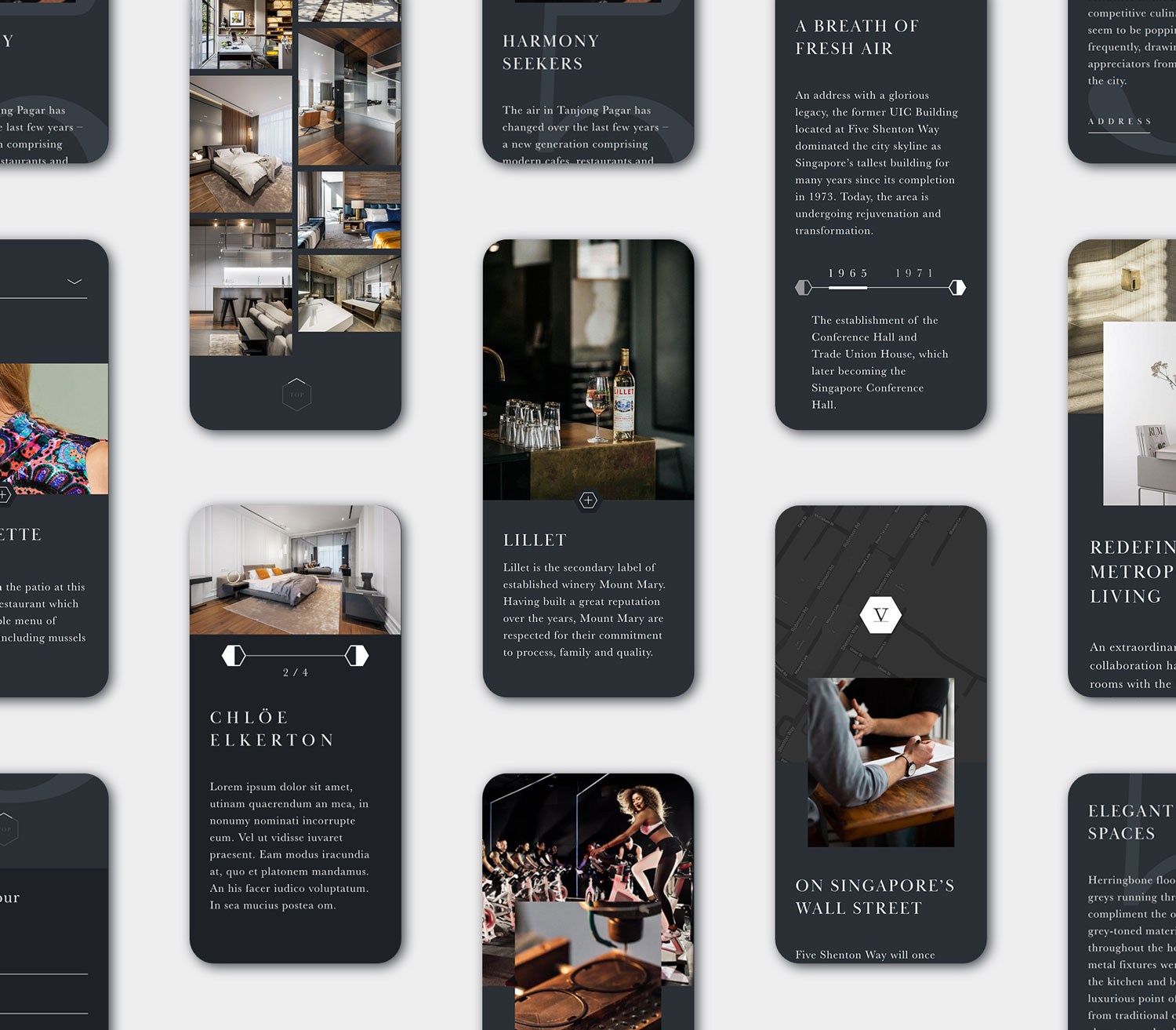
Having been onsite to this towering structure that breathes steel, this direction strips off the monotonous grey with deep dark navy to fit its masculine outlook. Starting from the Homepage, flaunts a dynamic flow in hopes to compel interest as visitor scrolls, leaving them with a good first impression. The site maintains a dual dimension comprising of parallex effects creating a sense of depth accompanied by curated juxtapositions. Elements of the honeycomb façade is peppered throughout the site with interactive hexagonal buttons and full-page navigation. Addressing the issue on property's name, a sticky address with overlaying presence of the number '5' translates the 'V' as a roman digit of the property's name.
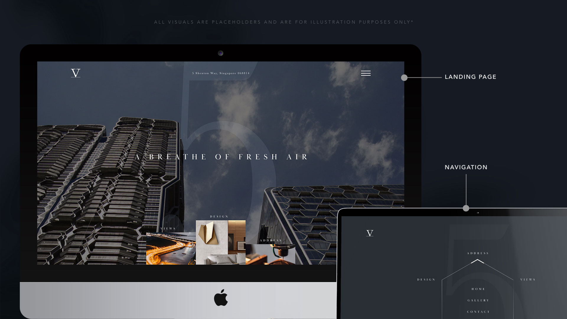
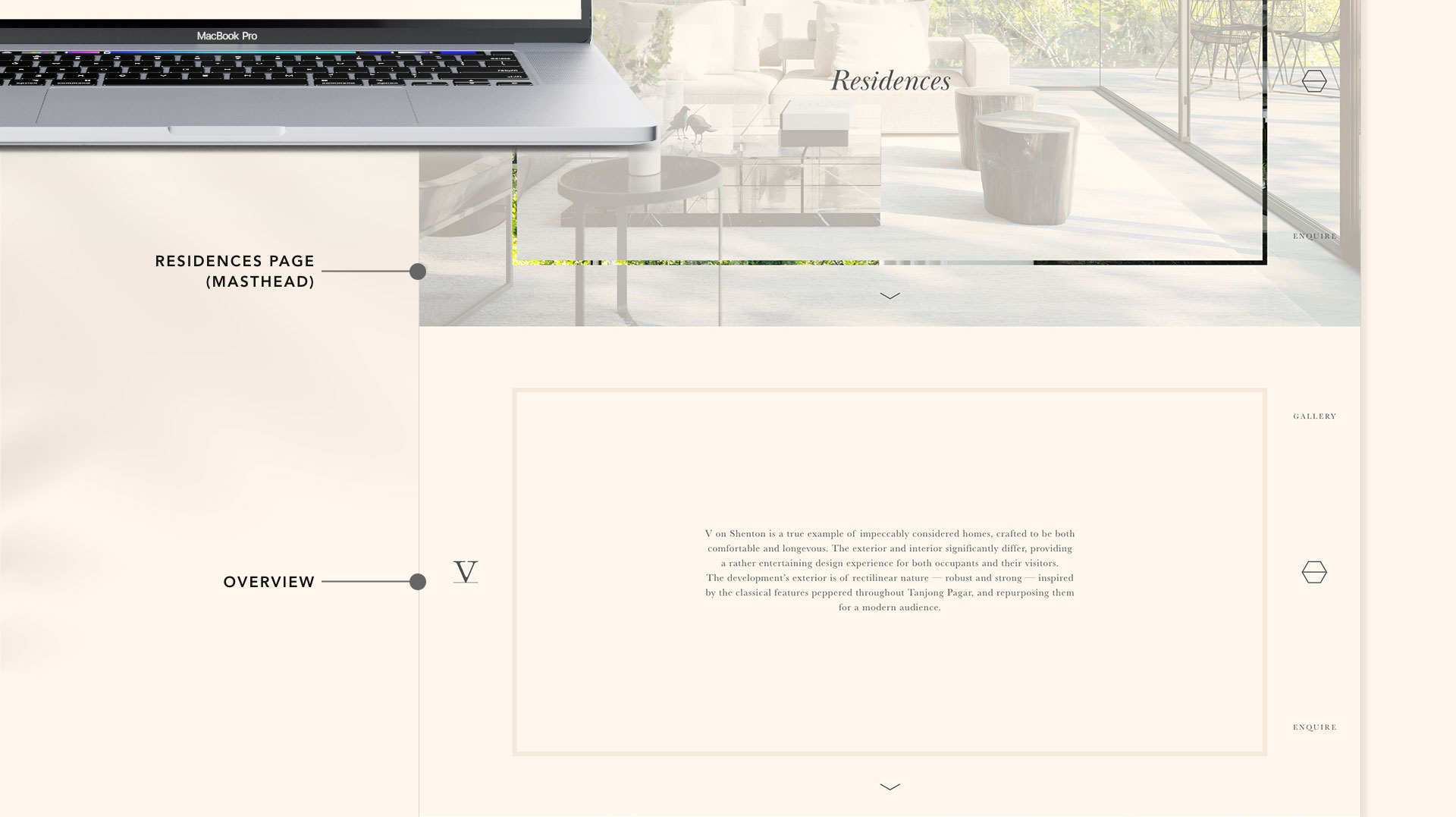
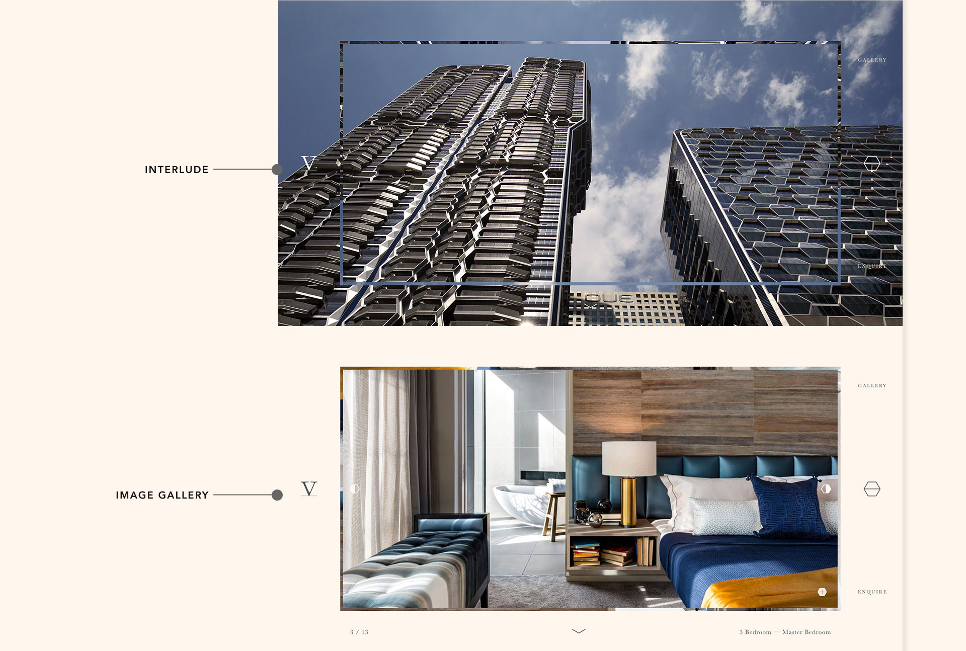
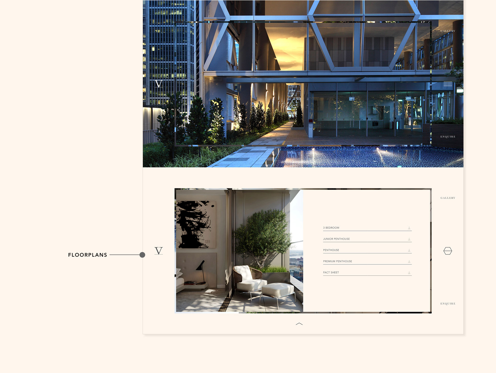
Scalability & Consistency
Carrying on the consistency, the wall of every page is painted with the same navy blue, with the numeric ‘5’ at the background. Elements of the honeycomb / hexagon are being utilized as toggles or bullet points. On carousels, the hexagon mimics an ‘hourglass’ effect as you click through. Visuals fall into place reflecting the same parallax effect as well.
Design and layouts are simplified depending on devices. From user data analysis, most visitors are visiting from a mobile phone hence great emphasis is given to mobile screens. Animations are mostly stripped away on devices and layouts are kept minimal while elements of the brand still remain intact.
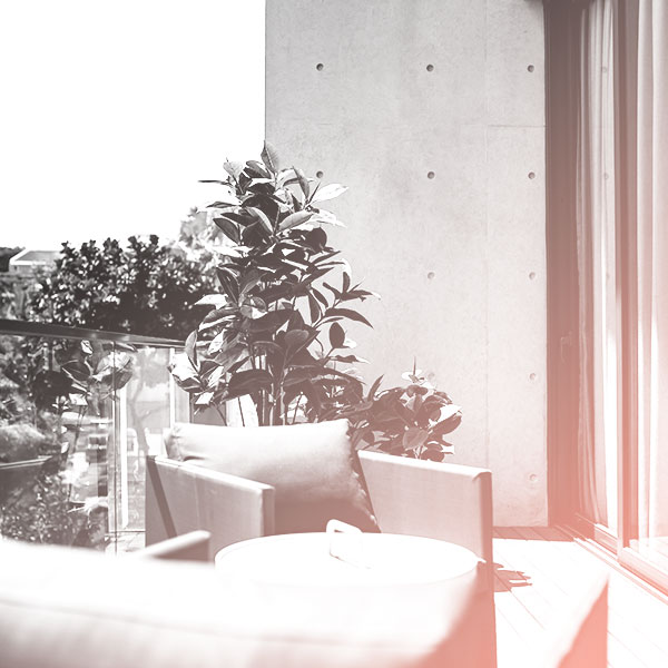
The Solution #2: Feminine
The interiors of V on Shenton were of a more warm and calm color palette with luxury furnishes and trims. This direction focuses more of its interiors with neutral tones and homely visuals with borrowed inspirations of Haute Couture. It is elevated with aspects of strong bold tailoring and construction to bring out the high-quality, expensive and luxurious spaces.