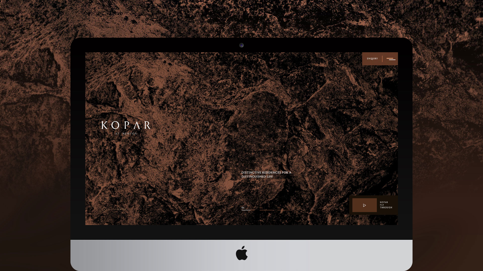
KOPAR AT NEWTON - PURE ELEMENTAL ESSENTIAL
Concept, Art Direction, UI / UX Design, Content Population, Project Management
Visit Website
The Situation
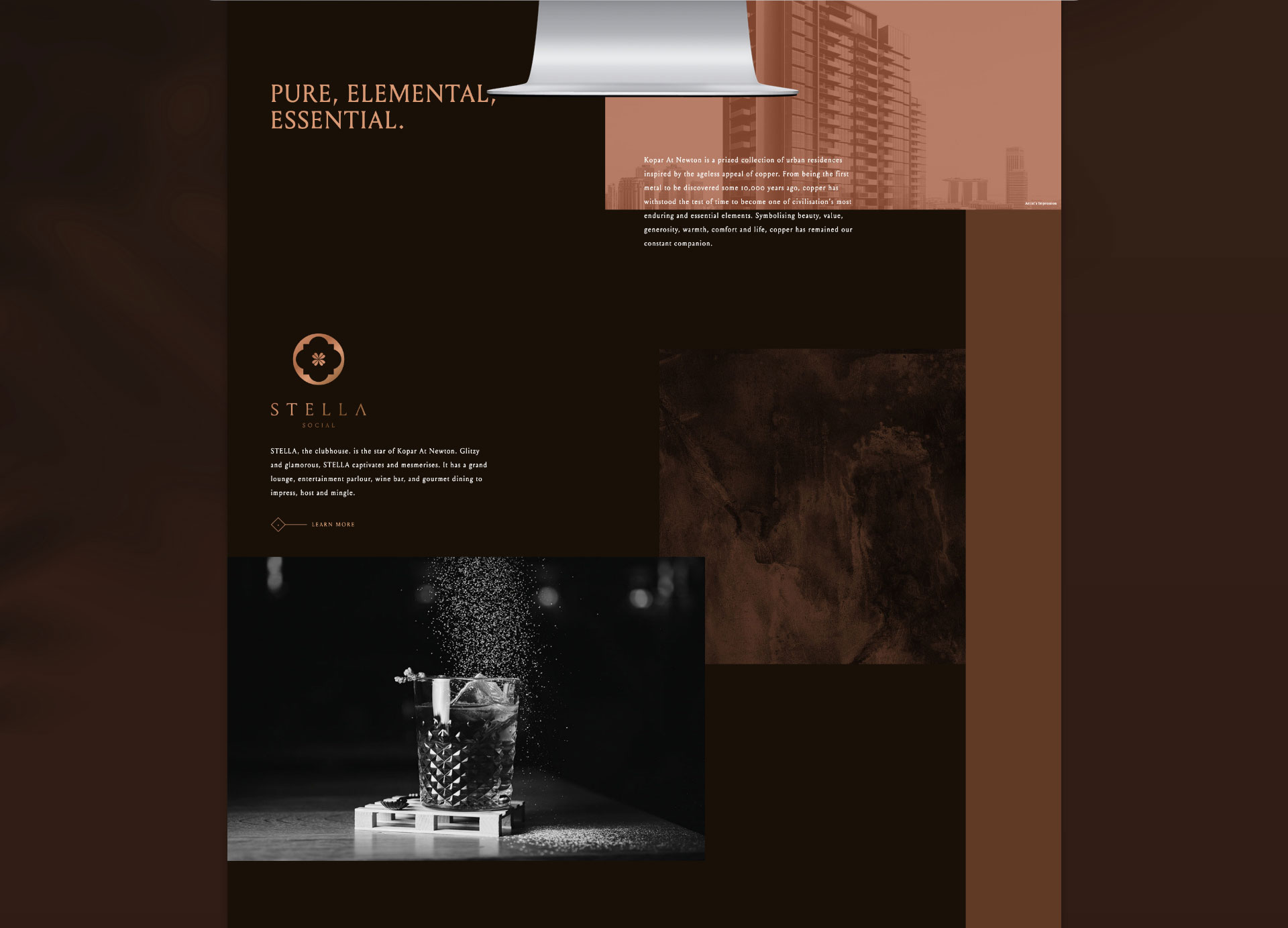
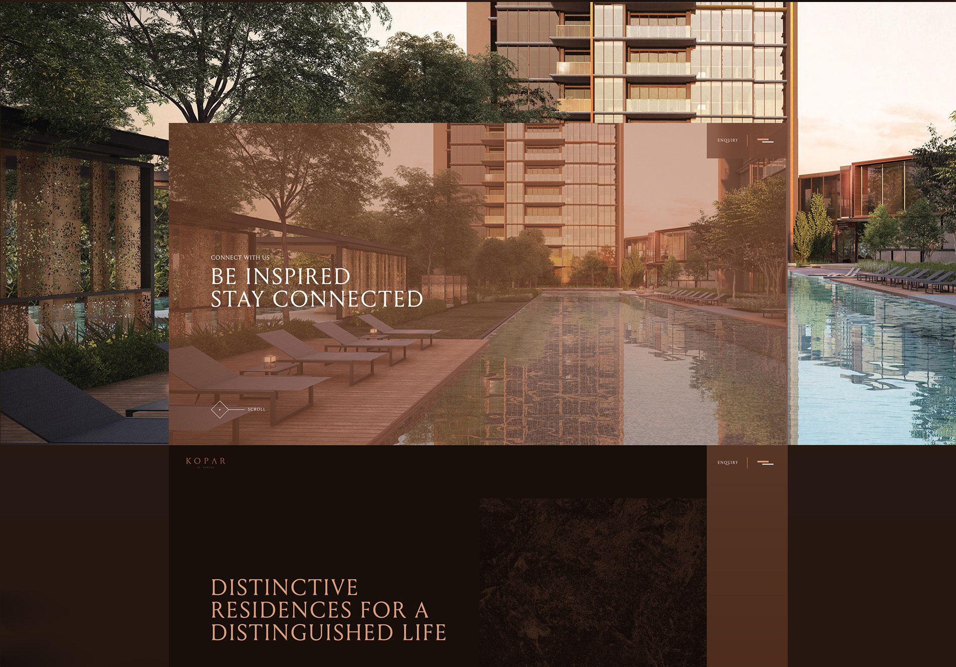
KOPAR (Icelandic for Copper), pronounced as ‘Copper’, is a new luxury development inspired by the architecture of the building which takes reference from the rich and lustrous appeal of the red metal itself. In many ways, the story of copper is the story of civilisation; it was the first metal to be drawn from rock, it has been forged into money and it runs in our blood. All in all, it has withstood the test of time to become one of humankind’s most enduring and essential elements. The material, symbolises beauty, value, generosity, warmth, comfort and life, copper has remained our constant companion.
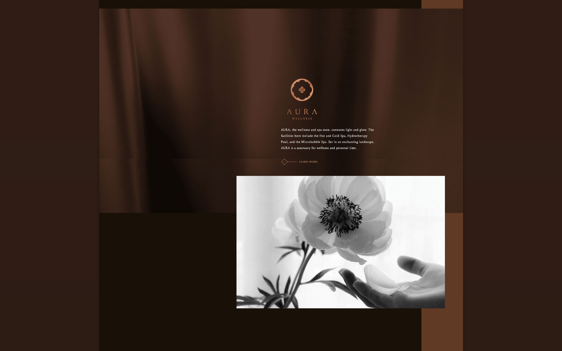
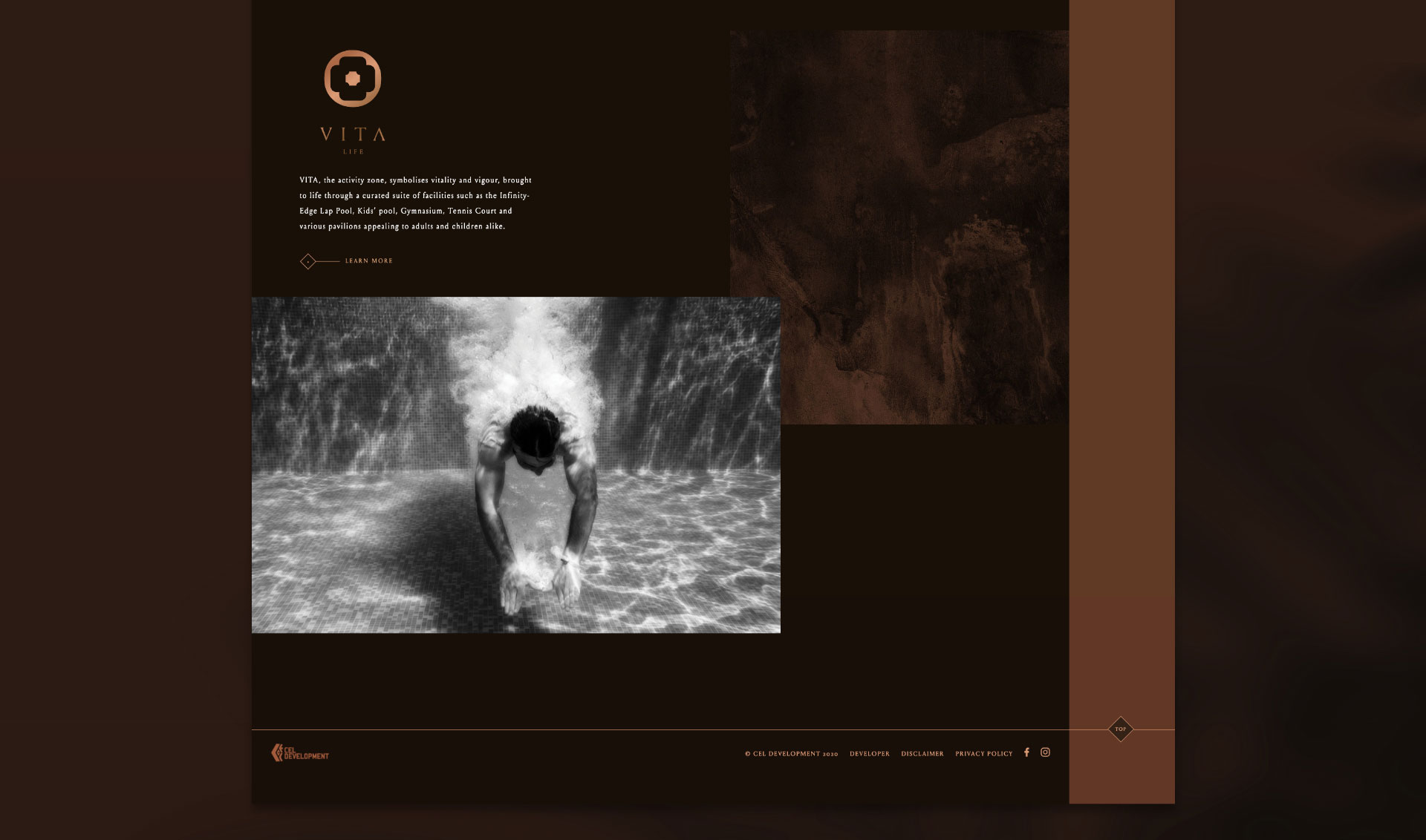
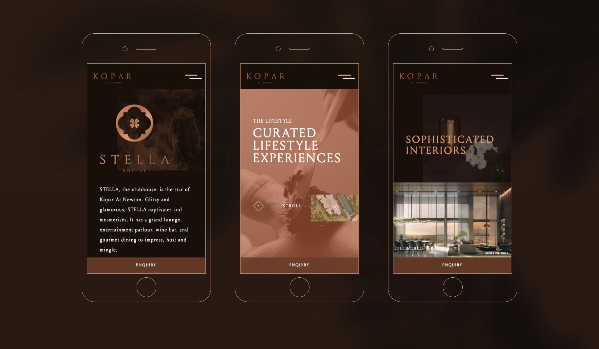
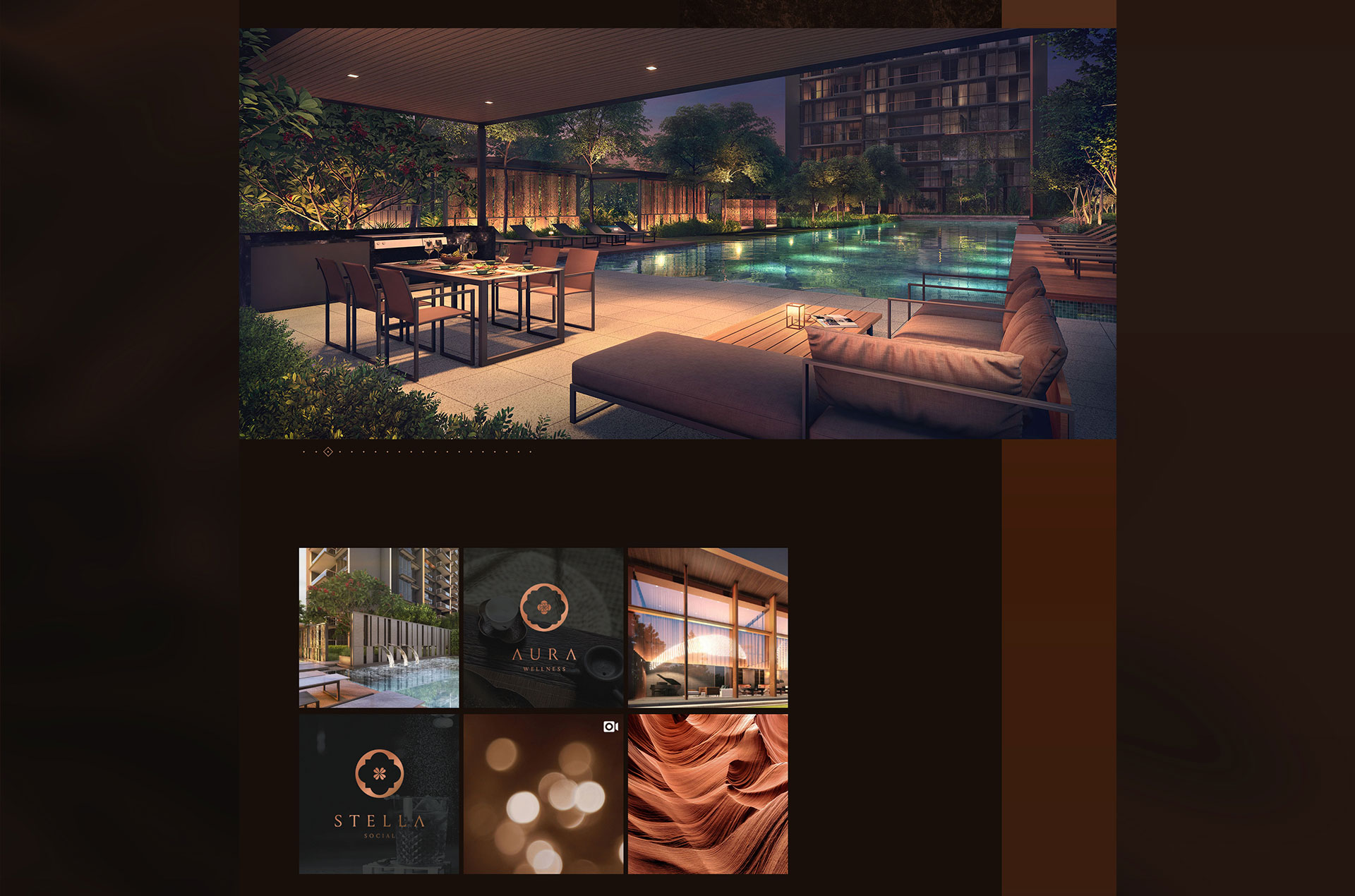
Separately, KOPAR crowns itself as a luxury hospitality residence which boast a grandeur of amenties divided into 3 distinctive characteristics. First, STELLA meaning star, features open spaces specially dedicated to group activities, where the community relaxes and hangs out. Next, AURA; connoting light, or glow - a sanctuary for wellness and personal time. Lastly, VITA - which connotes vitality and vigour, brought to life through a curated suite of facilities like kids pavillions and pools.
The Solution
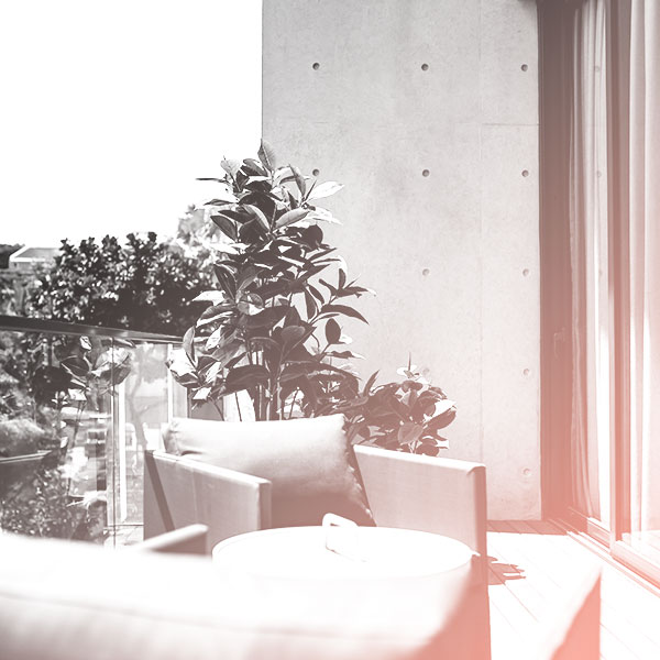
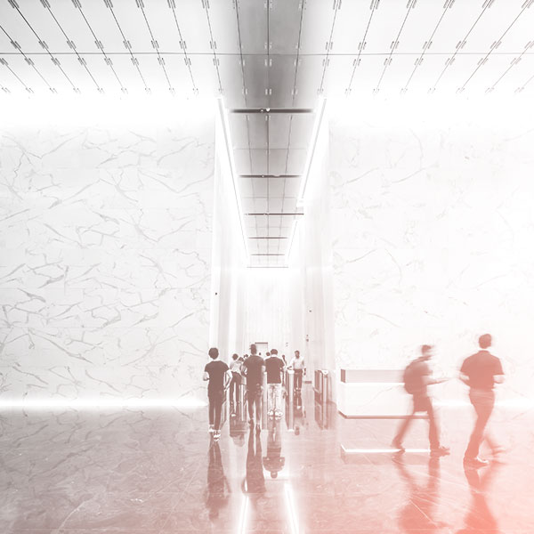
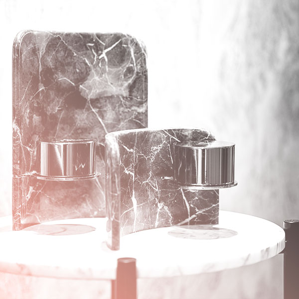
The shade of copper takes overall design direction, with copper trims visible wherever possible. One of the biggest challenge was to present the 3 distinct brands of KOPAR's amenities, yet not allow them to overwrite the property's overall branding. After a brief tease on the Homepage leading to a dedicated Lifestyle page housing these 3 distinct brands, audience is presented with a a vertical storyline with full-bleed visual breakpoints in between instead of the usual column or "powerpoint" representation.
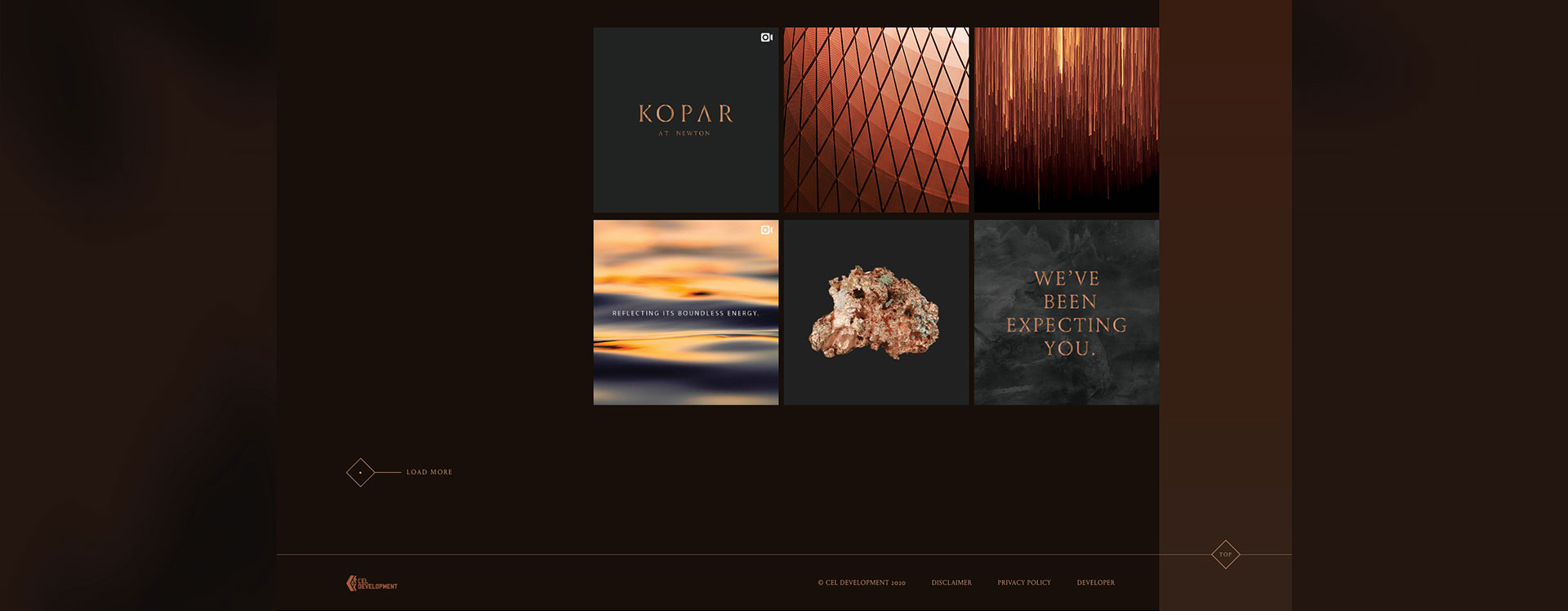
Instead of plastering the site with just carousels of "product shots", renderings are also accentuated alongside black & white images, textures etc. These montage of imagery creates a string of narratives to better portray the property in depth. A perculiar feature, I would like to emphasize, is the usage of moving graphics for the navigation. This page, a very important page yet often overlooked, features sparks or bokeh depicting the flares and heightens how this first metal was drawn from rock and forged into money.