LIFE WITH DYSLEXIA - A DIFFERENCE
NOT A DISABILITY
Research, Creative and Art Direction, UI / UX Design, Project Management
TABLE OF CONTENTS
- Introduction: The Initiative
- Understanding Dylexia Through Research
- Problem Statement & Solution
- Scenario Oriented Interactions
- Design Rationale
- Areas to Improve
THE INITIATIVE
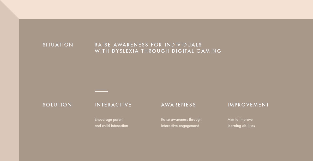
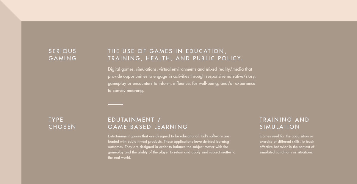
As part of my Final Year Project in pursuing my degree at NTU School of Art, Design and Media (major in Interactive Media), my teammate and I took the initiative to raise awareness for individuals with Dyslexia through digital gaming. This challenge rose from several touchpoints in our early research:
- Playing video games help Dyslexic children read better. Read More
- In the context of Singapore, reports show that one in ten students or 10% of the overall population suffer from Dyslexia.
- There may be occurrence of social stigma which can greatly affect the confidence and learning development of Dyslexic children.
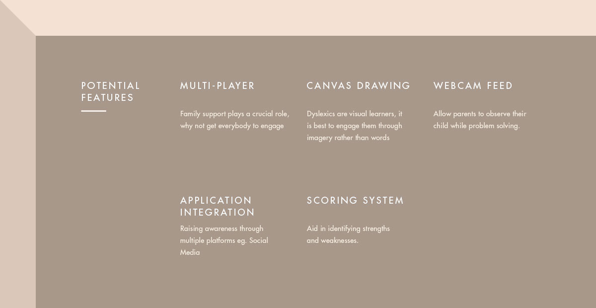
- Family support plays a very crucial role in aiding individuals facing challenges due to their condition.
Roles
For this project, my primary role is the UI/UX Designer while my partner is the Front and Back-end Developer.
Initial Thought / Ideation
UNDERSTANDING DYSLEXIA
Assumptions
- Dyslexia is a disability and it can be overcomed.
- Parents often neglect their children therefore result in them developing poor learning skills.
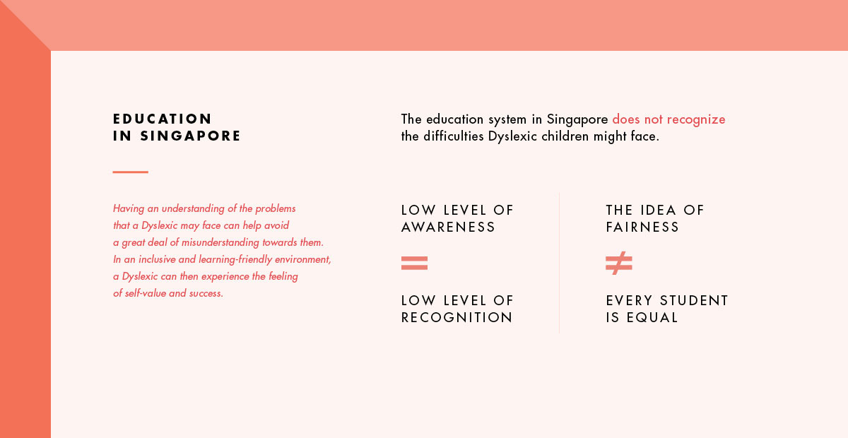
- The education system in Singapore is fair to every child, including Dyslexic children.
Questions
- What is Dyslexia and what causes it?
- A concerned parent of a Dyslexic child wants to help but maybe they do not know how?
- What can the education system improve on to help Dyslexic children?
Overview on Dyslexia
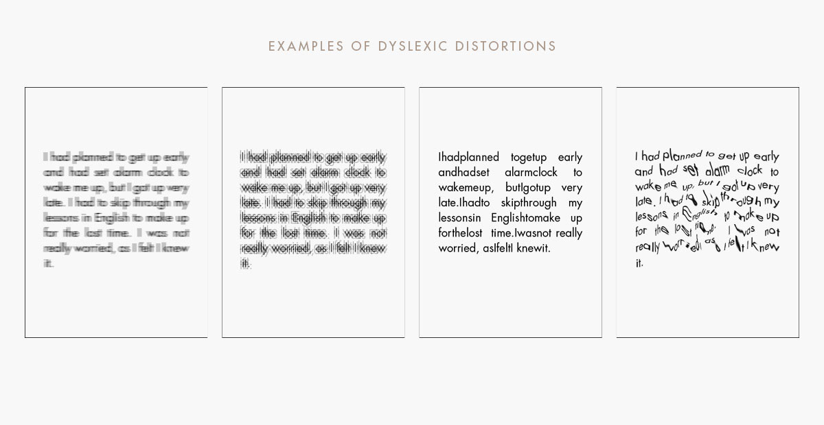
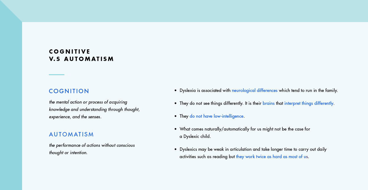
- Dyslexia is not the result of neurological damage, but the product of neurological development. It is cause by the dysfunction of neural systems in the left brain which are known to participate in the normal acquisition and achievement of reading and other related cognitive functions.
- Dyslexia is a unique mindset that is often gifted and productive but learns differently than other minds.
- Dyslexia affects nearly 10% of the population and is by far the most common learning disability.
Interviews (Qualitative Research)
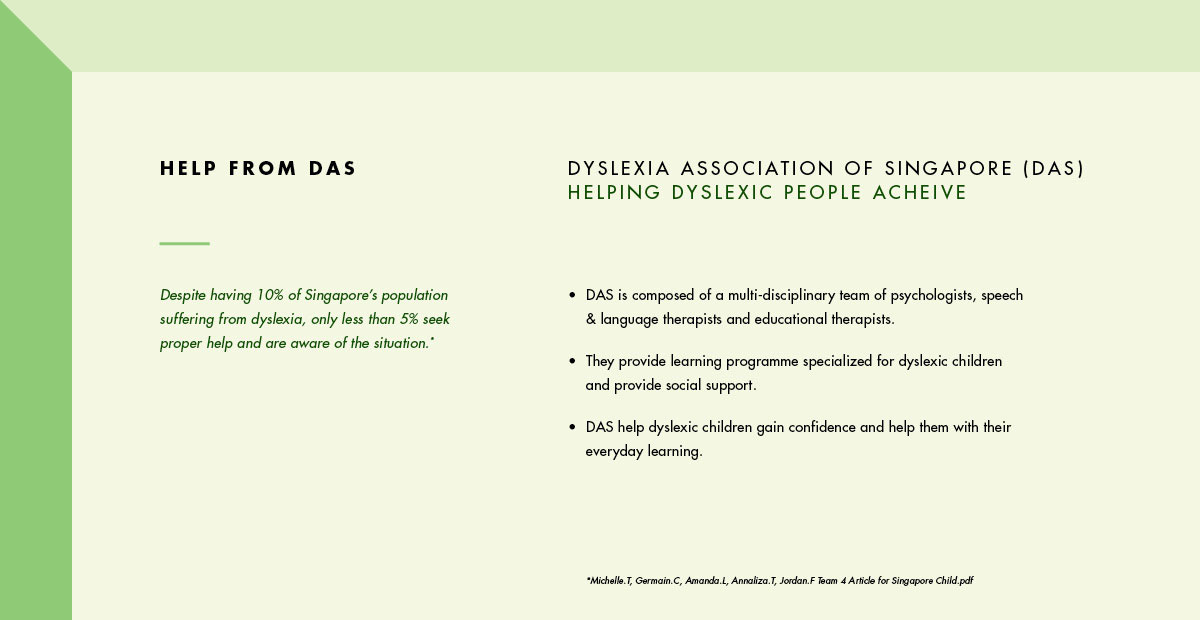
We had the oppotunity to talk with a few Dyslexic individual as well as a professional. Deborah Hewes, Head of Publicity and Publications, from Dyslexia Association of Singapore (Jurong Point) helped us understand the daily struggles of a Dyslexic child and how DAS helped them learn better. From that, we brought our focus onto 4 main areas in our course of work:
Survey Analysis (Quantative Research)
We conducted a short survey with 40 people, ranging from 20 years old to 50, to understand the public’s knowledge and views about Dyslexia. Based on the survey result, 85% stated they have heard of Dyslexia while some had not heard of the term and had to search online about it. 33 out of 40 people recognised the primary characteristic of a Dyslexic - having difficulties in reading due to word reversals, repetitions etc. 12 people also recognised that Dyslexics are weak in articulation and have poorer memory thus they tend to forget instructions or information.
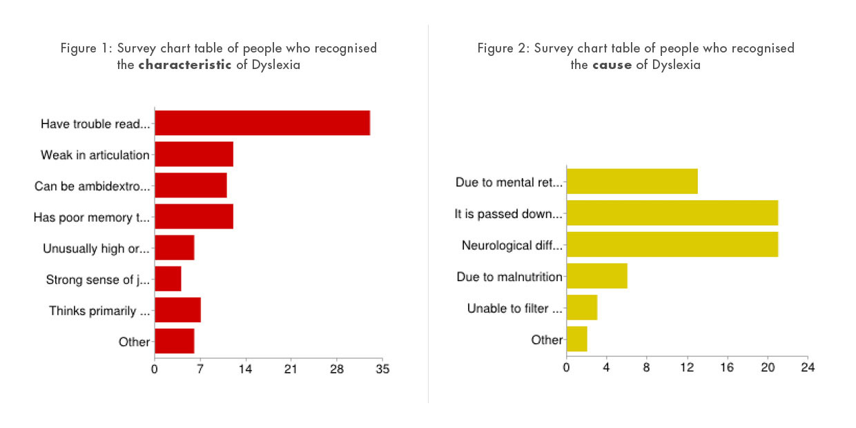
However, less than 50% knows the cause of Dyslexia. Only 32% states it is passed down by genetics and also due to neurological differences. Many others thought it was due to mental retardation and malnutrition. Most people get to know about Dyslexia through the internet, peers and education in school. The statistics from DAS show that 10% of overall population suffer from Dyslexia and from our survey result; similarly, the number of people who know someone who suffers from Dyslexia is also 10%.
Problem Statement:
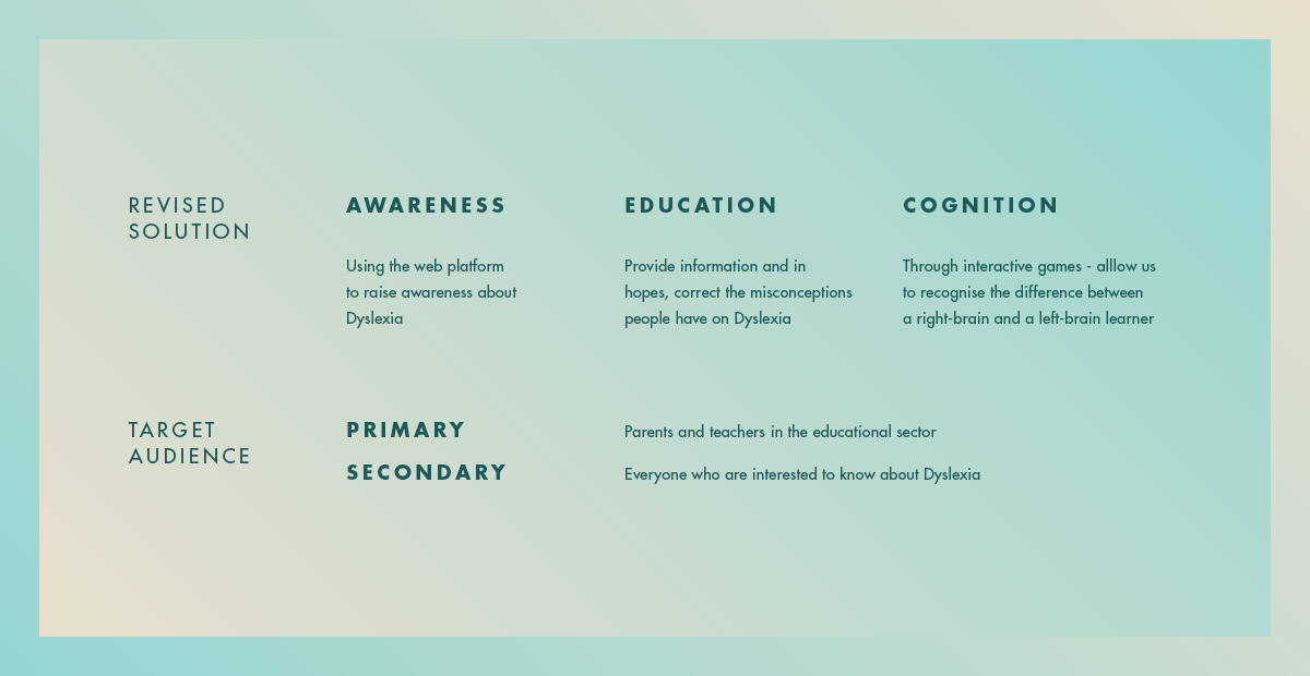
How might we raise awareness for Dyslexic children so that parents and particularly, teachers embrace their learning differences?
Scenario Oriented Interactions
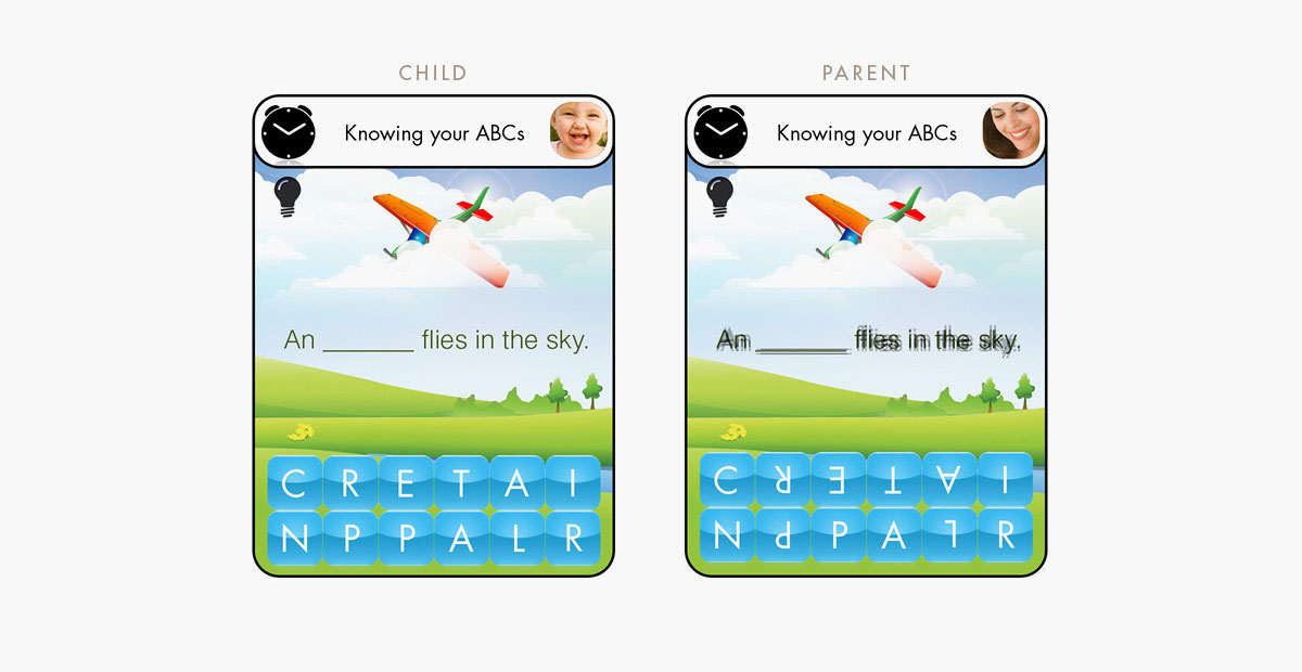
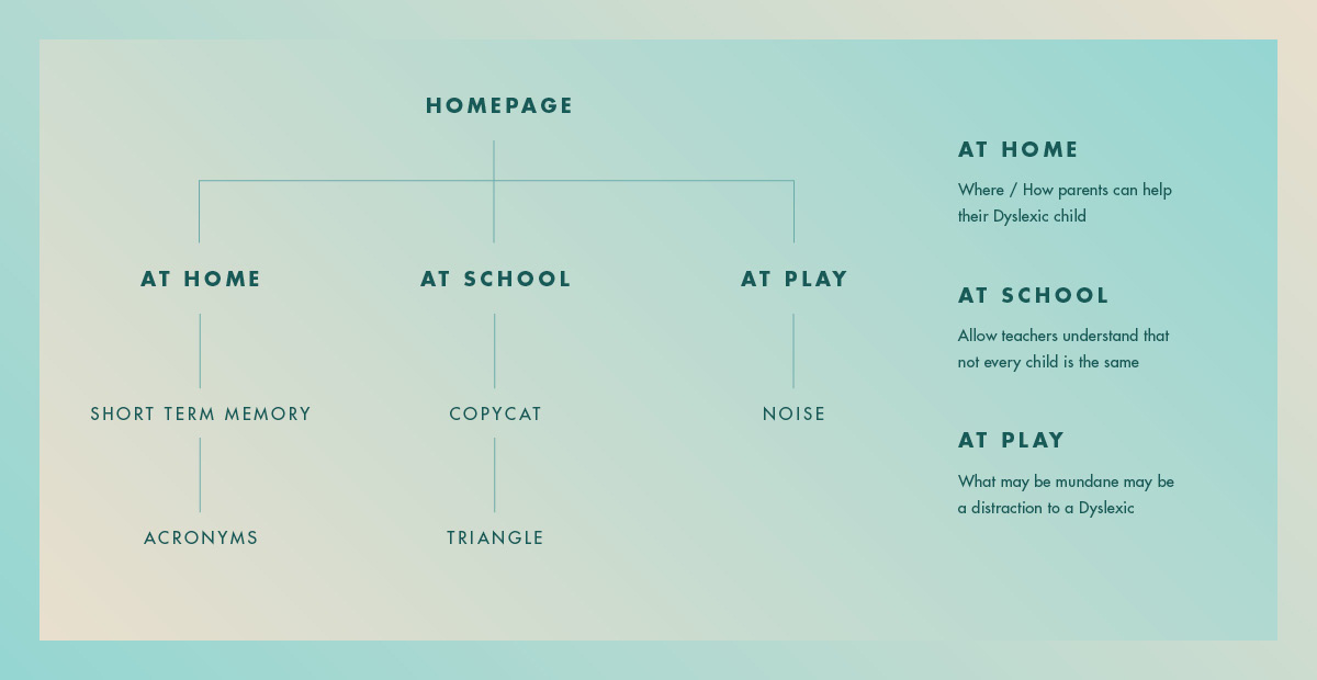
We take to 3 main areas of which a child is more commonly exposed - at home, at school and at play. At every scenario, we have incorporated mini games that allow us to recognise the differences between a right-brain and a left-brain learner. Additionally, it helps to stimulate and give an idea of what it is like to be Dyslexic.
At Home
As Dyslexia is genetically inherited, parents as well as their children undergo similar circumstances. As a parent whom went through all that pain, they are more than willing to help their children cope with the difficulties that come with being Dyslexic. Here we introduce two games that challenges the user as well as seek creative help:
-
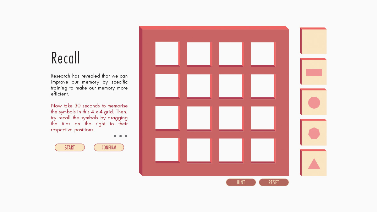
RECALL
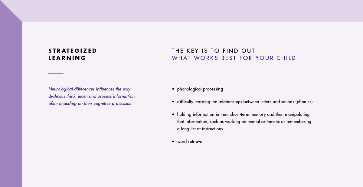
People who have Dyslexia often have memory difficulties, they tend to forget instructions, have problems learning multiplication tables, and easily lose track of what they are doing. In this game, the user faces the challenge of remembering the exact geometric shape in the exact sequence position in the short amount of time given.
Using this activity, parents can practice memory techniques with their Dyslexic child. For instance breaking the grid up into rows or columns, naming them or create a connection between boxes, all these aid in helping the child remember the sequence better. With that said, however, it is not surprising that a Dyslexic can do better than most people as the sequence involve visual cues such as shapes instead of plain text.
Explore Prototype Here (optimized for desktop only) -
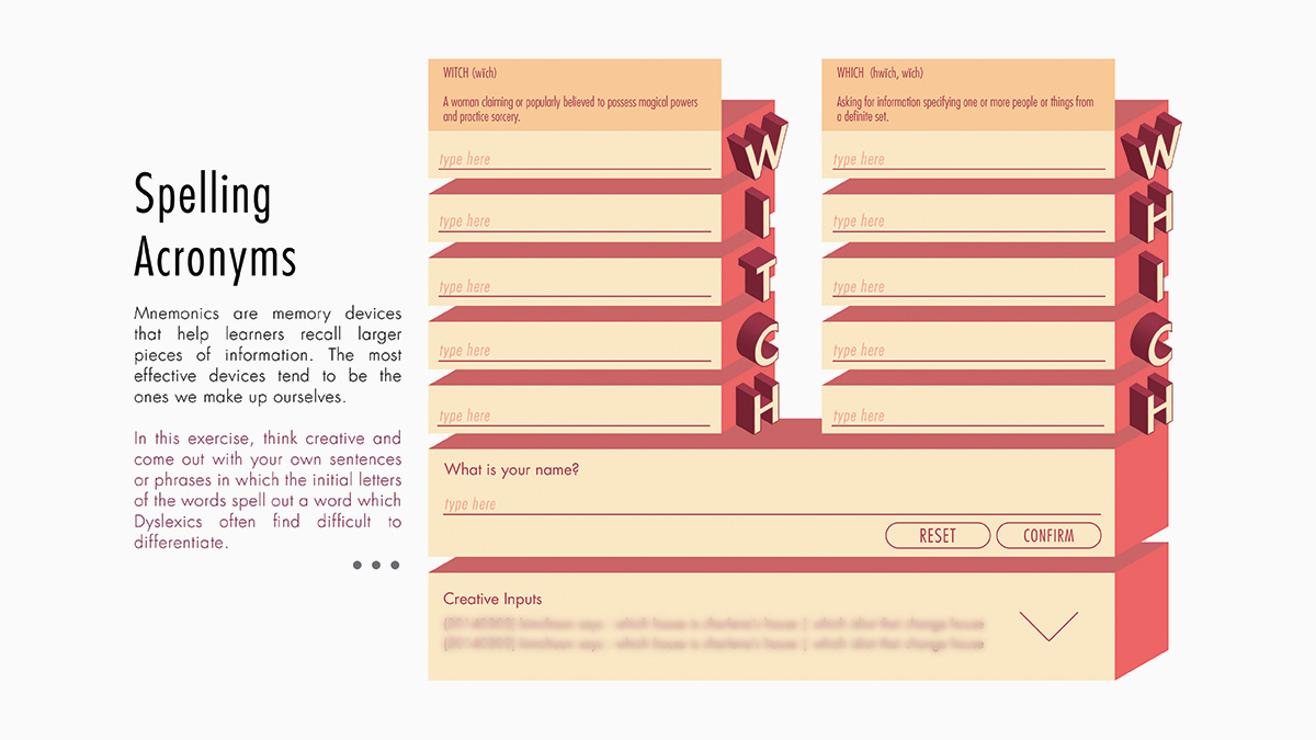
ACRONYMS
One of the more common Dyslexic problems is having low visual memory which is the ability to hold a mental image and even recall information and this may cause spelling mistakes because they cannot remember what a word looks like. Even the simplest examples such as remembering and differentiating words like “who” and “how” can be difficult for Dyslexic people.
This mini game uses a memory device such as Acronyms to help learners recall larger pieces of information. It pushes users to think creatively and come out with their own sentences that carry the meaning of the given word. One example is 'which' and 'witch' - (W)hich (H)ouse (I)s (C)harlene's (H)ouse / (W)itch (I)s (T)he (C)razy (H)ag. With a storyline and/or metaphor, this can greatly help Dyslexics remember things better.
At School
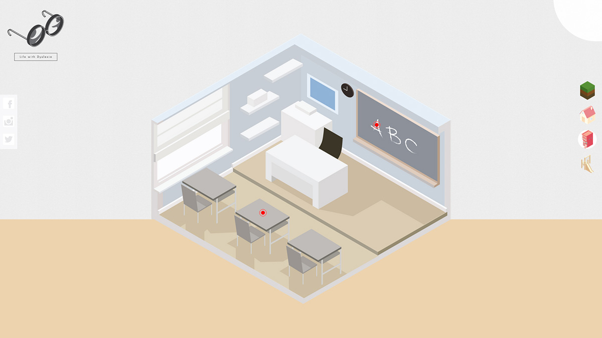
Due to low level of awareness, Dyslexic children often get ridiculed, dimissed and labelled as lazy students in class. But in actual fact, Dyslexics are smart and work twice as hard or even more than most people. The education system of Singapore, too does not recognise the challenges faced by them and often even the most common activities poses great difficulties for them. Here is one of them:
-
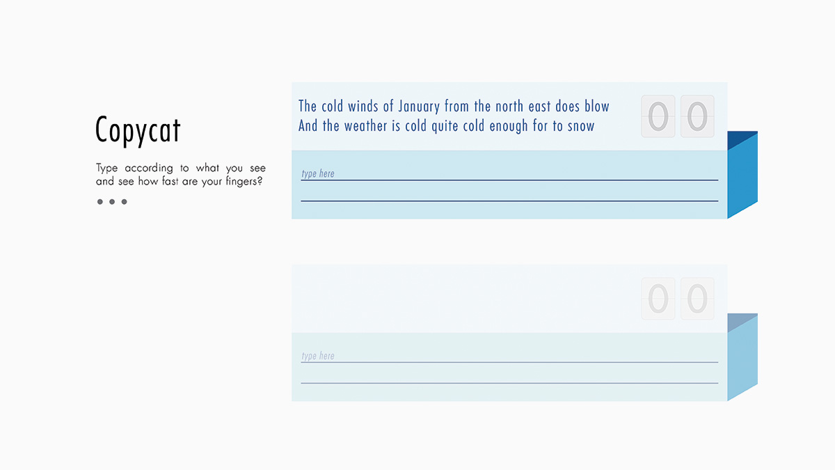
COPYCAT
Copying notes from the blackboard is a common practice in classrooms, but often, Dyslexics find this to be a difficult task. Children with Dyslexia often have difficulties doing so because they have to decode the text, understand it, read it as a whole, and then write them down. This process is time-consuming copying notes often is a race against time and Dyslexics find it hard to keep up with the teacher. As a result, Dyslexics feel pressured, insecure and copies blindly without understanding what they have copied.
This game simulates what a Dyslexic might experience when asked to copy notes. First, the user types accordingly to a randomly generated paragraph. After that, the user has to type the same paragraph with letters being jumbled up. A timer keeps track of the duration the user use to type each paragraph. By comparing the two durations, we can see the difference between us and Dyslexics and the challenges they face. Teachers can help by using different color markers, leave the writing on the board longer or simply reduce copying by providing handouts or notes.
Explore Prototype Here (optimized for desktop only) -
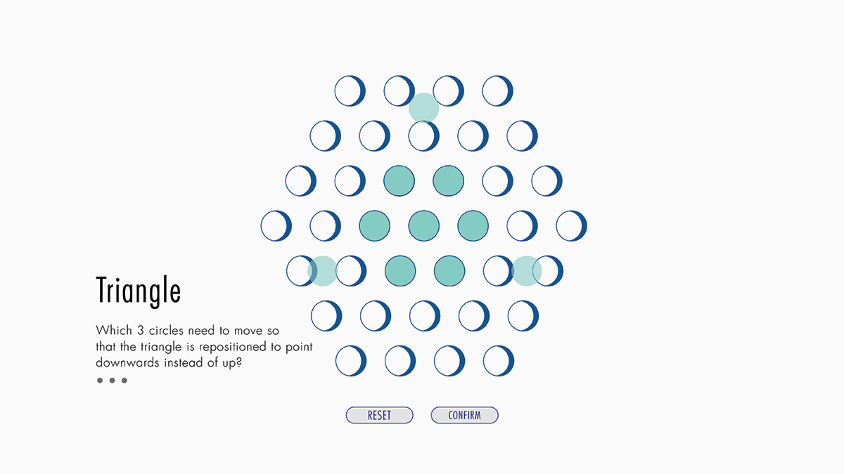
TRIANGLE
People with Dyslexia often have exceptional spatial awareness, the ability to mentally manipulate 2D and 3D shapes. Being spatially aware becomes an amazing aid for solving problems, thinking outside the box and coming up with creative ideas.
In this game, we highlight this special ability of Dyslexics by challenging the user to move circles around the area and complete the objective of forming another triangle pointing in a different direction. Some people will be able to solve it in a short amount of time while some would require longer time for trial and error.
Explore Prototype Here (optimized for desktop only)
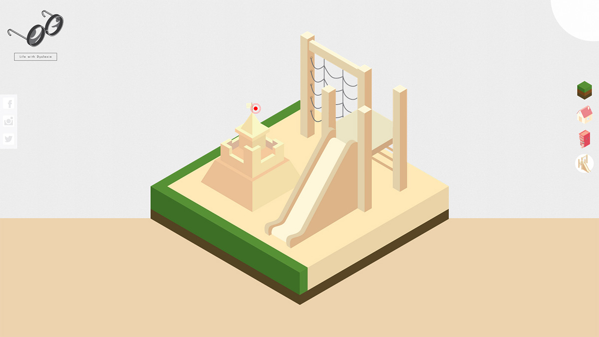
At Play
Playtime is all about fun and games, however it may not be the case for a Dyslexic child. Regular settings can be anxiety-inducing and carry triggers unlike what we would commonly think of. In worse cases, these situations may even lead to a Dyslexic developing depression symptoms.
-
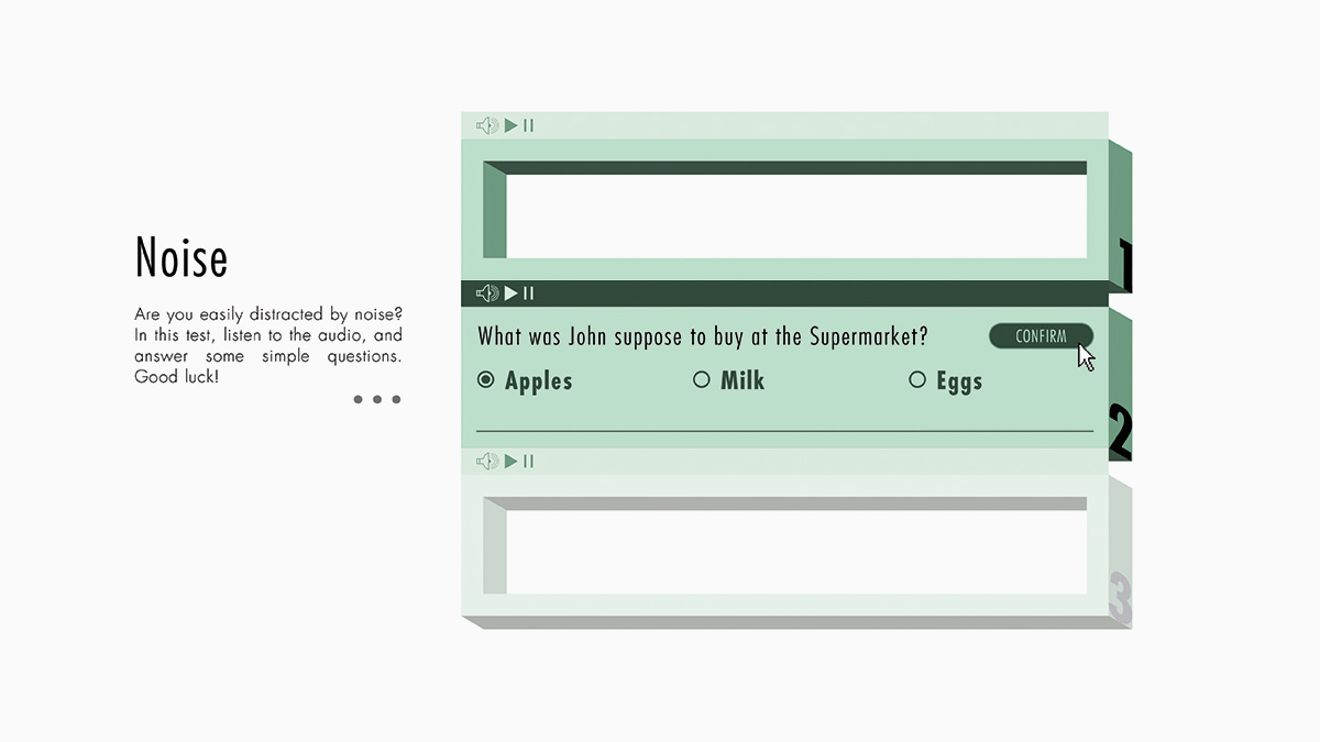
NOISE
Research has shown that symptoms of Dyslexia, including difficulties in reading, are at least partly due to difficulty filtering out excess background information like noise. The external noise exclusion deficit could lead to the creation of inaccurate representations of words and phonemes and ultimately, to the characteristic reading and phonological awareness impairments observed in Dyslexia.
In this game, we challenge the user to listen to three different audio files and extract the correct information in the midst of the background noise. Through this game, users will understand the difficulties that Dyslexics face and how noise can really affect their daily life.
Design Rationale
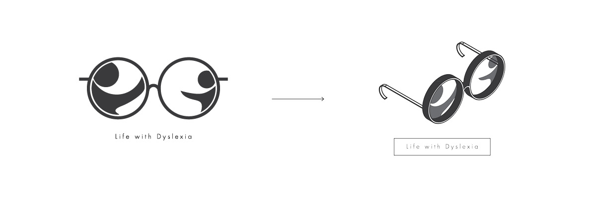
Dyslexics often have difficulties reading black text on pure white sheets; hence many wear colour tinted spectacles to help them read better. This is where the idea of using spectacles came about. Each glass frame contains a different figure, left is an adult reaching for the child figure on the right. Another way to interpret the logo is similar to a Dyslexic on how they view things differently from most of us. To suit the isometric style of our graphics, the logo is also being modified to 3-Dimensional.
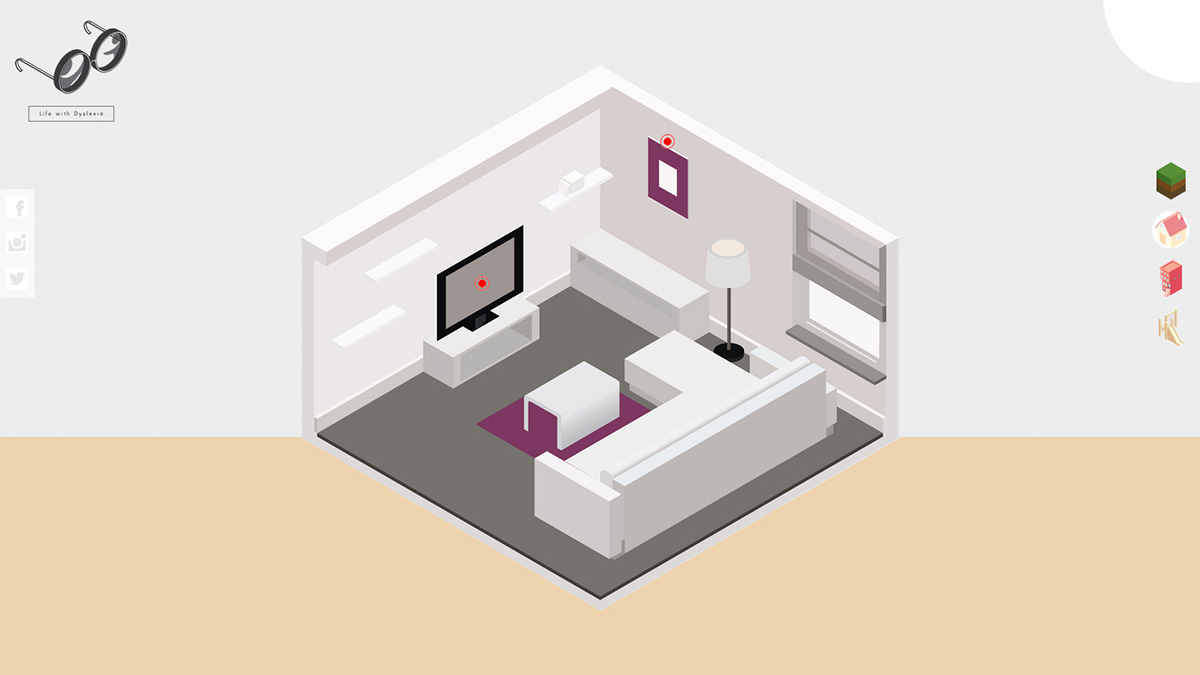
As for the interface, it is kept simple, straightforward and user-friendly. Putting into consideration that Dyslexics are more visual-based learners, contents are kept less textual and more visual aided. Most of the information or text comes after users have engaged themselves in the mini games or when they wish to find out more. The spaces between letters are being extended as well for better readability.
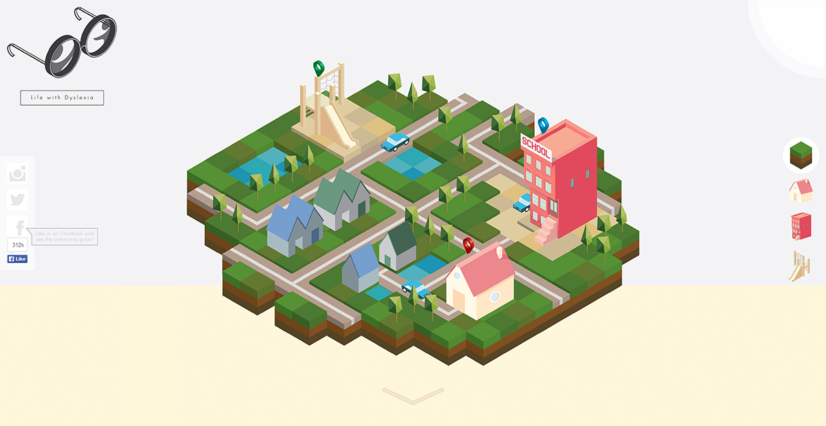
Dyslexics have increased right brain functionality thus they have exceptional visual-spatial ability which enables them to visualize objects mentally in three-dimension. Thus, the direction of our graphics is steered towards the use of 3D objects e.g. cubes. The design look and feel inspired by many game graphics and interfaces, adopts the isometric style. “Isometric” displays a viewpoint from a top-down perspective or side view, hence producing a three-dimensional effect. The colour scheme utilised is also soft pastel, primary colours.
Social Media Integration
To raise awareness of Dyslexia, one of the initial strategy was to have live feed from various social media platforms on the site. Other than encouraging the masses to spread the word via social media, we also made the website more interactive. The number of visits,likes or forwards will generated into data and reflect dynamically on the homepage. For example, the number and colors of the car is converted from the number Facebook likes.
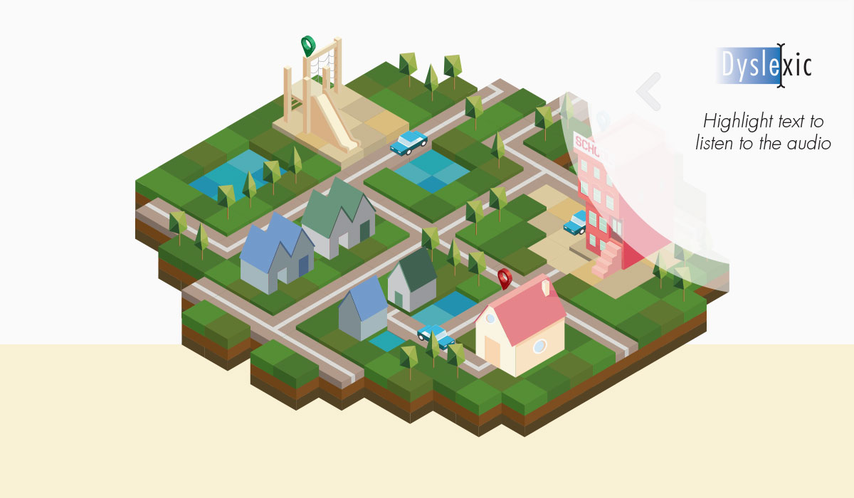
Even though contents are less textual and more visual-oriented, the site still carries a fair amount of text. For accessbility purposes, text-to-speech has also been considered. Whenever the user highlights the text, a voice-over will be activated.
Areas to Improve
-
UX Design and Writing
For new comers, it may not seem apparent as to what is the purpose of the site. Should there be an introductory sequence before allowing users to dive deep? And despite having done up the user interfaces, there were many areas that needs to be improved for example clearer Call-to-Actions, leading users to hidden panels, composition of graphics etc. Even down to the writing, especially for the instructions of every game. -
User Behavior Analytics
By understanding how users are really experiencing the website is very important, especially for a website that aims to raise awareness for a learning disorder. Plugins such as Google Analytics or Hotjar collects valuable user feedback and prompts areas for improvements. These will evertually turn vistors into regulars. -
Browser / Device Compatibility
In order to reach a wider audience, responsive or device compatibility should be taken into consideration. Further more, not all users have Chrome or Firefox browsers installed in their personal computer. As such, making sure that the website works well on all platforms has to be one of the priorities. -
Do more with Social Media Integration
Live feeds from social media platforms are common, and so how can we do more with it other than having a dedicated page. Tapping on the interactivity with the cars, we could explore having construction of buildings/roads through data. As the city is being constructed, we could have moving characters with speech bubbles curated from user posts. -
Building a Community
The train of thought came about from DAS lending a hand to people with Dyslexia. As told, maybe Dyslexics are afraid to seek help however they may be more open towards seeking help online. Having built a community allow them to come forth and share their woes and interact with people of the same kind. With the site allowing user sign-ups/registration eventually contributing to the construction of buildings and having characters walking around the map, like a 'SIM City' catered for Dyslexics and caring people around them. -
Performance of the Website
Currently, each page is loading a huge chunk of visuals which require a significant amount of time at the start. This is a bad practice. As such, a good practice will be to reduce the image size without compromising the quality or using image sprites or svg that canv greatly enhance the performance of the website.
