DOWNTOWN GALLERY - RETAIL OF THE 21ST CENTURY
Concept, Art Direction, UI / UX Design, Content Population
Visit Website
The Brief
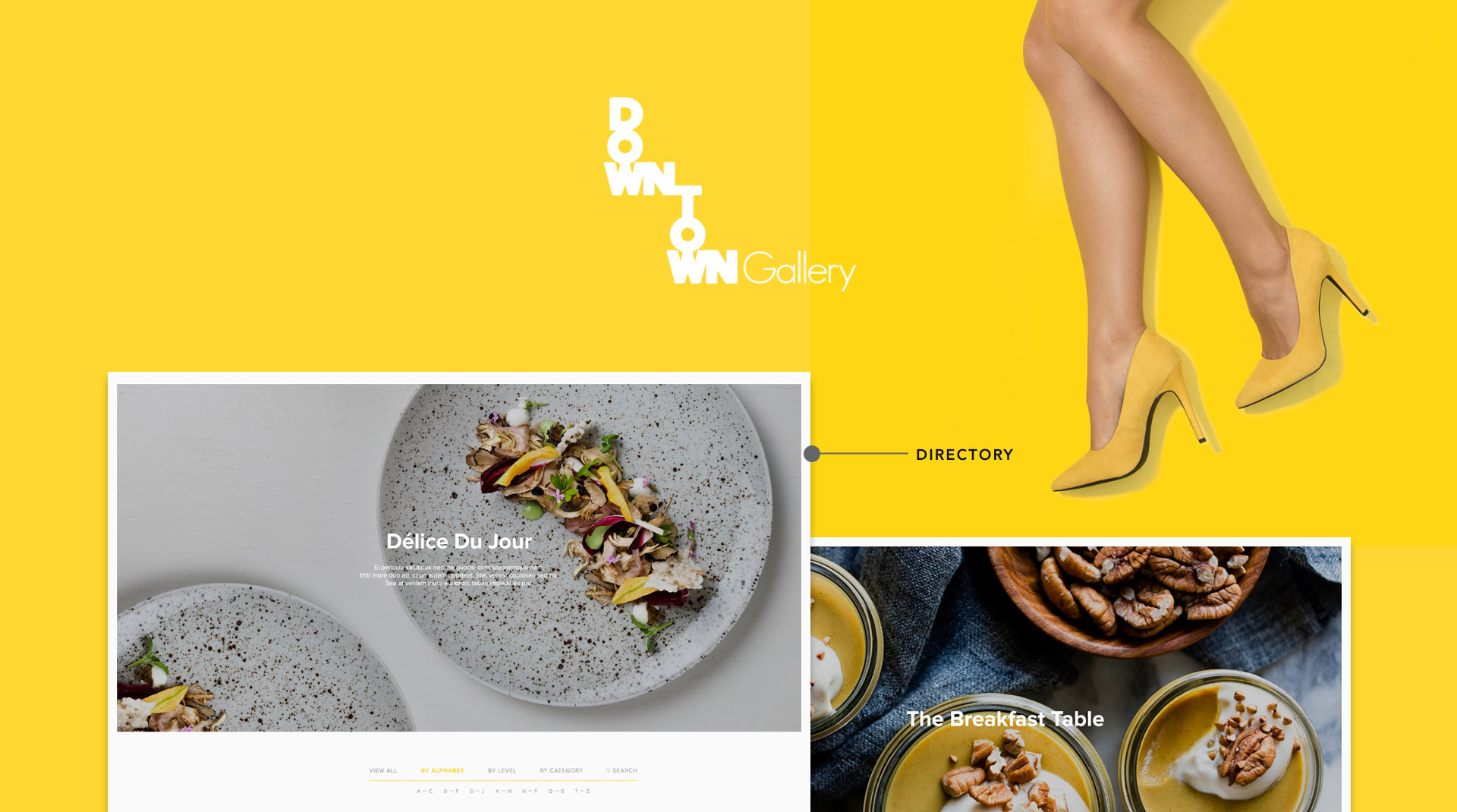
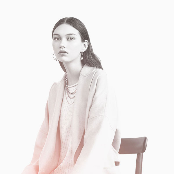
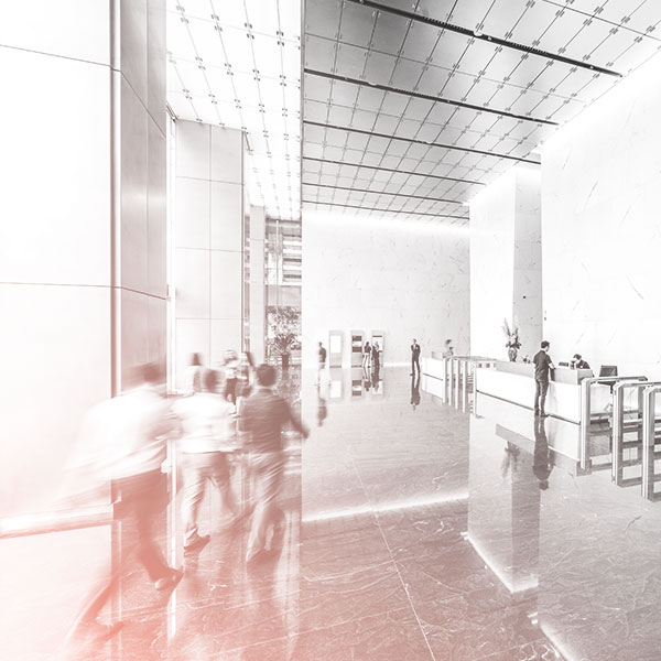
With the successful revamp of Mandarin Gallery (MG), OUE came back with another task of putting up their website for their new launched site; Downtown Gallery (DTG). Not only is it a mall, it also houses office spaces and is located in the heart of Singapore's financial district. DTG boasts itself as a commune destination with carefully curated labels catering to the office crowd.
The Objective
Being the sister brand of MG, DTG should not sway or look entirely different from that of MG's. The keyword "community" appears most frequently in the word cloud and thus it needs to be strongly and visually represented. Having situated at a business district, the website should not be to over-the-top yet gives a refreshing look.
The Solution - Homepage
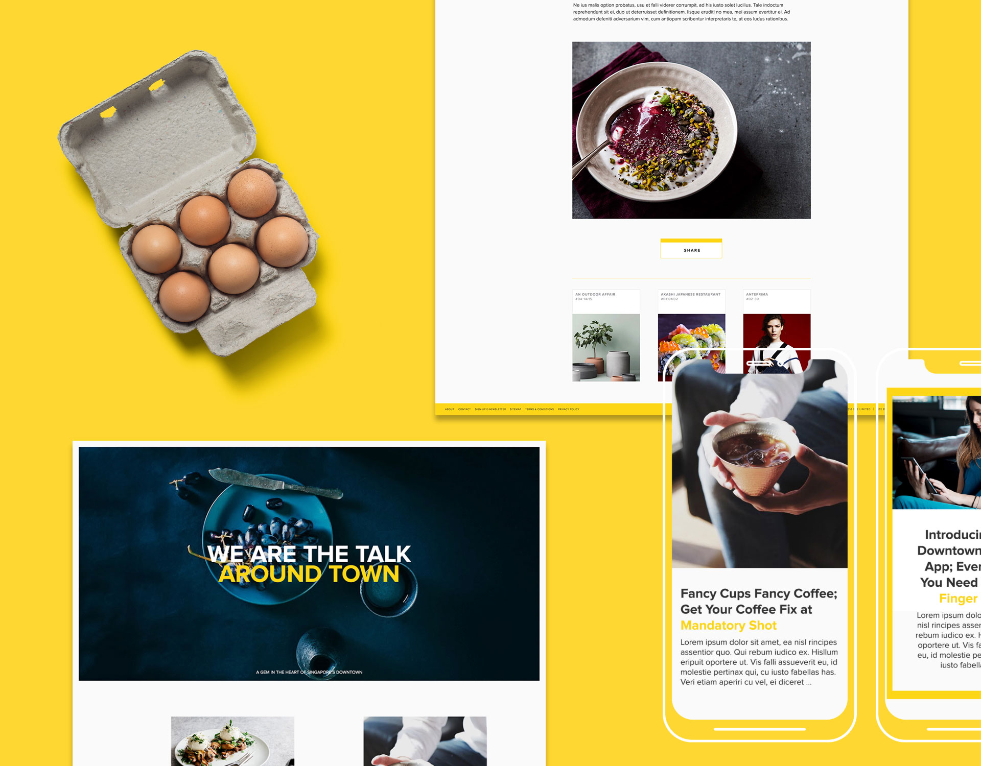
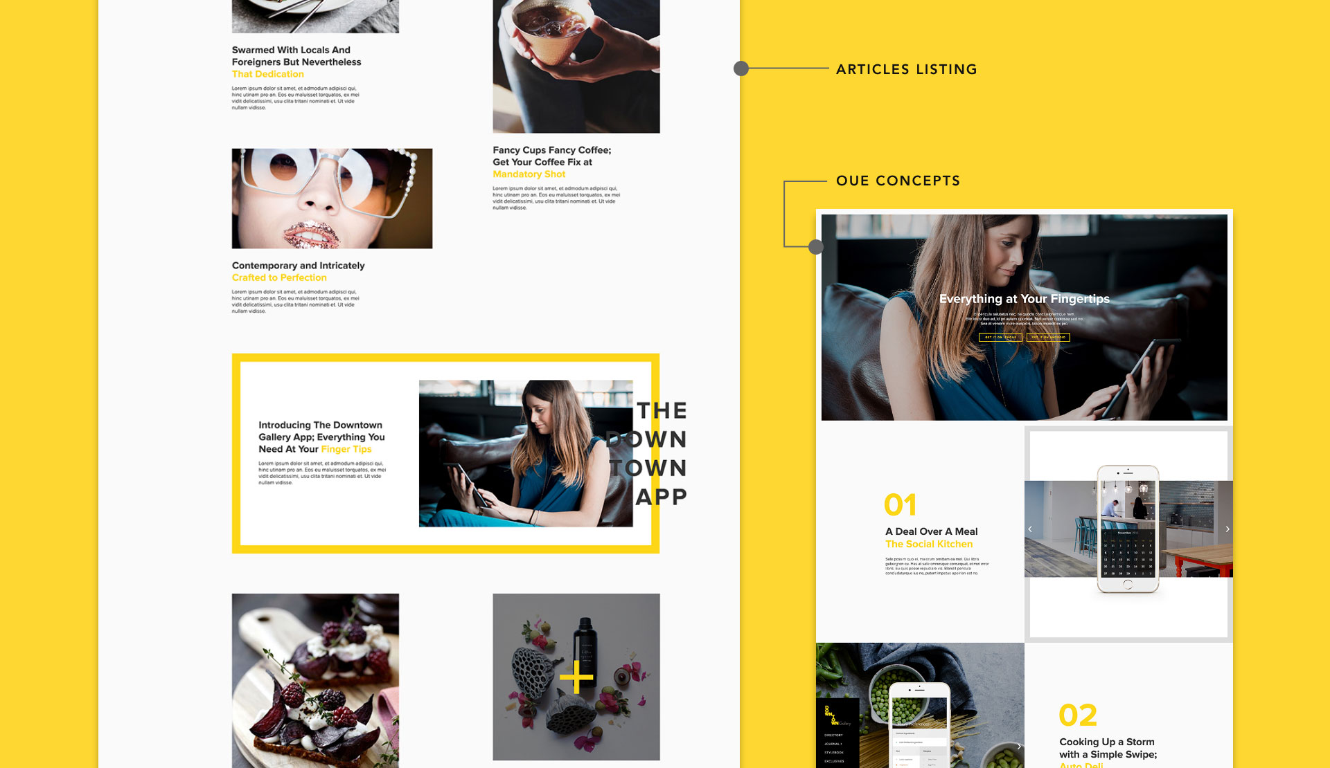
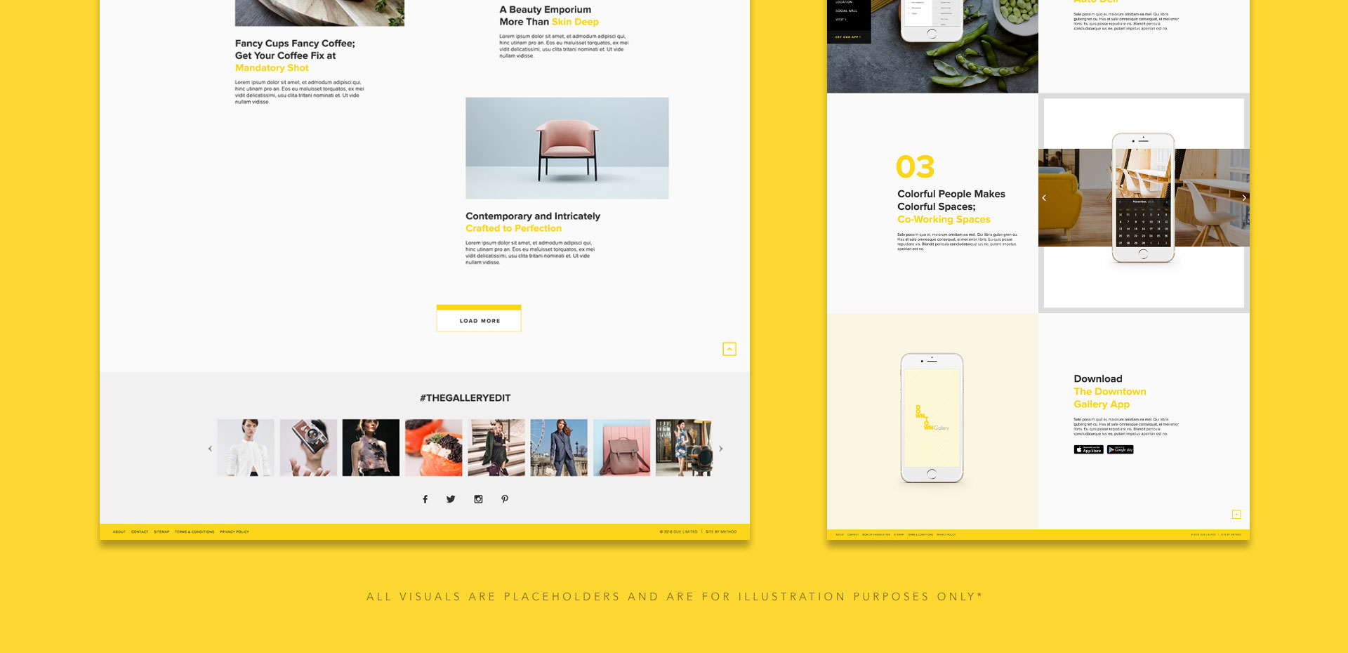
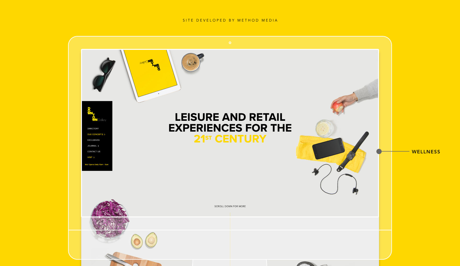
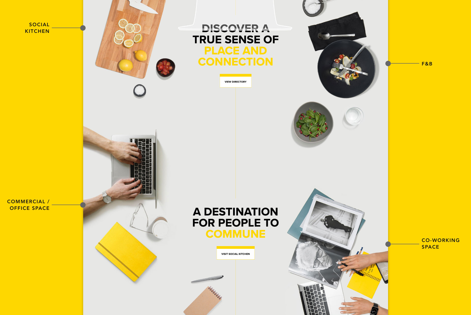
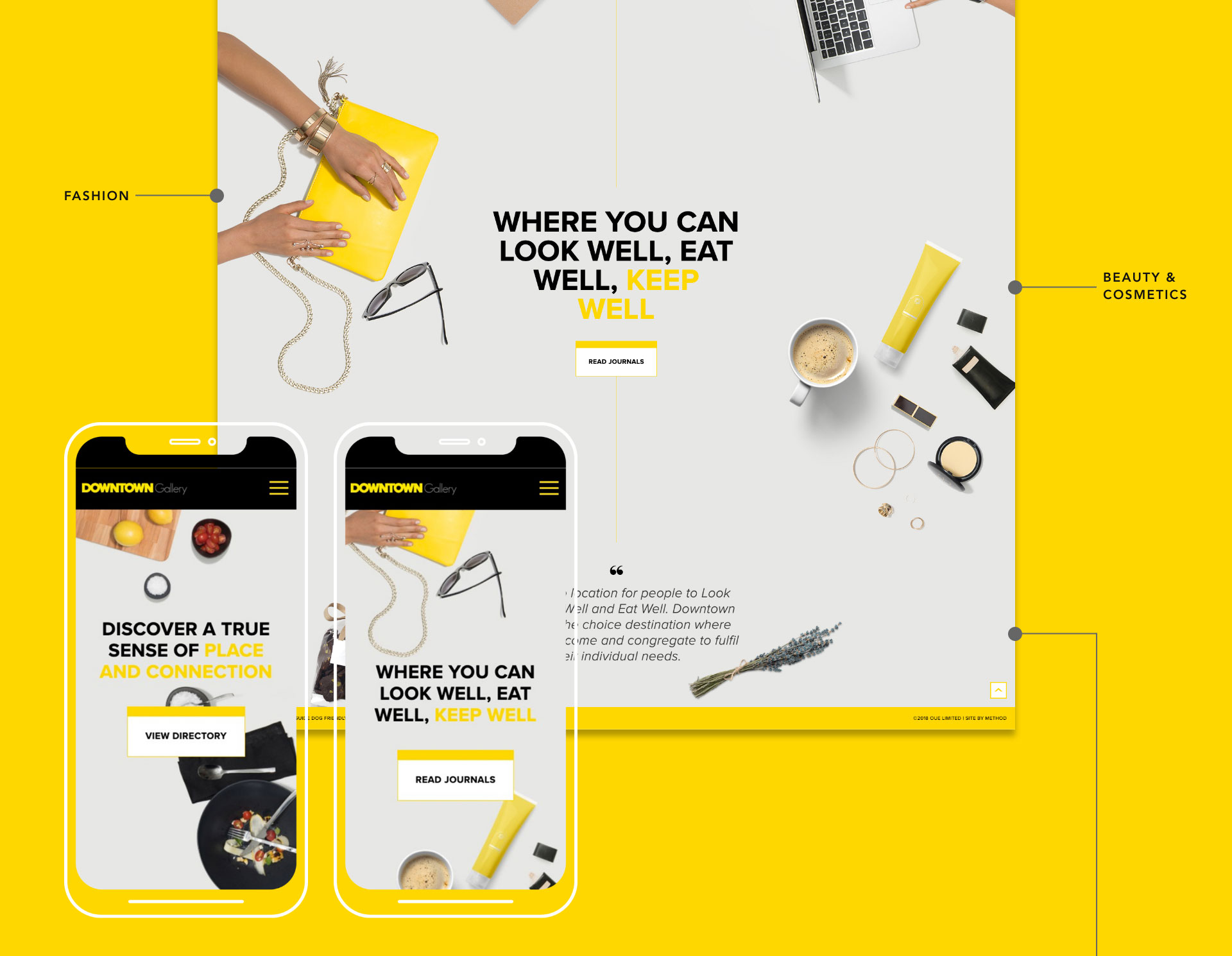
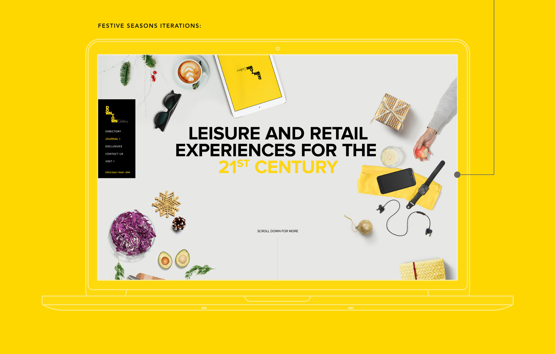
From the brief, I understood and interpreted DTG as a more upbeat and lively sister compared to the mysterious and fashionable Mandarin Gallery. To fully capture the sense of community, the homepage for Downtown Gallery is creatively designed to be laid out like a long communal table where everyone come together accompanied by the ever classic #flatlay visual representations. Different aspects of the site among these ‘place settings’ are introduced as the user scrolls.
The Solution - Brand Presence
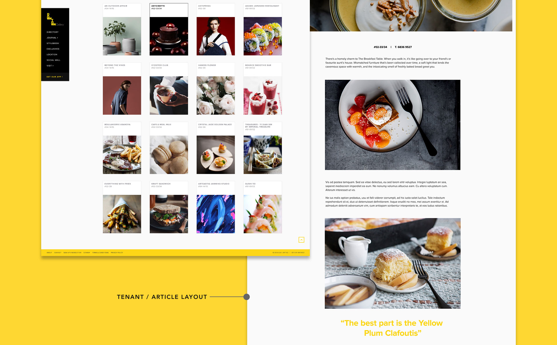
Aside from the Homepage, the site's main target audience will be those of the office crowd, hence, contents are laid out with ample breathing space with elements of DTG's branding, hint of yellow, plastered around the site. The design is such that it does not overwhelm the viewer and easy on the eyes, yet carry the vibrant vibe of DTG.
