OVERVIEW
To celebrate its 15th Anniversary, Method Media is looking to revamp its portfolio site and we took this chance to look into improving and branding ourselves better. My roles for this project included project management, research, UI/UX Design, and content population.
Objective
- A platform to showcase our work
- Attract business opportunities
- Attract new talent
- Price ourselves as an agency than a studio
Target Audience
- Luxury brands including but not limited to: Hospitality, Architecture, Property Development, Retail, Lifestyle etc
- Creatives and/or Developers looking for opportunities
RESEARCH
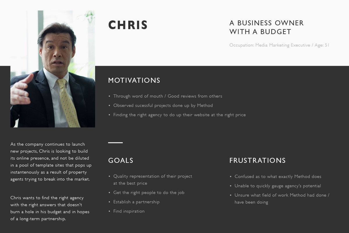
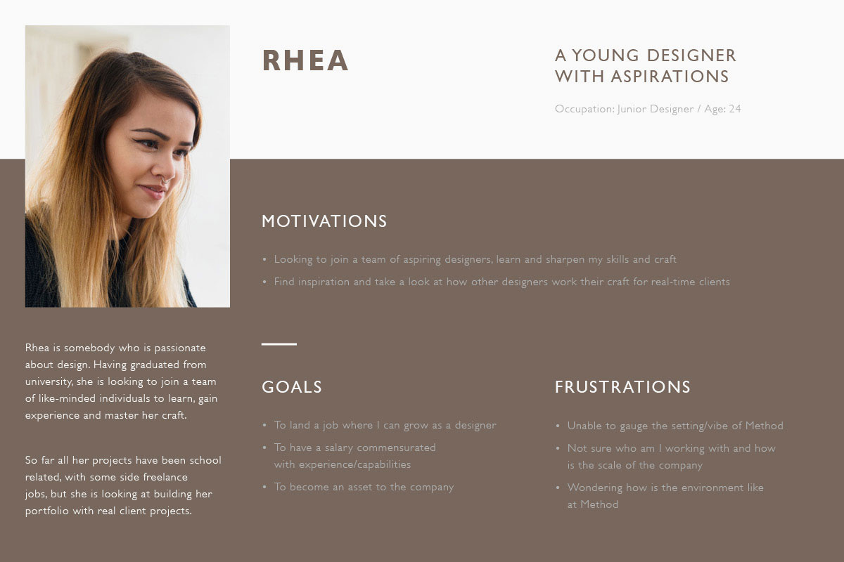
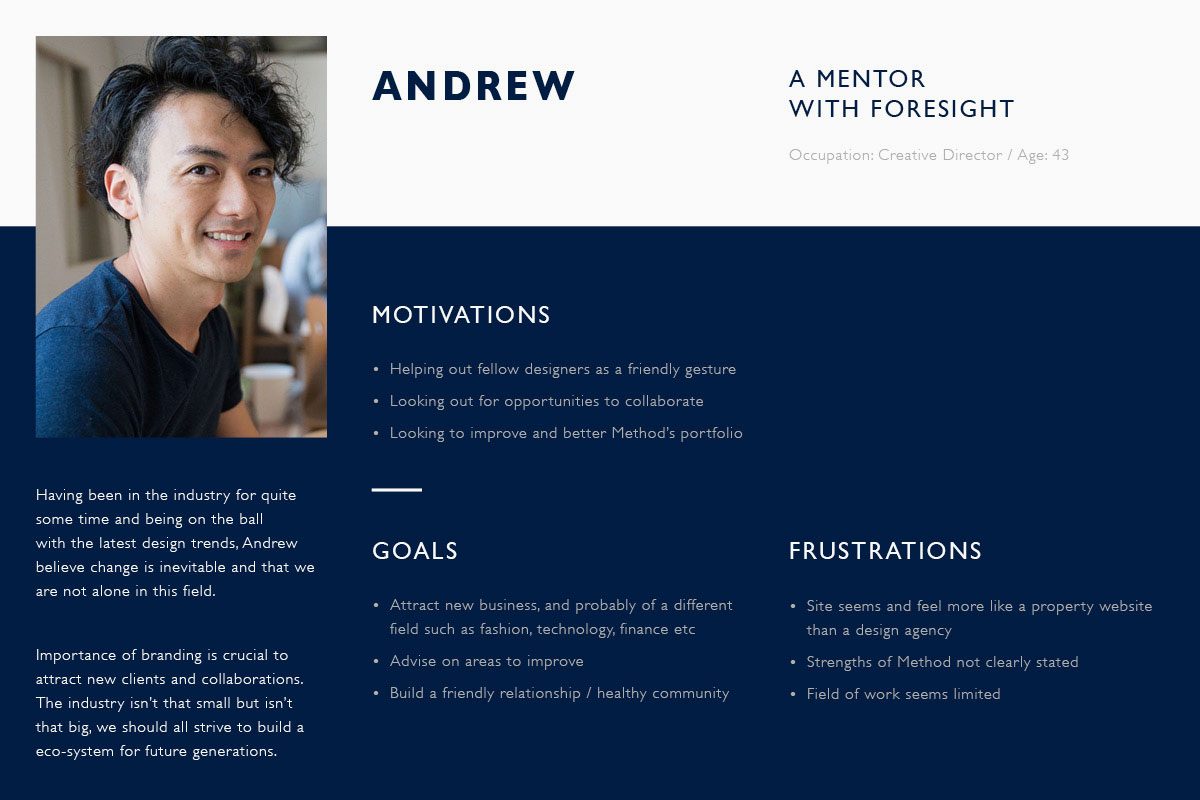
Apart from analyzing the data collected from Google Analytics (confidential according to my boss, sorry 😬), we gathered, interviewed and observe some of our clients/business owners and designer friends for their feedback and how they thought of our existing site. We looked into their motivations, goals and frustrations. From that, I've created 3 personas.
GAPS AND OPPORTUNITIES
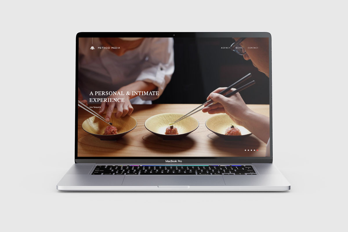
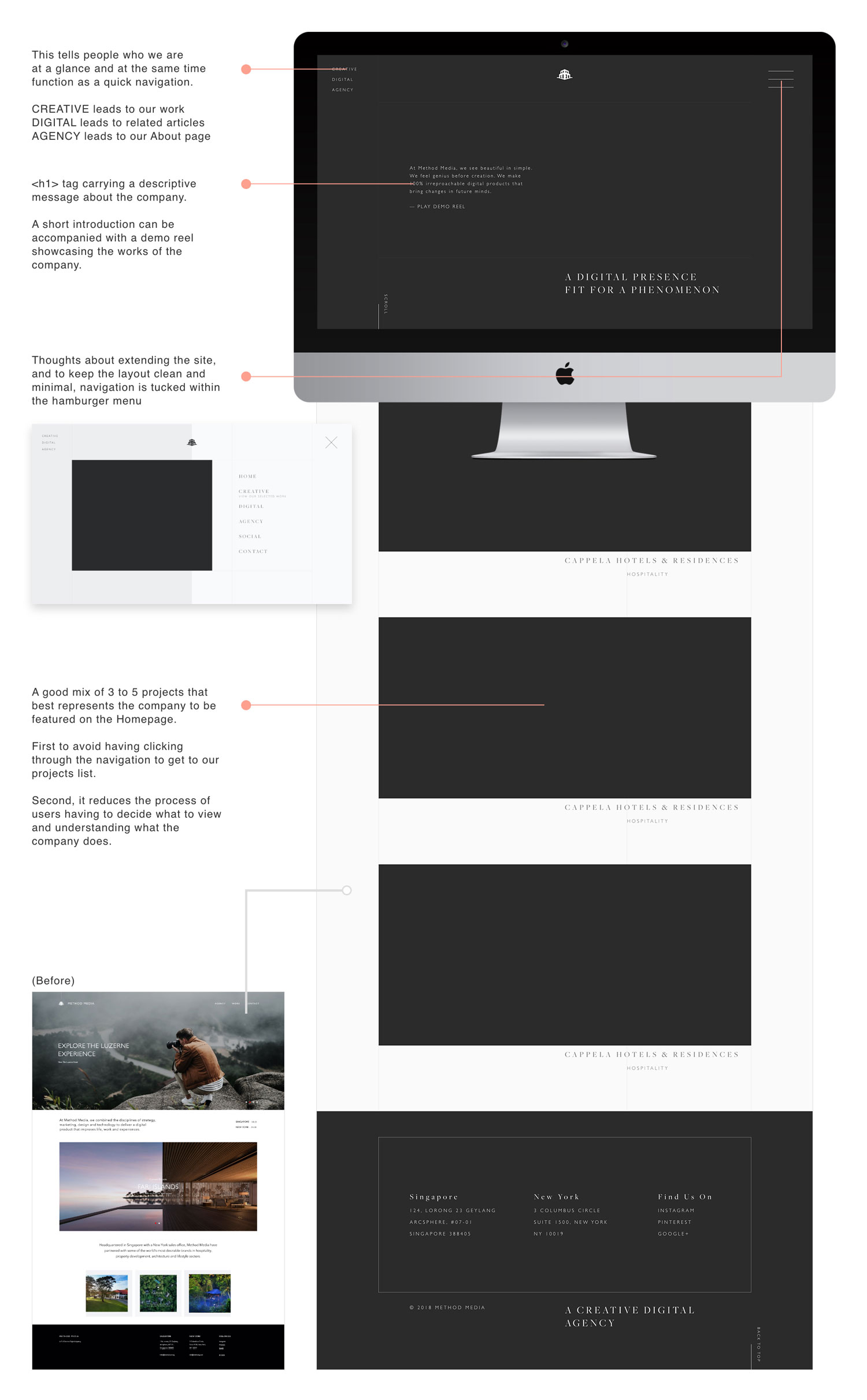
Homepage Takeaway
- Pain Point:
The Homepage, despite being the most visited page, does not inform much of what the company does. Despite the assumptions that people who visit the website already know that we are a design agency, it should still be conveyed clearly. However, there is no clear message as to what Method is capable of upon landing. - Possible Solution:
A simple message accompanied with a demo reel can be placed above-the-line so as to make it apparent that it is a portfolio site upon landing. Feature a few key projects that best represent Method, without having to navigate the whole list of projects. This can provide a glimpse of Method's capabilities as well.
Reduce the effort to read and understand
- Pain Point:
Reading is good but not everybody has the luxury to read what is stated on the site. Be it your company's long term philosophy or the long labour of a massive project, it is a lot of congnitive load, and may result in appearing too hardsell. - Possible Solution:
It'd be good to review the contents being put up and pick out key aspects in order to cut the chase. Putting emphasis on headers, reducing copy, group similar items etc would be a good way to start.
Content structure
- Pain Point:
What is it that potential clients want to see? It should not be just beautiful writing and beautiful visuals. Clients often look for metrics and what the company can offer in order to gague whether or not a collaboration should be in place and that it is worth the engagement. - Possible Solution:
Structure every project detail page as a case study with clear indication of roles, research and statistics to back up. This hopefully provides credibility instead of just flowery language. With a storytelling approach, real-time scenarios can be better imagined in turn allowing potential clients to better understand our thought/design process and steer them away from a passive, browsing mindset.
CMS implementation
- Pain Point:
Usually employees, designer or not are task to aid in updating the site manually and in most cases duplicating existing HTML pages and tweaking from there. The existing structure requires manual sequencing of projects which is quite a hassle for projects to be tucked in between. Or simply put, there is no easy way to sort the projects. And often major projects get pushed to the bottom of the page losing its exposure. - Possible Solution:
Instead of having to manually set up each HTML page, we can utilize a Content Management System (CMS) to better aid with creating, editing and managing the whole site. This allow some automation and greatly reduce room for errors especially for individuals that do not have strong programming background.
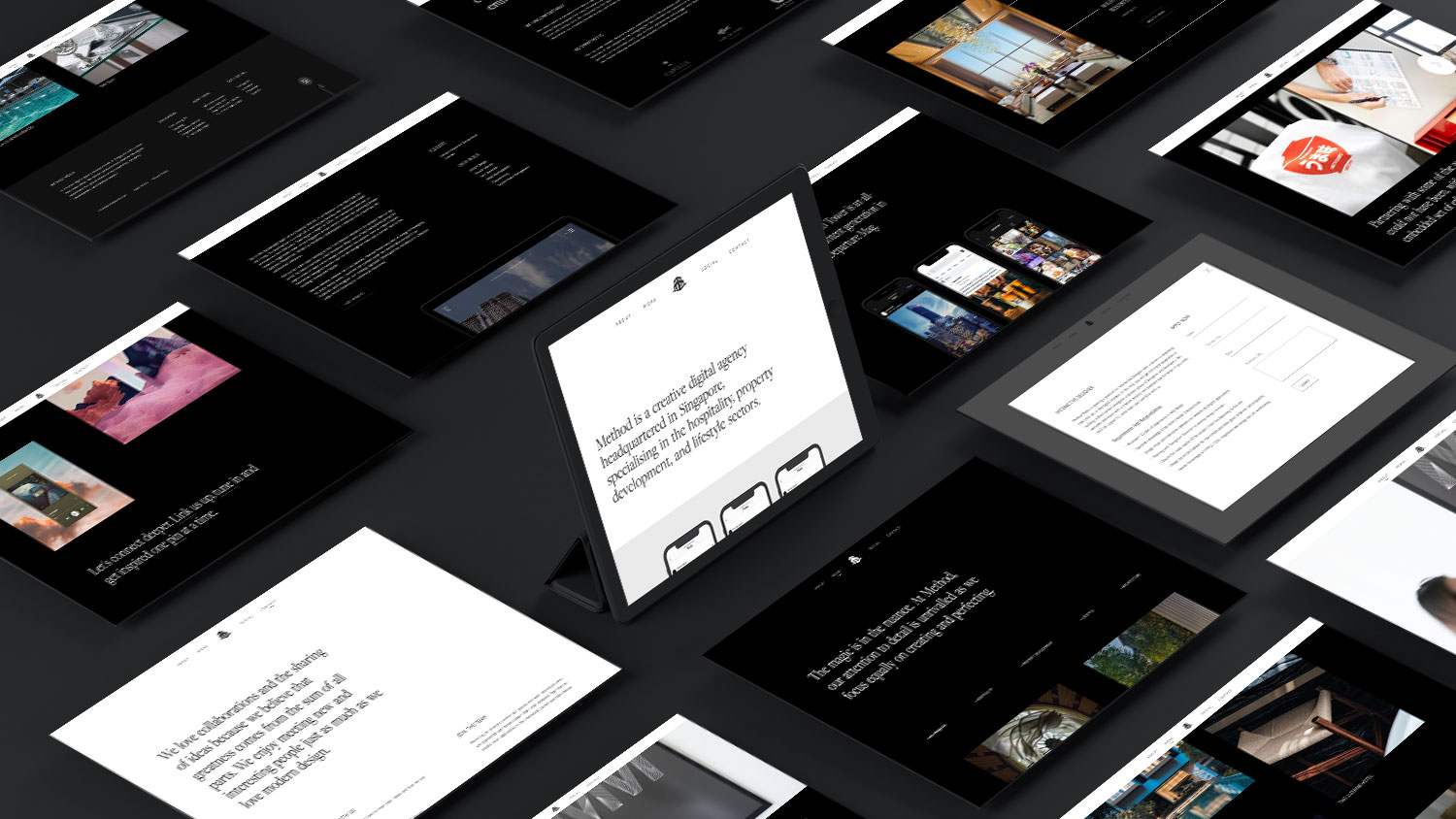
SITE RE-DESIGN
Homepage
The main objective of the Homepage, being the most visited page of the site, is being focused on having a quick takeaway for visitors (like a bikini 👙). Putting ourselves in the shoes of a client, there is so many agencies to sieve through and filter, visitors might not have the time to explore and navigate through the pages.
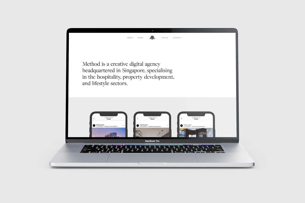
About
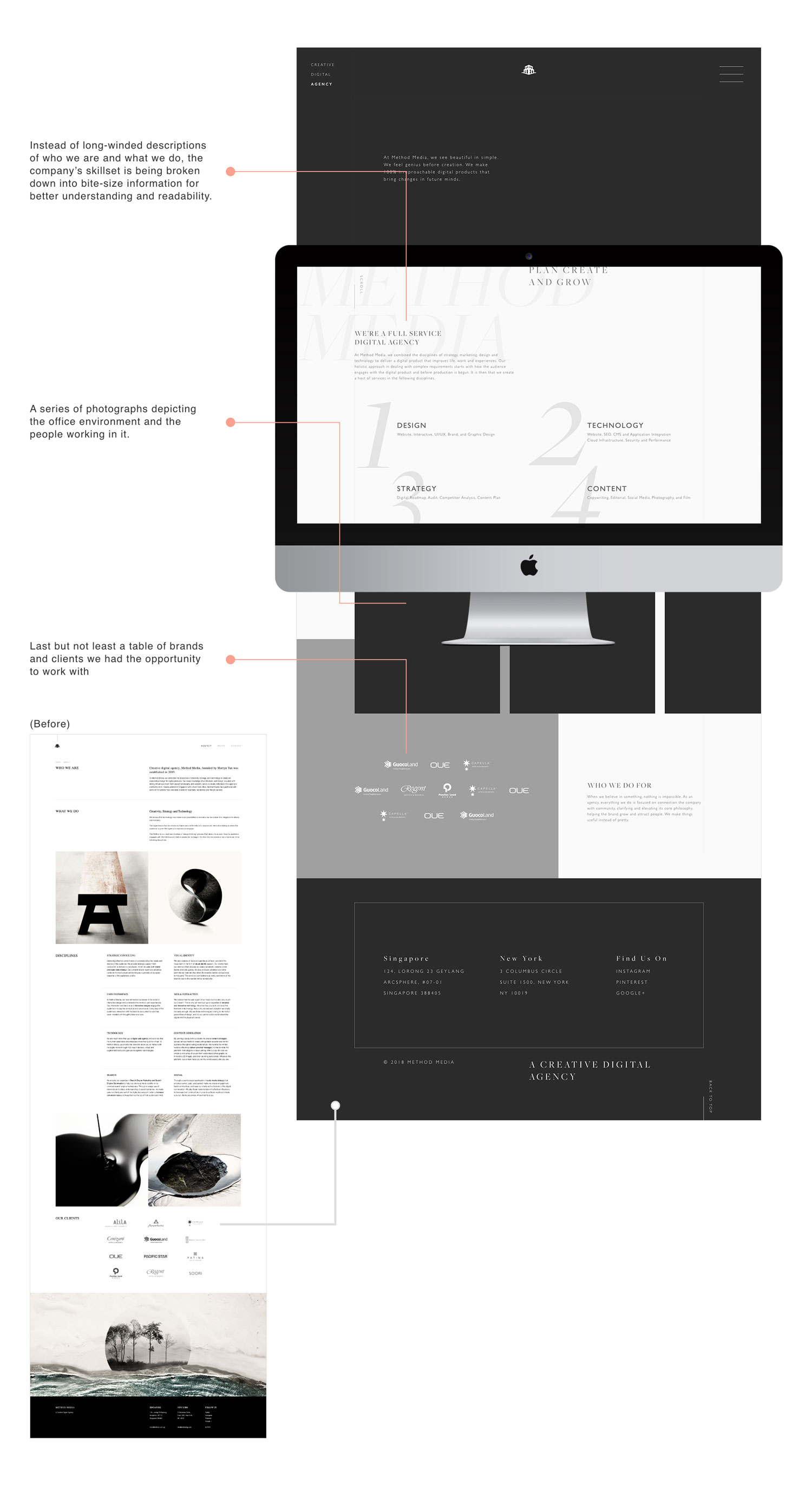
"What we do" comprises of compositions that were long-winded, hence it was apparent to streamline all the information into digestible nuggets. With the use of emotive copy and casual interior shots, hoping to portray the company in a more casual mode without sounding like an automation.
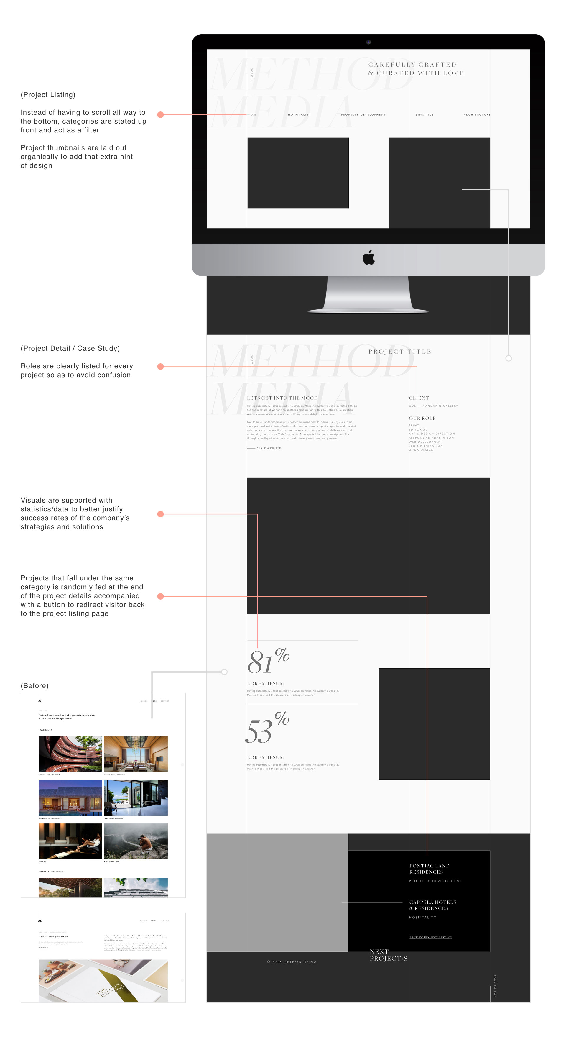
Work
Carrying the biggest bulk of site, it was important not to overwhelm the audience. Projects are tagged with their respective category and roles are clearly stated to avoid confusion. Visuals should not only be beautiful but also further elaborated with numbers and information.
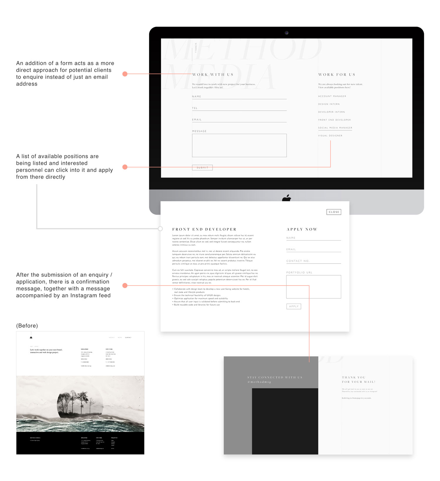
Contact
As much as it is important to have a Contact page, the information on the existing page is already available on the footer. So in order to make full use of a Contact page, we incorporated enquiry forms and job applications on this page as well.
Digital / Social
Hoping to drive audience engagement, an initiative that includes posting text and image updates, videos and well-curated content sprouted. This hopefully drives Method's online presence and also helps build brand awareness.
USER TESTING and ITERATIONS
We did up a prototype, after which, we gathered some feedback from a new pool of visitors and continued to make iterations to the design in order to reach the desired outcome. Here were some feedback we've compiled:
- Fanciful animation but causes latency on desktop and mobile (IOS)
- About section doesn’t sell our brand and “What We Do” section is not clear
- Our navigation is simple. Why hide inside the hamburger menu
- Font Pairing; serif doesn’t necessarily mean luxury
- Footer is too big and repetitive
IMPROVEMENTS
Despite the site has been launched, the team and I are still looking into areas for improvement in order to achieve the blue-sky design we imagined. Below are some areas at the moment:
Case Studies
Currently the portfolio consist of short project summaries and images, but case studies showcases the company's ability in solving the problems and coming out with creative solutions in greater detail. These are achieved through defining client's problem and the designer's role, accompanied with an overview of the design process instead of jumping right to the solution. This pushes the focus away from the aesthetic facade to showcase the company's skills, communication abilities and creativity, in turn instill trust and inspire confidence.
Social Media Marketing
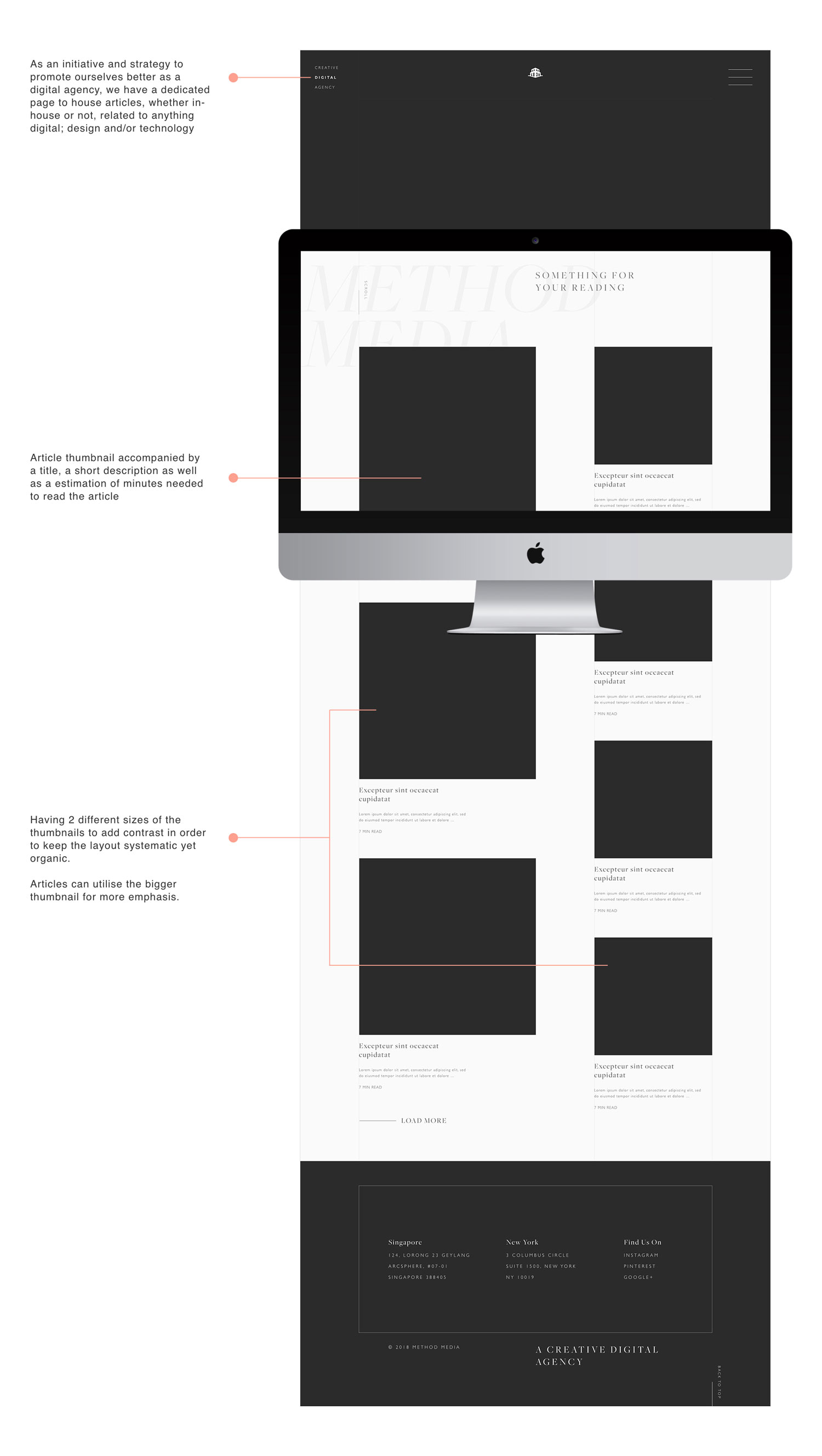
We can look into establishing in-house thought articles related to our business/field on platforms like MEDIUM. Moving forward, we can have these articles automatically fed onto our website (like an Instagram feed) instead of having to manually populate the contents. With the rise of Social Media Marketing, we can explore doing more than just articles, such as video contents, merchandises (posters, bags, sticker packs) etc to be put up onto Facebook, LinkedIN and Instagram.
Establish a Design System
Despite having a brand logo, brand colors etc these are not enough as the organizations scale. A design system audits all visual components which helps accomplish a number of things. It displays where the biggest inconsistencies within the designs are and helps identify the most important and most commonly used elements and components. Over time, it acts as a support, speeds up design processes and reduces cognitive load between devices. By creating a consistent language that internal and external users are able to understand, it creates a better experience for visitors as well as future designers working on the site.