HELPH for Your Health
Case Study, UI / UX Design
TABLE OF CONTENTS
Overview
Was lucky to have proceeded to the design brief phase, as part of a job interview, and the topic I chose was Healthcare. The task was to come up with a value proposition, taking into consideration the current global situation and how it serves as an opportunity to build relationships with existing and attract new customers.
In relevance to the brief, I imagined myself as the appointed agency of a healthcare provider seeking a solution. Thus, I am both the UX and the UI designer. The duration for the assignment was 5 days and part of the deliverables for the Visual Designer position was to produce high-fidelity mock-ups.
Problem Statement
How might a well-established healthcare provider provide a superior healthcare experience so as to build stronger relationships with existing customers and reach new audiences?
Discovery
Goal of Research
- What are the common problems people face?
- What have been done in the market to help with these problems?
- Where are the areas of opportunities?
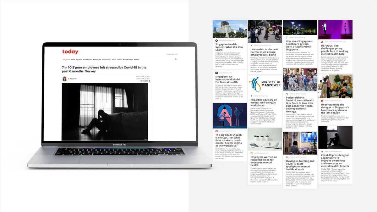
Majority of the topics revolve around adapting into the new normal of the pandemic situation - workplace stress and/or working from home has raised the concern of mental status and well-being tremendously. Additionally, when it comes to global context, Singapore is being recognised as one of the top countries in managing its nation's healtcare with its self-sufficient healthcare system.
User Research - Persona
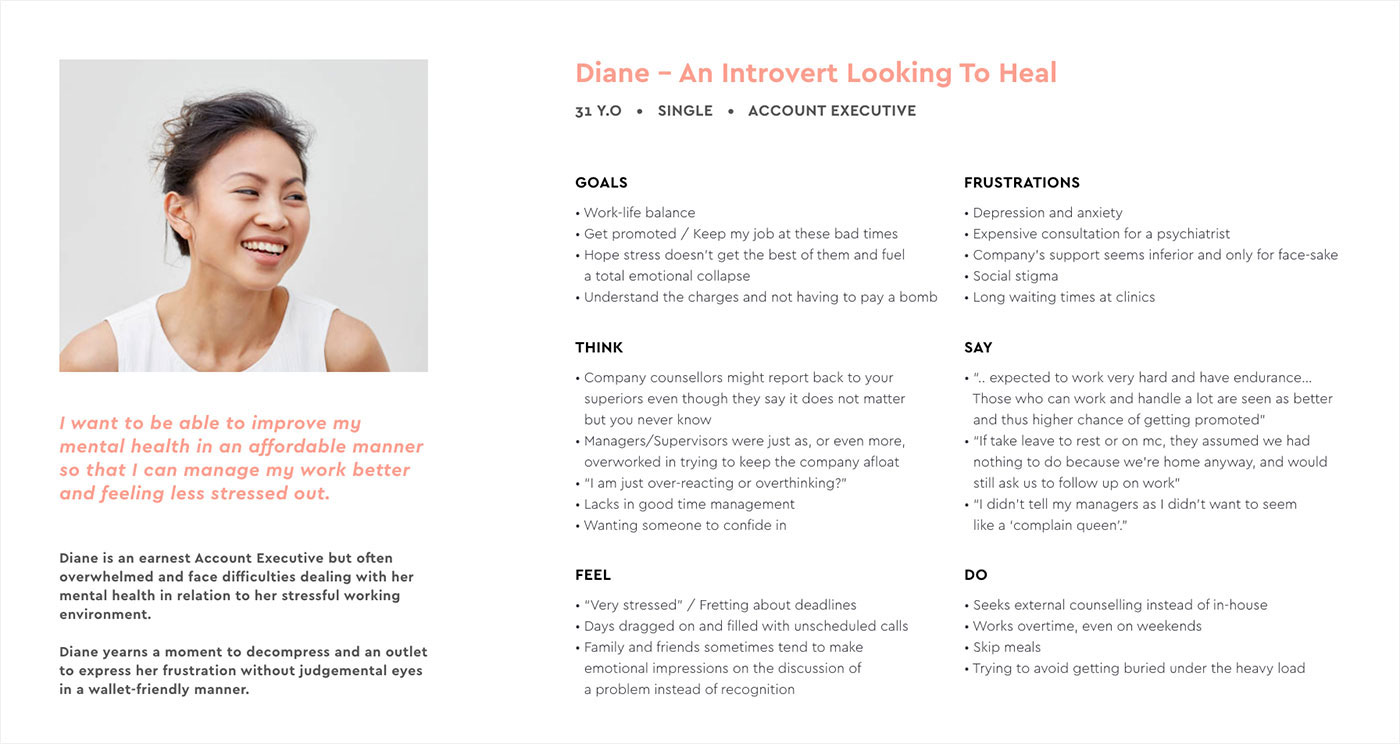
As time is of the essence, I jumped into user interviews. 6 of my friends and colleagues age 27 - 45 volunteered. I was lucky to also have them come from different sectors such as business, design, F&B and one of them being a Social Worker as well.
Hoping to keep the interview as authentic as possible, my questions were kept broad and generic, such as:
- What are your most concerned issues when it comes to healthcare?
- What do you think Singapore's government is doing in terms of caring for the nation's health?
- How do you identify stress? What makes you feel stress? Why do you think you feel stress?
Focused Themes and Assumptions

- Singapore’s Healthcare System
Government subsidies might assume the integration of Singpass usage and access to Medisave/Medishield accounts. These components are highly sensitive/private to individuals and thus security usage and research into government and privacy policies should be carried out before going into design phase. - Feature Expansion / Inclusion
If we are looking into government subsidies, it would assumed the product would be designed exclusively for Singaporeans or PR. What are the considerations in order to include foreigners? Is there a possibility that subsidies can be extracted via external means, for example passport number, insurance policy number or corporate code? - Mental Health Research
It would be ideal to include mental healthcare professionals in early stages of design. This would allow better understanding of how to engage patients. For example evidence-base cognitive behavioural therapy (CBT) and how these can be translated into digital. Assuming the ability to conduct workshops, user-testing to draft out user scenarios and flows. Proper copywriting and design triggers should not be overlooked as well. - Finding the Right Medium
Certain problems does not necessarily need a digital / online solution. The solution could be something simple like a company staycation to examine the overall state of mental well-being of employees. Or partnering with key organisations that provides counselling services. Solutions could function similarly to a cell group in order to build social inclusion. - Health and/or Productivity
From the research, mental health and workload goes hand in hand. And the latter seems to drive the former. The focus of the product (if not for the context of the brief), could be a solution steered towards managing workload instead of managing mental health.
Disclaimer: In the interest of this brief, all of the above are assumptions made and to support my hypothesis.
User-Centered Design Canvas
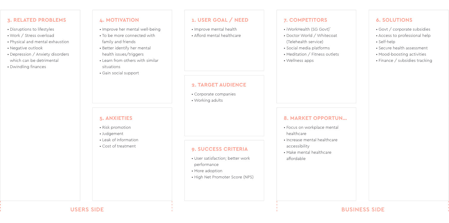
After research and discovery, I have applied the insights into a design tool called the User-Centered Design Canvas (UCDC), where everything is being laid out and easy to identify at one glance. This allows me to look at it critically and identify the reason for design. There is better understanding of the context and it helps evaluates:
- Desirability: User problems, user wants and/or needs and willingness to seek solution/s.
- Viability: Is there a market opportunity/gap or a business need to fulfill?
- Feasibility: The possibility of the solution coming into fruition. Available resources, capablities etc are taken into concern.
Ideation
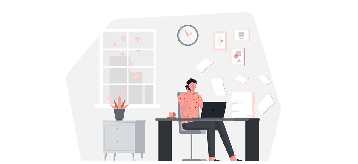
Loyalty Program; Business of Caring
- Regular health checkups, why not regular MENTAL health checkups?
- On top of the usual work performance appraisal conducted by the company, an additional anonymous cognitive appraisal conducted by a professional, could be engaged to identify employees' possible work stressors and how they response to them
- Professional advisory to overall management improvements
- Raising awareness: building an open and healthy eco-system
- Review of HR policies and scope of medical reimbursement/coverage
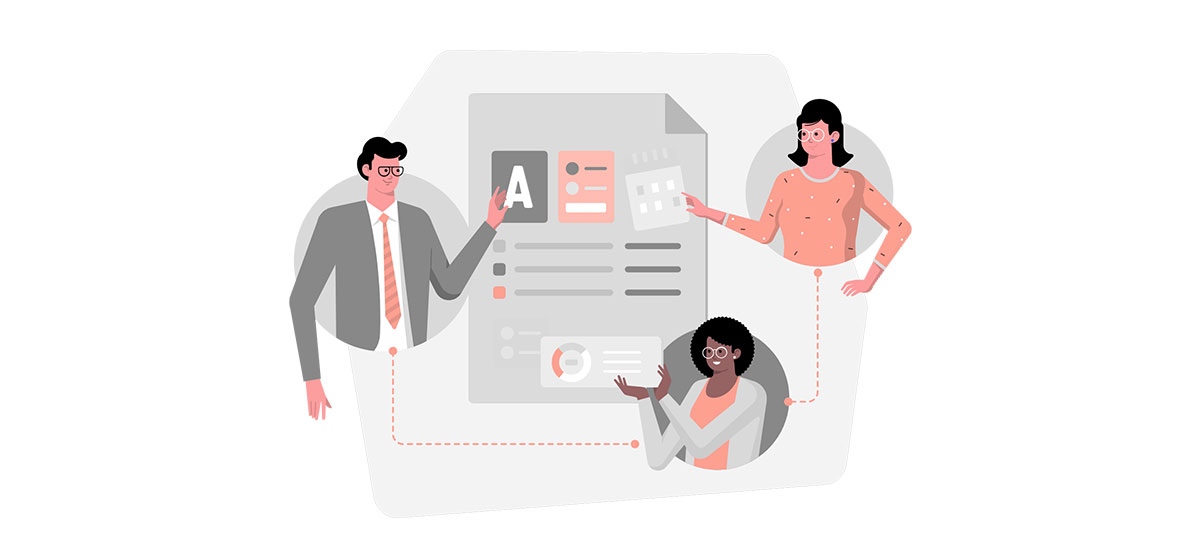
Be-Friender; A temple for your trust
- A confidential program that allows individual to reflect on their symptoms without inhibition, fear of judgment or embarrassment
- This idea seeks to promote self-help / help-seeking behaviour
- Allow users to gain access to a pool of selected volunteers, from a variety of organisations and mental health charities, trained to provide support and companionship
- Specially curated psychological content e.g. Defuse anger with humour, visual contents, comforting mantras etc to aid with coping stress
- Further expansion could include possible integration with AI assistant (Google Assistant, Amazon Alexa etc)
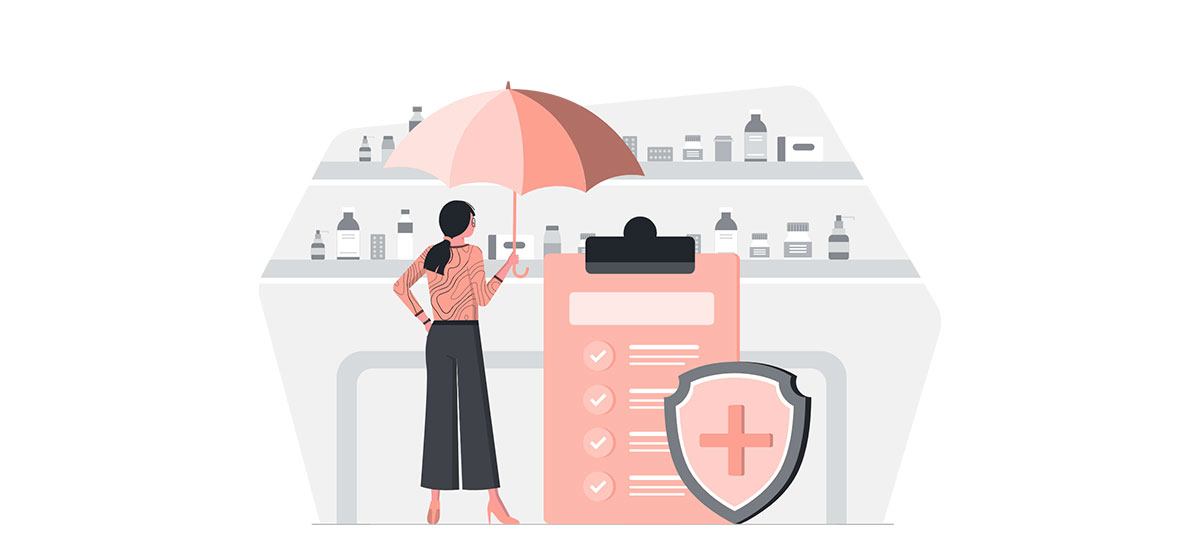
Checkup Happine$$; Check Your Mind as much as your Money (Chosen Idea)
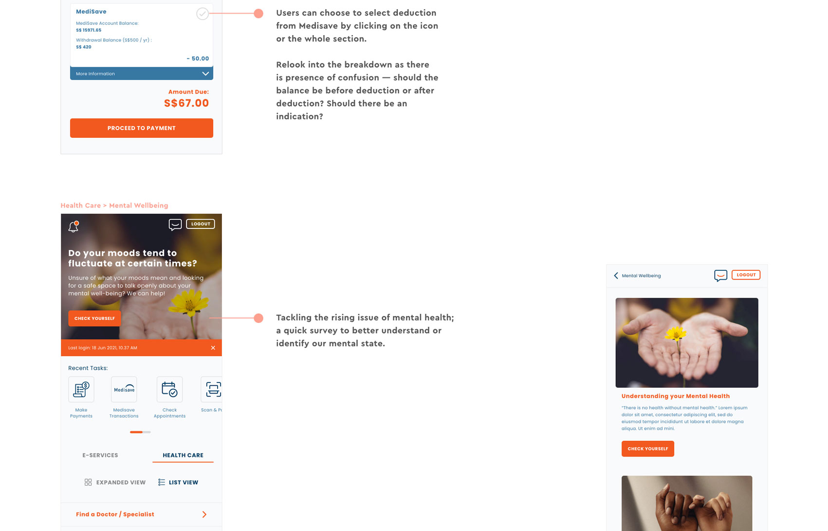
- Increased withdrawal limits under Medisave for mental healthcare
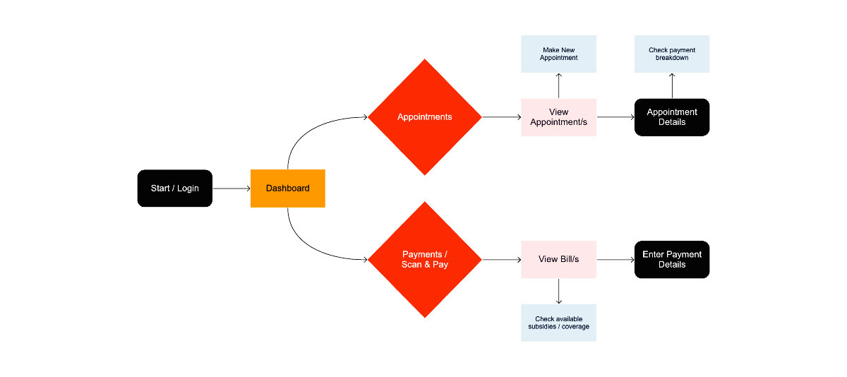
- Estimation of expenses with clear indication of coverage/subsidies/money you can utilise on medical bills to avoid any surprises
- In the light of Covid, payments should be made digitally for outpatients; zero waiting time
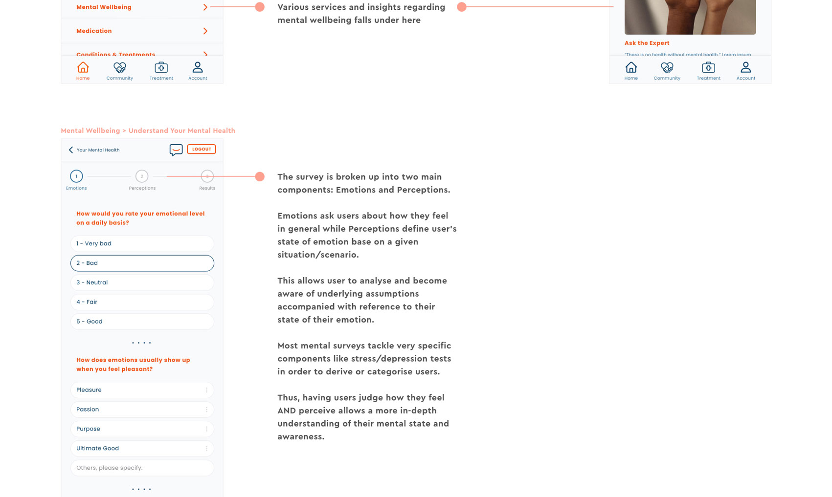
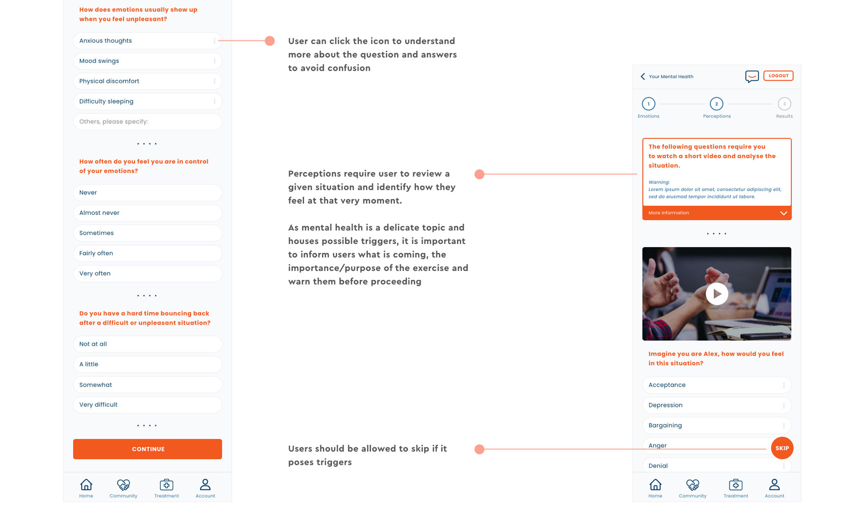
- Encourage individuals to be self-aware of their mental state
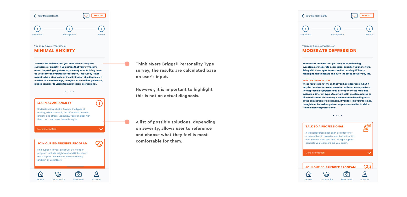
- Provide assistance and/or direction to users in coping their mental issues
Checkup Happine$$
- Even though supportive, half of the business owners believed workplaces should not bear the burden of their employees’ mental health problems*
- Self-sufficient act of using Medisave is a direct action as affordability being one of the major deciding factor for individuals seeking medical support
- Ongoing appeal to raise withdrawal limits for mental health treatments under MediSave scheme from S$500 to S$1,000/yr as they ranged from S$220 to S$380/mth**
- Convenience and clear indications of utilising subsidies without having users to find out. In most cases, users only got to know they are eligible for subsidies when they are asked by medical staff. Given the pandemic situation, everything is now done online.
- Other than Medisave, the possibilities of insurance policies can also be considered
** https://www.todayonline.com/singapore/review-singapores-mental-healthcare-system-underway-mps-highlight-existing-gaps
Checkup Happine$$

- Many of us are more concerned with monetary aspects than our own health; the mentality of “work first rest later”
- Mental health in particular is often dismissed or toned down as it is not something that is seemingly visible as compared to physical illnesses*
- The biggest reason for this downplay is the fear of judgement resulting in individuals finding it difficult to disclose and/or forgoing treatment**
- It is important to make it easier for individuals and general public to recognise, approach and deal with this subject without judgement of others
- A safe platform for individuals to take the first step in coming with consensus with their mental state in order to drive them to seek treatment
** https://www.channelnewsasia.com/news/singapore/singapore-mental-health-awareness-stigma-conditions-depression-14903772
Hi-Fi Wireframes
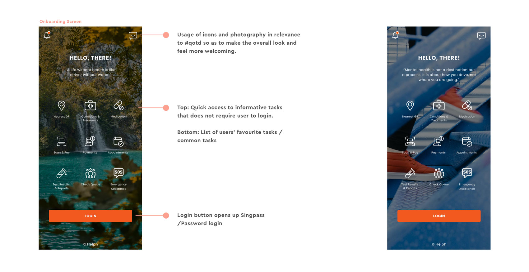
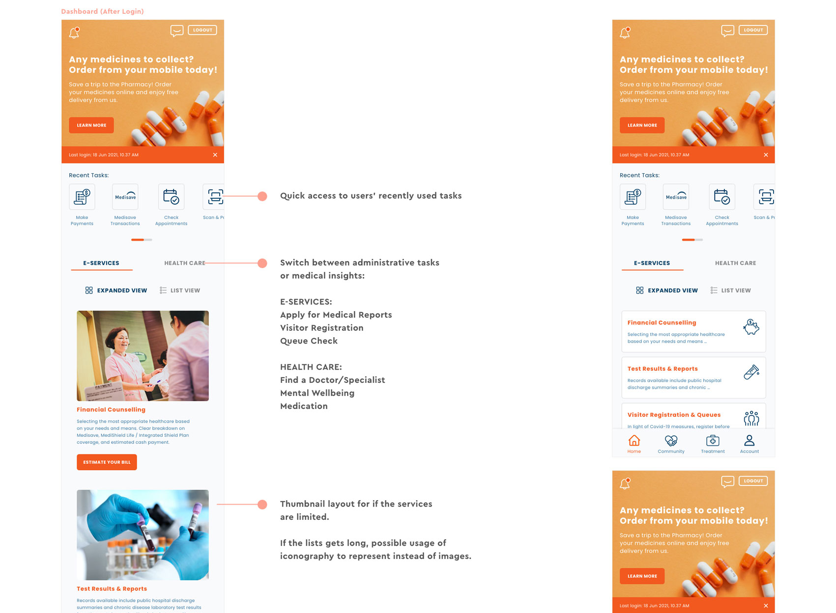
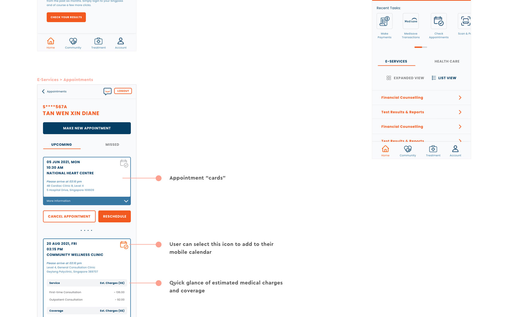
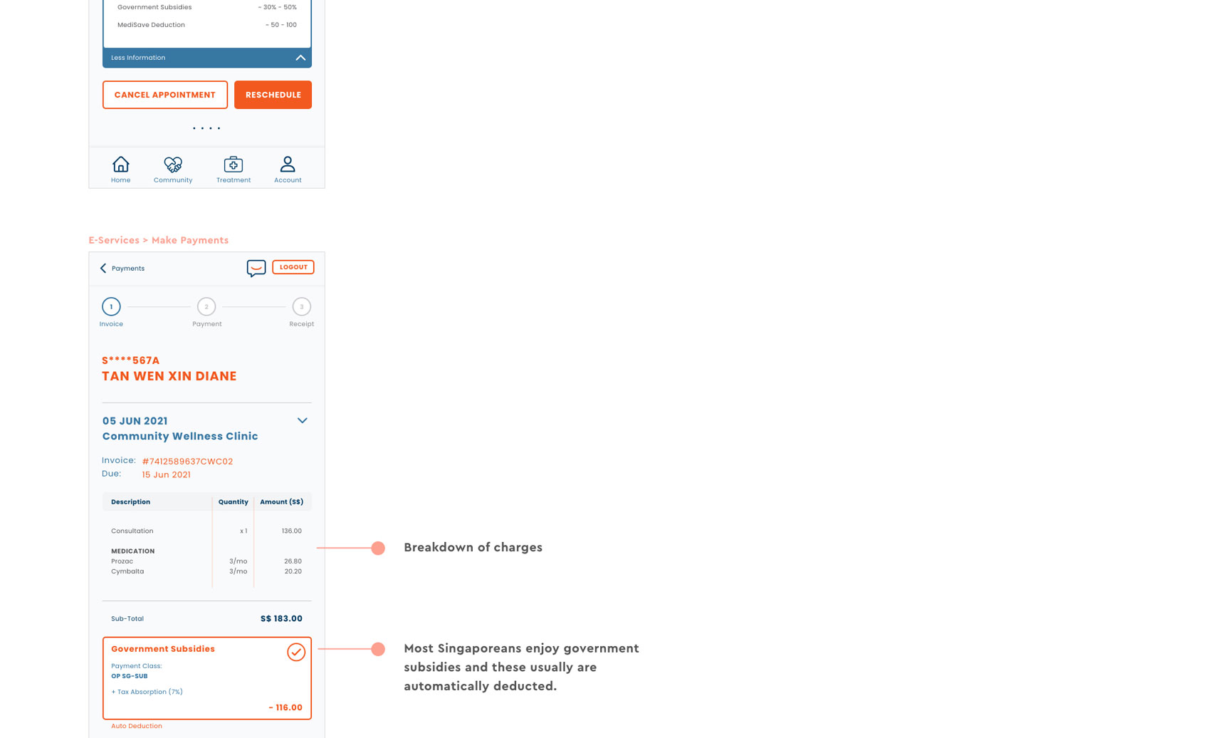
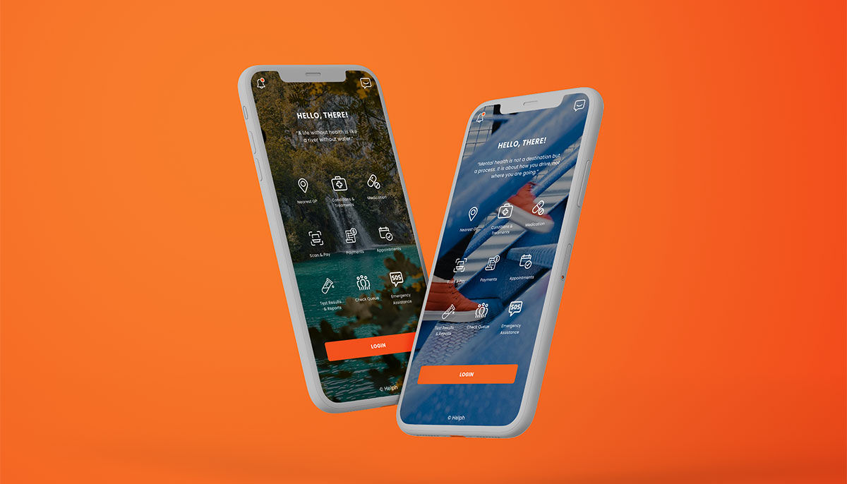
As part of the brief applying for the Visual Designer position, the deliverables include high-fidelity mock-ups. I took inspiration from a few applications which include SingHealth and DBS's bank app. The color schemes take reference from the SingHealth app with the additional of the blue tones as blue typically associates with credibility, trust, knowledge, professionalism, cleanliness, calm and focus. (click image to expand)
Reflections and Improvements
There is definitely room for improvement and more research to be done, especially on understanding mental issues and how to cope with them. One of the feedback to note was on the business impact and what is a driving force for investment. On the application design itself, there were certain design elements that require iterations, for example font sizes to adhered to if this were to fall in line with government's guidelines.
Overall this project was a joy to work on despite the limited timeline. The part that I enjoyed the most would be interviewing my friends and colleagues and understand the importance of mental health and how it could often be overlooked by day in day out activities. It was evident and beneficial that I come from someone close in contact hence my interviewees were comfortable and able to spill so much with me.
